
Level of Detail Exploration of Electronic Transition Ensembles using Hierarchical Clustering
Abstract
We present a pipeline for the interactive visual analysis and exploration of molecular electronic transition ensembles. Each ensemble member is specified by a molecular configuration, the charge transfer between two molecular states, and a set of physical properties. The pipeline is targeted towards theoretical chemists, supporting them in comparing and characterizing electronic transitions by combining automatic and interactive visual analysis. A quantitative feature vector characterizing the electron charge transfer serves as the basis for hierarchical clustering as well as for the visual representations. The interface for the visual exploration consists of four components. A dendrogram provides an overview of the ensemble. It is augmented with a level of detail glyph for each cluster. A scatterplot using dimensionality reduction provides a second visualization, highlighting ensemble outliers. Parallel coordinates show the correlation with physical parameters. A spatial representation of selected ensemble members supports an in-depth inspection of transitions in a form that is familiar to chemists. All views are linked and can be used to filter and select ensemble members. The usefulness of the pipeline is shown in three different case studies.
1. Introduction
Designing novel materials with specific properties and behavior is an important task in many applications. Theoretical chemists study materials at an atomic scale and try to understand the relation to macroscopic properties. In this paper, we are interested in the interaction between matter and light, which is linked to the change of charge distributions in molecules. Light-matter interactions are used for material characterization and have applications, for example in medicine. Aside from experiments, calculations of the electronic structure of molecules are widely used for this purpose. With current computational capabilities and efficient simulation software, it is possible to conduct such simulations at atomic scale for various molecular configurations and conformations, resulting in a collection of a large number of data sets called an ensemble. Each individual data set is called an ensemble member and consists of a molecular specification, two scalar fields, and physical properties. In this paper, we present a pipeline for efficient exploration, summarization, and visualization of this data to support easy navigation through the ensemble, forming and testing hypothesis, and finding patterns and correlations.

Pipeline for ensemble exploration of molecular electronic transitions: It takes an ensemble of simulations of molecule-light interactions as input, and combines automatic and explorative components to support an in-depth analysis.
Molecules can either absorb light and electrons will be excited from occupied to unoccupied orbitals, or emit light when the excited electrons relax to the occupied orbitals. This is called a molecular electronic transition. To find molecular configurations with specific physical properties it is important to understand these electronic transitions in detail. This entails classifying transitions and identifying correlations to physical properties, as the wavelength of the emitted light. In our context, an electronic transition is a pair of scalar fields, corresponding to the electronic density distribution before and after absorption. These scalar fields are traditionally visualized using an isosurface representation, similar to the hole and particle in Fig 2. The usual practice in the theoretical chemistry community is to analyze electronic transitions by visually estimating how the electron density distribution changes by comparing the isosurfaces before and after the transition. This process is highly subjective, as it depends on the choice of the isovalue and guessing the amount of charge concentrated on each subgroup. Also, such a technique does not scale for the analysis of large ensembles. Recently, Masood et al. [MTL∗21] introduced a measure, a charge transfer matrix, which quantifies the charges that are transferred between molecular subgroups. They also presented a visual representation of an electronic transition called transition diagram which provides a more efficient and accurate way to visually compare electronic transitions.

Spatial representations and member transition diagram for two transitions in a molecule with two subgroups, G1 (purple) and G2 (green). Top: LE type transition where the charge stays on the G1. Bottom: CT type transition showing strong transfer from G1 to G2. These transitions belong to the ensemble studied in Sec 7.1
- A novel feature vector to describe molecular electronic transitions and a derived quantitative measure of locality for distinguishing between transitions of different nature.
- A visual pipeline for ensemble analysis of molecular electronic transitions combining automatic and explorative methods.
- A level of detail representation for an ensemble of electronic transitions which summarizes and conveys the mean behavior along with the variations.
- Introduction of augmented dendrograms to provide a hierarchical visual representation of ensemble data.
Pipeline overview and structure of the paper — The design of the pipeline (Fig 1) is guided by a set of visualization and analysis tasks derived from the domain problem (Sec 4). The input to our pipeline is an ensemble representing the electronic transitions for different configurations of molecules. A detailed description of the data is given in Sec 2. A quantitative feature vector, derived in Sec 5.1, is computed in a preprocessing step. It is used to generate the ensemble statistics using hierarchical clustering (Sec 5.2) and cluster summarization (Sec 5.3). The results of this analysis establish the basis for a set of visual representations (Sec 6). This entails visualization of the clusters (Sec 6.1), and a level of detail visualization for augmenting a dendrogram to provide an overview over the entire ensemble (Sec 6.2), a projection of the feature vectors in the 2D plane for outlier detection, parallel coordinates showing the feature vector and the physical properties to verify the clustering results and to highlight correlations (Sec 6.3), and spatial visualization of selected ensemble members for detailed analysis (Sec 6.4). All visualizations are linked and can be used for filtration and selection.
2. Background and data
In studying the interaction between light and matter, chemists are interested in molecules that either absorb light where electrons will be excited from occupied to unoccupied orbitals, or emit light when the excited electrons relax to the occupied orbital. This change in the molecule is called an electronic transition. To find molecular configurations with specific physical properties as excitation wavelengths, it is important to understand these electronic transitions in detail. In a data analysis context, an electronic transition is a pair of scalar fields. A compact version of these scalar fields are called the natural transition orbitals (NTOs) [Mar03], the hole NTO which indicates from where and the particle NTO indicating to where the electrons are excited. Typically, the chemist is not interested in how the electron density distribution changes on an atomic level but a molecular subgroup level, which can be divided into donors or acceptors. For donors, the subgroup charge in the hole is larger than in the particle, which means the subgroup donates charge to other subgroups in the transition to the particle. For acceptors, it is the other way round, the charge is larger in the particle compared to the hole. Therefore, a common task is to distinguish between two different types of electronic transitions: Local Excitation (LE), when the electronic density distribution stays roughly the same within each subgroup, and Charge Transfer (CT), when the electronic density distribution changes and the charge is being transferred from one subgroup to another. An example of an LE type and a CT type of transition can be seen in Fig 2. Currently, such data is analyzed by comparing isosurfaces of the hole and particle NTO. Few methods exist to perform a quantitative analysis. In practice, however, not one but many simulations are performed to explore the parameter space defining the molecular configurations and the analysis tasks become even more challenging. There is a need to investigate multiple electronic transitions simultaneously in a comparative manner.
- Molecular specification: A set of atoms A = {a1, …, aN} where each atom ai is a sphere centered at pi ∊ ℝ3 with radius ri. And a partitioning of the atoms into M subgroups, S = {s1, s2, …, sM}, where
 and si ∩ sj = θ for i ≠ j, and optionally additional paramters like dihedral angle or subgroup type.
 - A pair of scalar fields: Φh : ℝ3 → ℝ and Φp : ℝ3 → ℝ (hole and particle NTOs) describing the electronic transition.
- Additional physical properties from the simulation, such as oscillatory strength, rotatory strength, energy, and wavelength.
We make the following assumptions: (i) All members in the ensemble have the same number of subgroups. (ii) A consistent mapping between the subgroups of ensemble members is available.
- The hole charge
 for each subgroup sj and the corresponding particle charge
  .
. - The amount of charge transfer Q̃jk between all pairs of subgroups sj and sk. All these charge transfer values can be represented concisely as a M × M matrix denoted by Q̃m × m.
where element Q̃i j corresponds to the charge transfer from subgroup i to subgroup j, all elements being non-negative. The sum of each row gives the hole subgroup charges, and the sum of each column gives the particle subgroup charges: 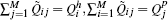 . The set of subgroups charges represents a probability distribution summing up to one
 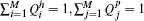 .
.
3. Related work
We will first summarize related work within the theoretical chemistry domain, which does not emphasize systematic analysis of ensemble data and is rather focused on the interpretation and analysis of individual ensemble members using simple visualization methods. Next, we discuss methods described in the visualization literature on ensemble visualization and data summarization.
Charge transfer analysis — Analyzing charge distributions and their changes in molecules is a frequently appearing topic in theoretical chemistry. Visualization plays an important role in enabling such analysis. Popular approaches combine isosurface rendering of the charge distribution together with a molecular representation such as ball-and-stick model or van der Waals surface [KKF∗17] or complex-valued molecular orbitals [ASSK19]. VMD is a widely used visualization software that supports efficient rendering of these representations [SSH∗09,SHS∗11]. Haranczyk et al. [HG08] propose to define orbital-specific isovalues that contain a given fraction of the total charge. Extending from the analysis of charge distributions in individual molecules towards charge transitions, popular approaches include side-by-side visualization (similar to Fig 2) and density difference isosurface plots augmented with arrows that indicate charge transitions [JBAC12]. To support the visual analysis of electronic transitions, Sharma et al. [SMT∗21] introduced a peeling operation for continuous scatter plots that help identify donor and acceptor groups in the molecule. The above methods do not typically support quantitative analysis, and further do not scale well when comparing transitions in an ensemble. A quantitative analysis of the charge density field relies on a portioning of the space, assigning charges to molecular subgroups [HZAV∗18, AMFH21]. One such approach is using atom-centered Voronoi partitioning that associates charges to individual atoms [REL17]. Quantification of changes in the distribution during molecular excitation either builds on these partitioning or a point-wise difference density field and can be computed using standard quantum chemical codes such as Gaussian [FTS∗16]. The method proposed by Masood et al. [MTL∗21] solves an optimization problem to establish a charge transition matrix, which is the foundation of this work. There has not been much work on the analysis of charge transitions for ensemble data.
Visual analysis of multi-parameter ensembles — Ensemble data appear in many scientific applications where simulations with varying parameter settings or configurations are performed. In a viewpoint article in 2014, Obermeaier et al. [OJ14] identified visual analysis of ensembles as one of the most important new areas of research in the field of visualization. They distinguish between feature-based and location-based ensemble visualization. Since then a significant advancement in the area can be observed as summarized in a recent overview article by Wang et al. [WHLS19]. A direct spatial comparison of the charge transfer fields does not account for the main transfer characteristics, so we will focus on feature-based methods in the following. Several works investigate the variability of contours or characteristic curves of ensemble data [HCJ∗14]. In the context of scalar field visualization, Pöthkow et al. [PH11]have analyzed the uncertainty of isocontours for ensembles. Ferstl et al. [FBW16] proposed streamline variability plots for characterizing the uncertainty in vector field ensembles.
To cope with multi-parameter aspects of ensemble data, exploratory frameworks with multiple linked views are frequently used. An overview of related methods can be found in the state-of-the-art report on coordinated multiple views by Roberts et al. [Rob07]. An example for the analysis of ocean simulation ensembles is the integrated visual analytics system by Höllt et al. [HMZ∗14]. In a similar application, Friederici et al. [FFH21] have published a framework to explore eddy transport in oceans using parallel coordinates of aggregated characteristic eddy measures together with spatial representations. Nested Parallel Coordinates Plots for multi-resolution climate ensemble parameter analysis has been proposed by Wang et al. [WLSL17]. They combine heat maps and dendrograms to explore intra- and inter-resolution correlations. Recently, Kumpf et al. [KSHW21] have presented a visual analytics technique for multi-parameter ensembles that supports selecting and analyzing parameter distributions using parallel coordinates plots linked to a side-by-side view of per-member violin plots. Some of these techniques have similarities to our work. However, the structure of our data is very specific, and the general methods developed for multiparameter data are only partially transferable.
Dimensionality reduction and clustering — A complementary approach to cope with higher dimensional data and reduce its complexity is to facilitate statistical tools to summarize data [WH20]. Dimensionality reduction methods organize points from a high-dimensional space into a low-dimensional (typically 2D) space while preserving select data characteristics. The widely used principal component analysis (PCA) method projects the data onto a linear subspace spanned by the eigenvectors corresponding to the k-largest eigenvalues of the correlation matrix. Other methods attempt to preserve the distance matrix containing the distance between all pairs of data points (multidimensional scaling (MDS) [SNHMS18]). Alternatives aim to preserve the point density, a neighborhood relation (t-sne [vdMH08]) or its topological structure [YZR∗18]. Modeling high-dimensional data in lower dimensions, using curved surfaces, results in the manifold learning problem, which can be solved by approaches such as isomap [TDSL00, SGM04]. Clustering aims to form groups of data points based on inter-point similarity or distance. Its success crucially depends on two ingredients: the similarity measure and the clustering strategy [Jai10].
4. Analysis and visualization tasks
- A1 Quantitative measure for transition type: Derive a measure that can help to distinguish between different types of transitions, LE and CT (as described in Sec. 2).
- A2 Efficient grouping of transitions: Find subsets of similar transitions in the ensemble.
- A3 Summarization of a subset of transitions: Design quantitative measures descibing the subset.
- V1 Overview of all transitions: Find a visual representation to gain an overview of the whole ensemble.
- V2 Inspecting a subset of transitions: Find a visual representation that highlights important information about a subset of transitions within the whole ensemble.
- V3 Identifying individual transitions: Find a way to identify and relate selected transitions back to the chemistry domain.
- V4 Interactive exploration of the transitions: The pipeline should support an exploration of the whole ensemble, to find transitions with similar behavior and support to filter on multiple parameters.
5. Analysis methods
In this section, we develop methods that address the analysis tasks identified in the problem specification (A1-A3 Sec 4). To obtain an efficient grouping of the ensemble of electronic transitions, we first find a quantitative way of expressing the transition as a feature vector together with a measure for the transition type. Using the feature vectors as input to a hierarchical clustering method, we create the grouping of transitions. Further, we develop summarization measures for describing the groups.
5.1. Feature vector representation
All elements in the vector are non-negative. This is a condensed way to describe the transition compared to the matrix, while still containing important information about the subgroup charges. It is a simple and straightforward way to create our quantitative representation, intelligible for the chemists. Most importantly, it is well suited to capture the difference between a local excitation (LE) type and a charge transfer (CT) type.
This value is between zero and one. A high value indicates a LE type of transition, and a low value indicates a CT type of transition.
5.2. Hierarchical clustering of transitions
To further address analysis task A2, a clustering method is needed that allows us to adjust the level of clusters during the exploration process without fixing the number of clusters beforehand. Further, the chemist expressed a need to understand the clustering process and the similarity of transitions in the sense of their behavior. These aspects made a hierarchical clustering method a natural choice. The result from a hierarchical clustering method can be visualized in a dendrogram, giving an idea about the relationship between all members, both how they cluster and their proximity. We use the transition feature vectors, Eqn 2, as input.
Hierarchical clustering methods build a tree representation of an ensemble based on the distances between the ensemble members. It is either done by using a top-down approach or a bottom-up approach [SPG∗17], the latter is also known as agglomerative clustering. It begins with the single ensemble members and successively groups them together into larger and larger clusters. We use this approach in our implementation. We visualize the resulting tree as a dendrogram, see Fig 5 (left), which is a binary tree, showing the hierarchical relationship between the ensemble members represented in the leaves. They merge together at different heights, creating hierarchical subtrees. The dendrogram thus provides an overview of the ensemble of electronic transitions and the different levels of clusters, as well as a possibility to inspect their closeness.
There are several options to define the distance between groups of ensemble members in hierarchical clustering. Commonly used are single-linkage, complete linkage, average linkage, and Ward linkage [Nie16]. The appearance of the dendrogram depends on the chosen linkage. In our pipeline, all the before mentioned linkage functions are implemented. For simplicity, we use only one linkage in this paper: the Ward linkage criterion. The Ward linkage criterion uses the difference between the centroids of the subsets to decide if these subsets should be merged, a variance minimization process.
5.3. Cluster summary statistics
To address analysis task A3, we derive measures providing the overall transition characteristics — the summary of a cluster.
 and the element-wise mean of all transition feature vectors v can be described by the vector
Hence, the mean v̄ is a valid transition feature vector.
This vector gives the standard deviation of the charge for each subgroup, both for hole and particle.
6. Visual abstractions
In this section, we describe the design of our visual abstractions for electronic transitions, addressing the visualization tasks, Sec 4. First, we explain the ensemble overview visualization and a cluster visualization, using the result from our analysis methods in Sec 5. Then, we develop a level of detail visualization to augment a dendrogram with additional information. Finally, we describe an exploration approach to give the possibility to inspect the ensemble of transitions and filter based on multiple parameters. We would like to note that the design of all visual representation has been developed in close collaboration with a theoretical chemist (being co-author of this paper), and the prototype implementation has been done in Inviwo [JSS∗20].
6.1. Cluster visualization
For each ensemble member, the electronic transition is visualized using a member transition diagram (MD) [MTL∗21]. It shows the amount of charge for each subgroup in both hole and particle, as well as the charge transfer between the subgroups. The transition diagram is a version of a Sankey diagram [RHF05], where the width of the bars are proportional to the amount of charge. The upper bars correspond to the particle subgroup charges, and the bottom bars correspond to the hole subgroup charges. The width of the connectors is proportional to the amount of charge transfer (Fig 2).
Cluster transition diagram (CD) — For supporting inspection of a subset of transitions and addressing task V2, we introduce a transition diagram combining the mean transition with a traditional box plot. As before, the bar width corresponds to the subgroup charge, here the mean of the subgroup (Eqn 4), and the whiskers sticking out from the boxes show the subgroup charge standard deviation (Eqn 6). The connectors are the mean of the transition. Fig 3 level 3 shows an example of the CD. The colors for the subgroups are chosen to be different grayscale values to reserve color for the representation of other properties.

(a) Level of detail visualization for the CD and (b) using colored disks to summarize the transition in the ML value.
6.2. Level of detail visualization
The dendrogram provides information about the hierarchy and similarity between transitions in the ensemble. We address task V1 by using the dendrogram and augment it with additional information about the clusters, at each clustering level. This gives an overview of the whole ensemble together with valuable cluster characteristics. To cope with the limited space in the dendrogram, we propose a level of detail glyph visualization of the cluster transition diagrams. We store the cluster statistics at each node in the dendrogram, and show the cluster transition as a glyph on the edges. We suggest three level of detail glyphs of the cluster transition diagram together with a color indicating the LE vs CT character for visualizing the transition (Fig 3(a)). The level 1 glyph shows the single most dominant subgroup involved in the charge transfer, for hole and particle. This gives an indication of the most important subgroups. At the next level of detail, the level 2 glyph, we show the cluster transition diagram without the standard deviation for the cluster. Thus, at this level, the complete information about the mean behavior of the charge distributions in hole and particle including the charge transfer between subgroups is available. Lastly, the level 3 glyph corresponds to the full cluster transition diagram for a cluster. Therefore, it also provides the information about the variability in the transitions in a given cluster. At each internal node in the dendrogram, the cluster of transitions is represented by a single number, which captures the LE vs CT character of the transitions. In our case, we chose the ML value (Eqn 3), and use the mean for all transitions to measure the overall amount of charge transfer. The single number can then be mapped to a color using an appropriate diverging color map such that the transitions with LE character are clearly distinguishable from those with CT character (Fig 3(b)). The ML value (for a single transition) or the mean of the ML values (for a group of transitions) is shown as a colored disk at each node, using three different sizes.
The levels and the sizes of the ML disks depend on the available space in the dendrogram. The minimum of the width and height available at a specific node decides which of them should be chosen. To have consistent visualization, we chose to have the same size for all the glyphs in the dendrogram belonging to the same level of detail, even if there is a bit more space available at some nodes than others. These sizes of glyphs were determined in an iterative manner with user feedback. An example of the combination of the dendrogram and the level of detail visualization can be seen in Fig 4. For the leaves, only the smallest ML disk is shown. Following the branches up in the tree, more space is available and other levels are chosen.

Design example of a dendogram augmented with the level of detail glyphs of the CD, and the ML values as colors (size of glyphs and colored disks are chosen depending on available space).
6.3. Filtering and selection of transitions
We address task V4 by using several interactive elements, described in this section.
Parallel coordinates plot (PCP) — To allow the user to filter on multiple parameters of the ensemble and to be able to distinguish correlations between the different parameters, we use a parallel coordinates plot [ID90]. In this plot, each parameter is represented by a vertical axis and each ensemble member is represented with a line segment, intersecting the axis at the corresponding value. The selected range of the axes can be changed to filter the data. It is also possible to highlight one or multiple data points by selection. For each transition, we show both the derived parameters relating to the feature vector: the difference in charge between hole and particle, for each subgroup ΔQi; the measure of locality (ML); the cluster id from the hierarchical clustering; and additional parameters including the name of the conformation or molecule, the state, and other physical properties like oscillatory strength, rotatory strength, and energy.
The user can adjust which parameters should be shown. The axes in the parallel coordinates plot are traditionally scaled between the max and min value of the data, but to make it easier to compare, we rescale the ΔQi axes to be the range from −1 to 1 and the ML value axis to be the range from 0 to 1. A negative value on the ΔQi axis means the subgroup donates charge, a positive value means that the subgroup accepts charge from other subgroups. The parallel coordinates plot serves as a tool to inspect correlations between the derived parameters and the additional parameters, but also as a tool to understand the clustering results and refine them. Parallel coordinates can mainly show correlations of neighbouring axes, in our implementation however, it is possible to interactively adjust the order of the axes. Further, one can also highlight multiple members to show correlation using brushing.
2D scatter plot — To give the user a complementary type of overview of the ensemble and the possibility to select single or multiple transitions, we use a 2D scatter plot with the feature vector representations projected to two dimensions. This also indicates closeness of transitions. In our implementation, the user can choose between multiple options for dimensionality reduction (such as t-sne, MDS and PCA). For this paper, we chose to use principal component analysis (PCA) [AW10], since it is a simple and robust method. The scatter plot is linked with the parallel coordinates plot, and both are affected by filtering and selection.
Dendrogram — The clustering of transitions is shown visually in the dendrogram. Here, we also use it as a way to select a level of clusters by cutting it at a desirable height: the distance threshold. The subtrees created below this threshold correspond to the different clusters. In Fig 5, a design example of a dendrogram is shown together with a parallel coordinates plot and a 2D scatter plot. The line in the dendrogram corresponds to the distance threshold deciding which cluster level is in focus. The coloring is based on clusters and used in all linked views. Here, we use a categorical color map.

Design example of a dendrogram, parallel coordinates plot, and a 2D scatter plot. Views are linked and colored by cluster.
6.4. Spatial representations
To meet the need to identify individual transitions, addressing task V3, we suggest using spatial representations of the scalar fields, a visualization the chemists are used to, but also with the possibility to color by subgroup. Having visual abstractions makes it possible for the chemists to explore the ensemble of transitions. However, they are used to working mostly with the spatial views of the electron density, often shown with isosurfaces over a ball and stick model. We support showing such spatial representations on demand (the hole and particle distributions for an electronic transition), with the aim to give the chemist a familiar view to aid in understanding. In addition to isosurface visualization, we also support segmented volume rendering to show electron density distribution more clearly on each subgroup in a molecule. See Fig 2 for an example.
7. Case studies
In this section, we illustrate different uses of the proposed pipeline with three case studies. The first case study demonstrates a top-down cluster exploration using the augmented dendrogram. The second case study explores the nature of electronic transitions in metal complexes and demonstrates the utility of the proposed cluster transition diagrams in showing summary statistics of a group of transitions. It also shows how multiple filtering can be used in PCP to reveal interesting transitions. The last case study puts special focus on investigation of the link between the charge transfer characteristics of the transitions and the associated physical and spectral properties.
7.1. Top-down ensemble exploration
As a first case study, we chose a simple molecule formed of three rings, as shown in Fig 6(a). The ring on the left, shown on the dark grey plane, is called thiophene while the two rings on the right are together called quinoxaline. (poly)thiophene is commonly used as a donor molecule in organic field effect transistors and solar cells [DHW11], while quinoxaline is an acceptor group also widely used in such applications. The relative conformation of these two groups (i.e. the dihedral angle between them) is an important parameter when it comes to electronic delocalization and excitation energy [YLK∗03]. Here, we consider a set of 13 different conformations with varying dihedral angles from 0° to 180°, and calculate the first nine excited states resulting in an ensemble containing 117 transitions. Fig 6(a) shows how the angle can vary between the subgroups. For this dataset, we naturally consider thiophene and quinoxaline as the two subgroups of interest. For the rest of this section, we will use the symbols G1 and G2 to refer to the thiophene and quinoxaline subgroups, respectively.

Top-down level of detail exploration of a Thiophene-Quinoxaline conformer ensemble using augmented dendrogram. (a) The molecule is composed of two groups, here available in 13 different conformations with dihedral angles varying from 0° to 180°. (b) The augmented dedrogram for the 117 transitions within this ensemble. Notice how the transitions group into two bigger clusters, each exhibiting different charge transfer characteristics. (c) The parallel coordinates plot shows an overview of the complete ensemble and highlights cluster C5 which is of interest. (d) The projection of ensemble in 2D using PCA. One outlier is identified using this scatter plot, highlighted in yellow.
We start the exploration of this ensemble with no specific transitions in mind, we rather seek to gain an initial overview of this ensemble and see where a further exploration would be interesting. The augmented dendrogram is ideal for this purpose as it reveals clusters in a top-down fashion at various levels of detail, see Fig 6(b). We observe on the top of the augmented dendrogram a clear division into two large clusters with very different characteristics evident from their glyph representation; cluster C1 is representing LE type of transfer with charge largely concentrated on group G2 and cluster C2 is mainly CT type with charge transfer from group G1 to G2. As we go down the hierarchy, C1 splits further into clusters C3 and C4 with C3 being purely LE type while C4 shows small charge transfer from G1 to G2. This difference in the amount of locality can also be seen in the colors of the leaves: the leaves under C3 are mainly red denoting high ML whereas the leaves under C4 are yellow or orange denoting smaller values of ML.
Going back up the hierarchy, we focus on cluster C2. We observe that the majority of transitions in this cluster are indeed of CT type as evident from most of the leaves being blue denoting very low values of ML. However, within this cluster we can also distuish an atypical sub-cluster labelled C5 with LE type as evident from mostly red leaves. From the glyph representation of this sub-cluster, it is clear that the charge is mainly concentrated on G1, unlike the cluster C1 where the charge is concentrated on G2. This initial overview now provides us with sufficient information to investigate the ensemble further. We are specially investigating cluster C5 in greater detail.
Using a threshold value indicated by dashed horizontal line in Fig 6(b), we partition the ensemble into three clusters: C1, C5 and C6. We then plot the parallel coordinate plot as shown in Fig 6(c) and also the 2D scatter plot as shown in Fig 6(d). In both these figures, transitions in cluster C5 are highlighted in green, while the other ensemble members are greyed out. The ΔQ1 and ΔQ2 axes of the parallel coordinates plot are very interesting. As highlighted by boxes marked 1 and 2 in the plot, it is clear that ΔQ1 has negative values for most ensemble members while ΔQ2 is positive. This means group G1 is a donor and group G2 is an acceptor. Also note that for the highlighted green cluster C5, the ML value is high for all members, confirming what we saw in the augmented dendrogram that these transitions have LE character. The scatter plot shows additional information about the spread of ensemble members, where the green cluster is the most spread out. When selecting the most extreme outlier in the scatter plot within this cluster, highlighted in yellow, we can inspect which transition this corresponds to in the parallel coordinates plot. We find that the selected electronic transition is for a conformation having an angle of 90° between the groups, state 8. This transition is a very strong LE type, since it takes values close to zero on the ΔQ axes and the ML value is high. This confirms what is known chemically about this conformation: the 90° angle makes the transfer very low between the two subgroups. We show the spatial representations together with the member transition diagram for this individual electronic transition in Fig 2 (top row).
7.2. Exploring the nature of transitions in metal complexes
The second case study focuses on a dataset consisting of metallic complexes used for light emission with application in Light Electrochemical cell [ESDM∗16]. Each complex contains one single metal atom (copper, silver or gold) and two additional ligands. The first ligand, phenanthroline (PHE), is the same for every complex. The second ligand varies with subsituted phenanthroline (PHE-Me, PHEoMe, PHE-phe) and two other types with a very different chemical nature: a carbene (ipr) and a biphosphine. We consider the metal as one subgroup and the ligands as individual subgroups, giving three subgroups in total for this ensemble (resulting in 6 dimensional feature vectors). The ensemble contains 180 transitions in total, see Fig 7(d1-d3) for examples.

Using CDs to explore the nature of transitions in metal complexes consisting of a metal atom surrounded by two ligands (PHE and Lig2). (a) 2D projection of all the transitions in the ensemble, colored according to six identified clusters. (b) CDs for the six clusters, with subgroup order from left to right: metal, PHE, Lig2. Note the clear differences in charge transfer characteristics of the transitions in these clusters, and how the CDs convey this concisely and effectively. (c) Exploring the charge transfer character shown by CD6 in more detail, filtering the PCP reveals three similar transitions. (d1-d3) The spatial data from which the transitions were computed confirms our findings.
Since metal is a known to be a strong donor, it is expected that most of the transitions in this ensemble will exhibit high charge transfer from it to the other two subgroups. However, exploring the similarities and differences in charge transfer characteristics among the transitions in this ensemble, including finding outliers, is of particular interest. Similar to the previous case study, we start the exploration with the augmented dendrogram and through interactive exploration identify a cut-off threshold which results in six clusters, see Fig 7(a) for the 2D scatter plot of the ensemble where the six clusters are shown in different colors. Now, we use our cluster transition diagram to examine the charge transfer trends within each cluster. This is shown in Fig 7(b). Note how the cluster transition diagrams of the six clusters looks fundamentally different. We immediately observe four of the six clusters (CD1, CD3, CD5, CD6) are of strong CT type while two clusters (CD2 and CD4) are more of LE type. Within Fig 7(b) we have indicated the key charge transfer behavior at the top of each cluster transition diagram. Firstly, it is interesting to observe that even with a metal subgroup which is a strong donor, there are two LE clusters within this ensemble. However, these two clusters are LE types on PHE and Lig2, respectively. There is no Metal→Metal LE cluster. Secondly, among the CT clusters, CD3 is particularly interesting as it exhibits roughly equal charge transfer from metal to the other subgroups, unlike the other three clusters where one ligand acts as a sole acceptor.
CD6 shows slightly atypical charge transfer character as instead of metal being the donor, the majority of the charge is transferred from Lig2 to PHE. We decided to investigate this behavior further. We use the parallel coordinates plot shown in Fig 7(c) with two filters for this purpose. First we filtered on the ML axis to select the transitions which have very low ML values, thus limiting to transitions of CT type. Next, we filtered on the ΔQ1 axis which corresponds to a change in charge on the metal subgroup to further select only the transitions where the metal is not acting as a donor. Using this filtration, we identified three transitions in the ensemble where the majority of the charge moves from Lig2 to PHE. They are au-phe-ipr, ag-phe-pheome and ag-phe-ipr, all in state 10. These findings can be confirmed by examining the individual transition diagrams and the spatial embedding of the hole and particle NTOs as shown in Fig 7(d1-d3). An important observation here is that these three transitions all happen for State 10, they are very high energy transitions and therefore more unlikely.
7.3. Finding correlation with chemical properties
The final case study concerns a recently synthesized cyclic molecule called [4]cyclonaphthodithiophene diimide (C-NDTI) [ZZQ∗21]. This molecule consists of four NDTI subgroups bonded together to form a ring or a cylindrical constrained structure as shown in Fig 8(a). The NDTI subgroup can take two possible orientations in the ring, denoted as type A and B. The molecule, therefore, has six possible unique isomers considering permutations of the orientation of NDTI subgroup: AAAA, AAAB, AABB, ABBB, BBBB, ABAB. These isomers present interesting symmetry relationship, for instance, AAAA and BBBB are mirror images of each other and are not superposable. Our goal in this case study is to explore the relationship between the different isomers and their spectral properties to establish the possible links between the nature of the electronic transitions and the observed spectral properties.

Finding correlations of charge transfer characteristics with the spectral properties of the transitions in the C-NDTI isomers ensemble. (a) The molecule consisting of four identical subgroups is shown. Each subgroup can have two orientations resulting in six different isomers which are explored in this study. (b) The dendrogram is shown along with a cluster highlighted in green which is different than other members of the ensemble in its charge transfer characteristics. (c) This is also evident from the 2D scatter plot as the green cluster lies in the middle while other points are distributed away and around it. Two points in this cluster appear separated from the other four and are highlighted in yellow. Four representative member transition diagram are shown selected from different regions. (d) Finally, the PCP is used for finding correlations with spectral properties of the transitions in this cluster. All members of the cluster belong to State 1 and have large wavelength. The two yellow transitions also have the highest absolute rotatory strength within the ensemble.
The input for this study is the set of hole and particle NTOs for the first seven electronic transitions for each of the six possible isomers, giving 42 electronic transitions in total. Additionally, quantitative values for the spectral properties associated with the transition such as wavelength, oscillatory strength and rotatory strength are provided. There are four subgroups in the molecule as shown in Fig 8(a), which results in 8 dimensional feature vectors. In the 2D scatter plot, Fig 8(c), we observed a cluster of transitions, colored green, in the middle, around which all other points are distributed. This cluster was also successfully obtained using hierarchical clustering with appropriate threshold indicated by the dashed line in Fig 8(b). Using the parallel coordinate plot, we immediately observed that all members of this cluster correspond to the lowest energy transitions (State 1) in the six isomers, and therefore they result in the longest wavelength of absorbed light as well, see the State and Wavelength axes of the parallel coordinates plot in Fig 8(d). It is interesting to observe that transfer characteristics are different in the lowest energy states compared to higher energy states. We also noted that these six transitions are of strong LE type. Compare the four sample member transition diagrams MD1 to MD4 selected from different regions of the 2D projection in Fig 8(c). Notice how the charge is equally distributed across the four subgroups in MD3 and MD4 with high LE character, while the distribution in MD1 and MD2 is non-uniform and transitions are of CT type. In general, we observed a negative correlation between the ML value and the energy associated with the transition for the whole ensemble.
On closer examination, we further observe that within the identified cluster consisting of six points, two points highlighted in yellow in Fig 8(c) are separated from the other four. This is also clear from the member transition diagrams MD3 and MD4. We selected these two points in the scatter plot and through the linked parallel coordinates plot in Fig 8(d). We observed that these points correspond to the AAAA and BBBB isomers and also have the highest absolute rotatory strengths among all the ensemble members. The fact these isomers have the highest rotatory strengths was known to chemists, however, using our tool it was possible to discover that these two transitions also have unique distinguishable charge distributions on the subgroups compared to other transitions in the ensemble. This suggests a link between the charge transfer characteristics of the transition with the spectral properties, which provides a unique insight into this ensemble and opens avenues for future research.
8. Conclusions
The pipeline for the analysis of ensembles of electronic transition data combines automatic and explorative components. It has been jointly developed and designed with a domain expert (theoretical chemist and co-author). We experimented with different analysis and visualization options until we converged to the current solution.
The complexity of the data requires automatic support going beyond traditional methods. A first lesson learned during this process was how essential it is to keep the automatic part transparent and provide the means to use domain knowledge efficiently during the analysis. The interaction with the multiple linked representations serves both requirements. At first, the representation of the feature vector in the parallel coordinates and the visualization of the cluster transition diagrams generate trust in the results while allowing for some adaptations. Secondly, the linked views support an in-depth analysis of selected configurations and investigation of correlations to physical properties. This observation could also be confirmed when presenting the results to a group of theoretical physicists with slightly different backgrounds. Demonstrating our pipeline to other groups sparked a lot of interest and gave additional input and ideas for extensions and future work. The relevance is also manifested in a master's student project just started within the chemistry group based on our work. A second lessons learned was that we realized the importance of integrating traditional visualization methods in the pipeline to help familiarize the user with the analysis tools.
Possibilities to extend the work includes strengthening the correlation analysis with other physical properties or extending the feature vector with this respect. So far, the visualization methods have been designed for a small number of molecular subgroups involved in the electronic transition. To cope with higher numbers of groups, some adaptations in the representation might be necessary. Further, we see the possibility to apply some concepts of our pipeline in other domains. This could generally be data where a change in distribution between two states can be observed. The visual abstractions could also be used for uncertainty visualization, for example related to uncertainty in spatial segmentation. The augmented dendrogram could be useful in many applications dealing with hierarchical guidelines. Here it would be interesting to think about strategies for automatically choosing a ‘good’ hierarchy level and exploring alternatives to using the available space more efficiently.
Acknowledgements
This work is supported by SeRC (Swedish e-Science Research Center), the Swedish Research Council (VR) grant 2019-05487, and an Indo-Swedish joint network project: DST/INT/SWD/VR/P-02/2019 VR grant 2018-07085. VN is partially supported by a Swarnajayanti Fellowship from the Department of Science and Technology, India (DST/SJF/ETA-02/2015-16) and a Mindtree Chair research grant. SST is associated to the Wallenberg AI, Autonomous Systems and Software Program (WASP). The computational resources were provided by the Swedish National Infrastructure for Computing (SNIC) at NSC (VR grant 2018-05973).