Illustrating Income Mobility and Poverty Persistence
Abstract
This article introduces several diagrams relating to relative income mobility, positional change within the distribution and poverty persistence. They are easy to produce and, at a glance, provide valuable information about income mobility and poverty dynamics, given information about the incomes of a cohort of individuals in two time periods.
1 Introduction
As a diagrammatic method of illustrating income inequality and comparing alternative distributions the Lorenz curve is ubiquitous.1 With individual observations arranged in ascending order, it plots the cumulative proportion of total income against the corresponding cumulative proportion of individuals. A normalised area measure of the distance between the Lorenz curve and the line of equality gives rise to the equally famous Gini inequality measure.2 The Lorenz curve thus provides much more information than either the frequency distribution or the cumulative distribution alone.
Where concern is largely for those below a poverty line, an alternative diagrammatic device, for incomes again arranged in ascending order, plots the cumulative poverty gap per person against the corresponding cumulative proportion of people. This is the TIP curve, named by Jenkins and Lambert (1997) for its ability to indicate the ‘three Is of poverty’, namely incidence (the poverty headcount), intensity (the poverty income-gap) and inequality (the within-poor distribution). For those below the poverty line, the curve is a straight line only in situations where all the poor have equal incomes. As with the Lorenz curve, comparisons can then easily be made.
These diagrams concern cross-sectional distributions of income measured over a specified period, usually a year. However, a crucial feature of incomes is that they vary over time. The considerable extent of relative income movement within cohorts means that cross-sectional data provide an imperfect picture of inequality and poverty more widely considered. This creates a need for diagrams that are both informative, regarding different characteristics of income mobility, and easy to produce. The starting point of the present article is the fact that the ‘three Is’ properties of TIP curves can be translated to the context of income mobility. The article provides an introduction to several convenient diagrams that capture crucial features of income and poverty dynamics: for further technical details, extensions and discussion of the related literature, see Creedy and Gemmell (2018, 2019a).
First, the Lorenz curve and its ‘close relative’, the concentration curve, are considered in Section 2, illustrating the need for specially designed diagrams that can reveal income mobility characteristics. One such curve, named the TIM curve, is introduced in Section 3. With individuals ranked in ascending order of initial income, a diagram can be constructed by plotting the cumulative proportional income change per capita (that is per head of the total population, not per head of the cumulated sub-group) against the corresponding cumulative proportion of individuals. Since the diagram bears a close resemblance to the TIP curve it is described here as a ‘three Is of mobility’, or TIM curve, revealing ‘incidence, intensity and inequality’ of mobility. Where interest is in the mobility of particular lower-income segments of the population, the curve can be used to illustrate the relative income growth of different sub-groups.
In Section 4, a comparable device capable of illustrating properties of rank-order (or positional) changes within a cohort is developed. This considers the cumulative observed re-ranking change across individuals ranked in ascending order of the initial income distribution, producing a ‘cumulative re-ranking curve’.
In the context of poverty dynamics, the focus is on movements across a designated poverty line (or threshold income value, which is assumed to remain constant in real terms). Section 5 describes a ‘poverty persistence curve’, which illustrates those income changes that generate movements out of, and into, poverty.
In each case, illustrations are provided using a longitudinal sample of individuals from New Zealand. Conclusions are in Section 6.
2 Some Lorenz Curve Comparisons
Before considering curves specifically designed to illustrate income mobility characteristics, several Lorenz curves are shown in Figure 1, using Inland Revenue Data for New Zealand (described further below).3 Standard (cross-sectional) Lorenz curves for 2006 and 2010 suggest that the taxable income distribution changed very little over the period, as the two Lorenz curves are hard to separate. However, between these 2 years, all individuals’ incomes did not change by the same proportion: some people experienced large increases while others experienced small increases or even reductions, and at the same time their rank positions in the income distribution changed substantially. Remember that in producing the Lorenz curve, the first operation involves ranking all individuals from lowest to highest incomes, so the order of people is different in 2010 from what it was in 2006. None of these mobility characteristics is evident from the Lorenz curves.
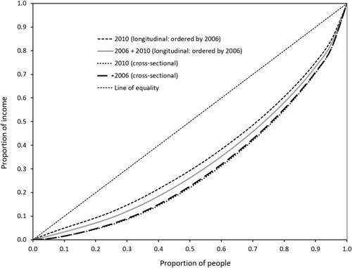
A special feature of the dataset used for these illustrations is that it is a longitudinal sample of taxpayers, so that the same individuals are in both annual income distributions. The question arises of whether a modified type of Lorenz curve can reveal any features of the relative income changes. Consider a curve obtained by averaging individuals’ incomes in the two years. If the income changes over the period have been in some sense equalising, then the Lorenz curve of this average may be expected to lie inside the cross-sectional curves, although it may not necessarily lie inside over the whole length (if changes are not equalising over the complete range of incomes). Figure 1 actually shows a ‘concentration curve’ of average income over the 2 years, where the individuals continue to be ranked by their 2006 incomes (rather than being ranked by their average incomes, as in a Lorenz curve). This concentration curve is everywhere inside the cross-sectional Lorenz curves. The ranking by the initial year (2006) is used so that the curves can be compared with another concentration curve, that of the 2010 annual incomes, with individuals ranked by their 2006 incomes. This curve is seen in Figure 1 to be closer to the line of equality than all the other curves shown. This suggests that those with lower incomes in 2006 did indeed generally experience higher gains relative to those with higher incomes in 2006: hence the cumulative proportion of total income in 2010 is higher, for any given percentile of the 2006 distribution, than it was in 2006. Nevertheless, while the Lorenz curves necessarily reveal nothing about income dynamics, and the two concentration curves demonstrate that there were systematic equalising income changes over the period, the precise nature of those changes across the distribution remain unknown. The following sections discuss curves that are specifically designed to illustrate mobility characteristics.
3 The TIM Curve
This section begins by summarising the key aspects of the TIP curve developed by Jenkins and Lambert (1997), in Subsection 3.1. It is then adapted for the income mobility context in Subsection 3.2. Empirical examples are given in Subsection 3.3.
3.1 The TIP Curve
Jenkins and Lambert (1997) demonstrated that three important dimensions of poverty can be summarised by their TIP curve. These are: the incidence of poverty, as captured by the headcount poverty measure; the intensity, as measured by the income gap, , where is the poverty line; and the inequality of poverty within the poor group, capturing how far the incomes of the poorest differ from those closer to the threshold, .
Let denote individual 's income, with . Given , the poverty gaps are defined by for and for . When incomes are ranked in ascending order, the TIP curve is obtained by plotting against , for . That is, the total cumulative poverty gap per capita is plotted against the associated proportion of people.
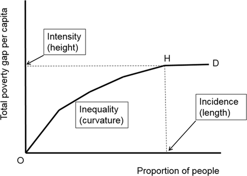
A hypothetical example is shown in Figure 2. The slope at any point is equal to the average poverty gap, with a steeper slope indicating a larger poverty gap. Flattening of the curve therefore shows the extent to which the average poverty gap falls as income rises towards . Thus, inequality among the poor is reflected in the curvature of the TIP curve. The curve becomes horizontal beyond H, beyond which there is no one in poverty. Poverty is unambiguously higher where a TIP curve lies wholly above and to the left of an alternative TIP curve. These properties relate to levels of poverty at a point in time, rather than poverty dynamics over time, such as the extent to which the poor stay poor over different time horizons.
3.2 Three Is of Mobility
The three Is properties of TIP curves can be translated to analogous properties of income mobility, using the ‘three Is of mobility’ (TIM) curve. First, define the logarithm of income, , for individuals . Hence is (approximately) person 's proportional change in income from period to . With log incomes ranked in ascending order, plot against , for . Thus the TIM curve plots the cumulative proportional income change per capita, , against the corresponding proportion of individuals.4
In specifying a TIM curve, the focus is on the mobility of those with incomes below , for the proportion, , of the population. In this framework captures the incidence of the particular low income group of concern, just as the headcount poverty measures the incidence of income poverty. Similarly, intensity and inequality properties of mobility can be defined. The intensity of mobility of a particular group of individuals, such as those below , is measured by the height of the TIM curve at the relevant point, . The inequality property of mobility refers to differences in the income growth rates within the specified group below , and is reflected in the curvature of the relevant portion of the TIM curve. The relevance of all three dimensions of mobility to longer-term inequality suggests that a TIM curve, analogous to the TIP curve, can provide similar insights when ‘mobility as income growth’ is the mobility concept of interest.
A hypothetical example of a TIM curve is shown in Figure 3. The particular curve reflects a situation in which relatively lower-income individuals receive proportional income increases that are greater than that of geometric mean income. Hence the TIM curve, OHG, lies wholly above the straight line OG.
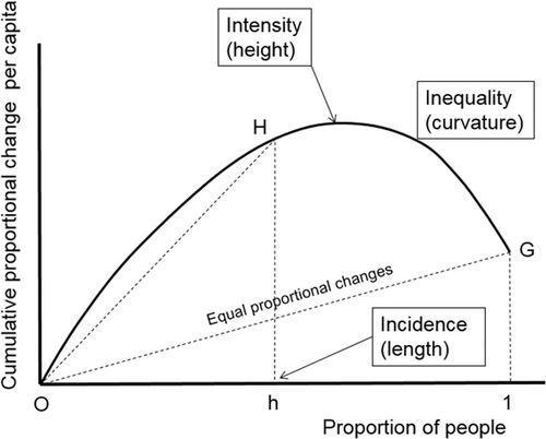
If all incomes were to increase by the same proportion, the TIM curve would be the straight line OG. The height, G, indicates the average growth rate of the population, while the height, H, indicates the average growth rate of those below : these heights reflect intensity properties of mobility. Furthermore, the inequality of growth rates is reflected in the degree of curvature. For example, the curvature of the arc OH relative to the straight line OH indicates that lower-income individuals have higher growth than those individuals to the left of, but closer to, . If concern is for those below a poverty line, , the corresponding percentile is , where, as defined above, is the distribution function of . The TIM curve gives an immediate indication of whether income changes have been pro-poor.6
Suppose interest is focused on those below the percentile, indicated in Figure 3. There is less inequality of mobility—a lower dispersion of income changes—among the group below , shown by the fact that the TIM curve from O to H is closer to a straight line than the complete curve OHG.7 The TIM curve also shows that the income growth of those below is larger than that of the population as a whole. The average growth rate among the poor—the intensity of their growth—is given by the height H.
3.3 Empirical Examples
This subsection illustrates TIM curves using data from a 2 per cent random sample of (anonymous) individual New Zealand Inland Revenue personal income taxpayers. Using data for 1998, 2002, 2006 and 2010, three separate panels were obtained for 1998–2002, 2002–06 and 2006–10, each 5-year panel containing incomes for both years for the same taxpayers. To avoid the exercise being contaminated by taxpayers with very low incomes, such as small part-time earnings of children, or small capital incomes of non-earners, individuals with annual incomes less than $1,000 were omitted from the sample. This yielded usable samples of 29,405, 31,355 and 32,970 individuals respectively for the three 5-year panels. In each case, individuals were ranked by initial-year incomes.
Figure 4 shows the three TIM curves. Growth rates shown on the vertical axis are measured over the 5-year period. The right-hand end of the TIM curve represents the average growth rate over the five years across all individuals. This was similar, at around 15 per cent, for the periods 1998–2002 and 2006–10, but was around 20 per cent over the period 2002–06. All three curves rise steeply at the lowest income percentiles and flatten out at higher percentiles, yielding concave profiles and suggesting greater upward mobility especially among the lower percentiles. These curves combine average growth (across all individuals) and relative growth, but the latter can most easily be seen by normalising each curve using the sample average growth rate.
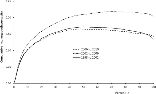
Figure 5 shows the normalised TIM curves, which end at a normalised cumulative growth rate of unity. These allow the curvature of each profile to be more easily compared. The 2002–06 normalised TIM reveals unambiguously lower relative mobility than the other two curves, for all . There appears to be a clear ranking according to the extent of relative mobility, with 1998–2002 exceeding that of 2006–10 and the latter exceeding 2002–10, which displays less curvature, implying more equality in income growth, at any selected percentile.
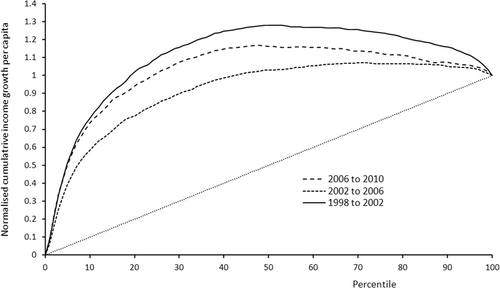
Figure 5 has been constructed to illustrate the extent of interpersonal inequality of mobility for the sample as a whole, by comparing the concavity of the three normalised TIM curves to the straight line representing equality of mobility. However, if interest is focused on the inequality of mobility for a particular income group, such as the poorest half of the sample, so that , then each TIM curve can be re-normalised using the average income growth rate for this group.
3.4 Pro-Poor Mobility
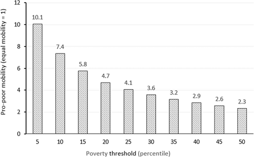
Figure 6 shows the values of , using Equation (4), for different percentile values of from 0.05 to 0.5, in steps of 0.05. For income growth of the poorest 5 per cent in 2006 is approximately 10 times that of the full sample: the process could therefore be described as highly pro-poor. As rises towards 0.5, the extent of this pro-poor income growth falls, but remains above one, reaching at .9
4 Positional Mobility
Subsection 4.1 introduces the concept of the re-ranking profile, which is then illustrated in Subsection 4.2.
4.1 Definition of Re-Ranking Profiles
An alternative class of mobility measures is based on the idea of mobility as positional change, rather than relative income change. It is therefore useful to examine whether a diagram similar to the TIM curve can be helpful in this context. This section focuses on income re-ranking positional change. Individuals can move to higher or lower rank positions, so that explicit treatment of the direction of change becomes important. Defining a re-ranking mobility index, it is first necessary to decide whether negative re-ranking (dropping down the ranking) is treated symmetrically with positive (upward) movement within the ranking. A second issue concerns the choice of whose mobility is to be included.
In the following discussion, individuals are ranked in ascending order of initial incomes, , so that ranks are for individuals from the lowest to the highest income. The initial period is denoted 0, and initial ranks may be defined as . Consider, as in previous sections, the case where it is desired to measure the extent of mobility of a subset of individuals, , with the lowest initial incomes, and let denote the change in the rank order of the person who initially has rank, . Three treatments of re-ranking are possible, all related to how negative, or downward, re-ranking is treated. First, negative re-ranking could be treated symmetrically with positive re-ranking such that positional mobility is defined in net terms, that is, positive changes in rank net of any negative changes for those with .10 This is referred to as ‘net re-ranking’. Second, negative movement in the ranking could be ignored, which simply involves setting when . This is referred to as ‘positive re-ranking’. Third, re-ranking may be measured in absolute terms in which all re-ranking is measured as a positive value. This is referred to as ‘absolute re-ranking’.
The choice among these three measures depends on the question of interest. For example, if interest is focused on those below the poverty line as a group, then it may be desirable to balance any upward mobility by some of those in poverty with downward mobility of others in poverty, in order to gain an indication of the overall experience of the group. This suggests a focus on net mobility in this case. If movement per se is the mobility concept of interest, then a non-directional measure such as absolute re-ranking is more relevant. Positive re-ranking quantifies only those who are moving up, a common metric when assessing the persistence of low income or poverty status for a sub-set of individuals or households.
To examine the ‘three Is’ properties similar to the TIM, but based on the indices in (8)–(10), one approach would be to plot the value of the relevant index against the cumulative fraction of the population, . However, a difficulty with the indices in (8)–(10) is that they are not scale independent, since they depend on the population size: more re-ranking is possible in larger populations. One solution would be to scale the three indices by . However, rescaling, by , yields normalized values, , that lie between 0 and 1 (or 0 and 2 for absolute re-ranking). These may then readily be plotted against .11 Hence it is possible to define a cumulative re-ranking curve, similar to the TIM curve for relative income mobility, that plots against .
4.2 Illustrative Examples of Re-Ranking Profiles
This section turns to an application of the positional mobility measures described in Subsection 4.1 to the same New Zealand income data, to assess both the extent of observed positional mobility and the incidence, intensity and inequality dimensions. This is illustrated first by plotting the re-ranking measures and against , for the 2006–10, period in Figure 7. In each case, these profiles could contain concave, linear or convex segments, reflecting the degree of re-ranking being experienced as is increased to include higher income individuals. A greater amount of re-ranking mobility generates profiles that are more concave or less convex.
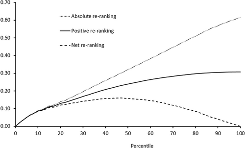
To assess the incidence, intensity and inequality aspects of these re-ranking measures, Figure 7 can be interpreted as follows. For a given definition of positional mobility (net, positive or absolute re-ranking), select a value of representing the sub-set of low income individuals of interest (the incidence dimension). The height of the profile on the vertical axis at this value of represents the intensity of re-ranking for this group, namely how much re-ranking they have experienced on average. The section of the profile to the right of becomes irrelevant, equivalent to the flat section of the TIP curve.
The deviation from linearity (concave or convex) of the re-ranking profile, from the origin to its value at the selected , provides a measure of the extent of inequality of mobility within . That is, the actual profile may be compared to a straight line from the origin to the relevant value of . For example, in Figure 7 the profile for absolute re-ranking appears to be approximately linear over a wide range above the percentile. This suggests that, at least for this sample and measure, the extent of re-ranking is relatively constant across the income distribution.
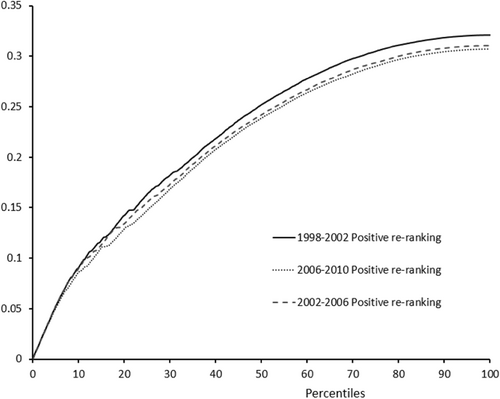
As with the TIM curves in Section 3, changes in the incidence, intensity and inequality of positional mobility associated with different time periods can be examined by plotting relevant re-ranking profiles for the three periods. Figure 8 illustrates this for the positive re-ranking measure, , showing that the characteristics of positive re-ranking mobility across the three periods are very similar, both in terms of levels of at each value of , and the degree of inequality of mobility (concavity) of each profile for any given . To the extent that the profiles differ, there is some evidence of slightly more re-ranking mobility during the first period, 1998–2002, as also observed for the income-growth TIM curves.
5 Poverty Persistence
This section turns to the question of how poverty persistence can be shown diagrammatically, reflecting the extent to which upward income mobility between two periods shifts individuals from below, to above, a given income threshold, . Since the TIM curve illustrates the cumulative extent of mobility for those below , it can show whether the incomes of an initially poor group on average grew sufficiently to escape from poverty, but it cannot directly illustrate the extent to which individuals below escape from poverty. Suppose first that poverty is measured in relative terms. If the TIM curve up to were to lie below the straight line OG of Figure 3, income growth for those below is insufficient to lift this group, in poverty at , above the poverty line at . That is, had the income growth experienced in aggregate by those below been redistributed among those individuals to maximise the numbers above at , there is no reallocation that could have lifted all of them out of poverty.
| In poverty | Out of poverty | |
|---|---|---|
| Move | ||
| Persist |
The groups are separated by values of and , denoted and , respectively, given by and . These can be illustrated by a variant of the TIM curve. As discussed above, the TIM curve plots, for incomes in ascending order, cumulative proportional income changes per capita against the corresponding proportion of people, . Consider an alternative diagram in which individual income growth rates, and (which depends on the proportional difference between and ) are plotted against , for any given income poverty threshold, and associated .
Figure 9 plots the values of against , for a poverty income threshold, , such that : that is, 20 per cent of the population are below the poverty line. Hence, the profile crosses the -axis at . This is referred to as a poverty persistence curve, , which is defined for a given value of .
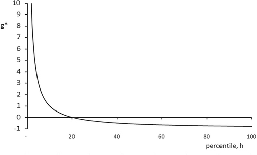
To the left of , growth rates greater than from period to period are sufficient to move individuals out of poverty, that is, to an income level that places them above in the population in time period, . Conversely, for those who are placed to the right of in period , growth rates less than are sufficiently negative to move the individual into poverty in period . The profile of critical values, , approaches an asymptote of (or per cent); that is, as incomes become very large relative to , the required (negative) growth rate to move such individuals into poverty from period to period approaches per cent.
5.1 Illustrative Examples of Poverty Persistence
It is first necessary to stress that, since these data are based on incomes of individuals as opposed to households, the notion of a poverty line is not particularly meaningful, in view of the income sharing that takes place within households. Clearly many individuals experience substantial year-to-year changes in income without this necessarily implying that the households of which they are members move into, or out of, poverty. For present purposes it serves to illustrate the conceptual aspects of interest.
Identifying poverty persistence first requires a choice of poverty income threshold, . For illustrative purposes this is arbitrarily set here at 50 per cent of median income in 2006: thus, where , the poverty line is . In this case it turns out that (or 25 per cent).12 Figure 10 shows both the critical growth rate, (the dashed curve) and median actual growth rates within each percentile.13
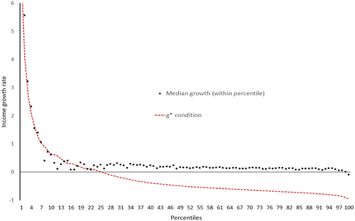
As required, the critical growth rate, , crosses the -axis at . To the left of that point, any median growth rate for a given percentile above the curve implies that for at least half of the individuals in the percentile, income growth was sufficiently large that their income in 2010 exceeded .
Figure 10 shows that this condition is satisfied for about 10 of the 25 percentiles below . By contrast, above there are no percentiles for which median growth is sufficiently negative (that is, lying below the curve) to push median individuals below in 2010. This suggests a high degree of poverty avoidance over the 2006–10 period for those not initially in poverty, and somewhat less persistence in poverty for those initially below the poverty line.
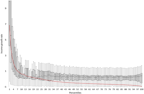
However, the median percentile growth rates cannot capture the diversity of experience within each percentile. Figure 11 replaces the percentile medians with ‘box plots’ for actual percentile growth rates where each box shows the median growth rate and inter-quartile range. The ‘whiskers’ record the maximum and minimum income growth rate within each percentile. Figure 11 reveals a richer pattern of movement into and out of poverty. In particular, the whiskers indicate a wide range of growth rates within each percentile of the initial income distribution, such that, for example, every percentile above includes at least one person who moved into poverty. Similarly, for those percentiles initially below , there is evidence of many individuals in almost all the lower percentiles moving out of poverty. There are numerous cases of individuals lying between the median and upper quartile (of the percentile distribution) who are observed to move out of poverty. This reflects a high degree of volatility in individual taxpayer incomes from year to year in New Zealand.
This volatility can also be observed when frequencies are inserted into the four-way classification in Table 1. These are shown in Table 2 for three alternative definitions of the poverty line, , of , 0.50 and 0.67 of median income. Values in Table 2 for are for the case shown in Figure 11.
| 2006 headcount (%) | ||
|---|---|---|
| In poverty | Not in poverty | |
| Move | 9 | 5 |
| Persist | 3 | 82 |
| Move | 11 | 8 |
| Persist | 14 | 67 |
| Move | 12 | 9 |
| Persist | 21 | 58 |
The table shows that, for the lowest poverty line (33 per cent of median income), 14 per cent of individuals move across the poverty line from 2006 to 2010: 9 per cent move out of poverty by 2010 while 5 per cent move into poverty from above the 2006 poverty line. The extent of poverty persistence is sensitive to the poverty line, rising from only 3 per cent or approximately one-quarter (precisely 3/12) of those in poverty, (at ) to 14 per cent (with ) and 21 per cent or around two-thirds of those in poverty (at ).
Hence in this New Zealand case, those initially more deeply in poverty—those below one-third of 2006 median income—appear to experience the least persistence of the three poverty group definitions. A similar picture emerges for those initially above the poverty line, but moving below it. The percentage moving into poverty is also sensitive to poverty line definitions, ranging from 82 per cent for a poverty line of 33 per cent of median income, to 58 per cent when the poverty line is 67 per cent of median income in 2006. These values for ‘movers’ suggest that, at least among individual New Zealand income taxpayers, there is substantial movement into and out of the lowest income levels. Since these lowest income levels are typically a few thousand dollars of annual income, this may capture, inter alia, the effects of moving into, or out of, the labour market including temporary migration spells overseas, and/or part-time employment. Additionally, the inclusion of the self-employed (who are known to experience more income volatility) in this dataset may contribute to the observed mobility into and out of low-income status.
6 Conclusions
This article has described several diagrams that can be used to highlight a number of important features of income mobility and poverty persistence. Their advantage is that, like the Lorenz curve in the case of cross-sectional inequality, they are simple to produce, provide convenient comparisons of the different dimensions and can be suggestive of further analysis.
Specific summary measures (of inequality, poverty, mobility and so on) are inevitably needed to supplement the diagrams. But the measures necessarily involve a loss of information: for example, a wide range of Lorenz curves are consistent with the same Gini inequality measure. The simplicity, the immediate visibility of essential characteristics, the ability to deal with the detail revealed over the whole range of incomes and the need to communicate such important concepts to a non-technical audience, explain the popularity of diagrammatic methods.


