Consideration on Needs and Elements of Restroom Signs in Group Homes for the Elderly With Dementia: Research on the Systematic Construction of an Environment With Non-Pharmacological Therapy Using Signs Part 3
Funding: The authors received no specific funding for this work.
This paper is part of a series of papers selected by the Japan Architectural Review Editorial Committee as candidates for translation. It is made up of three parts, and the one selected was Part 2. However, as these are connected papers, we have decided to submit Part 3 this time.
The Japanese version of this paper was published in Volume 87, Number 802, pages 2329–2340, https://doi.org/10.3130/aija.87.2329, of Journal of Architecture and Planning (Transactions of AIJ). The authors have obtained permission for secondary publication of the English version from the editors of the both Journals. This paper is a translation of the original Japanese version with slight modifications and corrections.
ABSTRACT
This study focuses on restroom signs displayed in group homes for the elderly with dementia and clarifies the specifications necessary to design restroom signs that enable the elderly with dementia to independently locate restrooms by recognizing the signs. Restroom signs are commonly displayed in many group homes in Japan. The needs of staff regarding restroom signs include supporting the elderly with dementia in identifying restroom locations and promoting their independent use. When planning restroom signs for the elderly with dementia, it is essential to include text-based signs that explicitly indicate the restroom, as relying solely on pictograms may result in insufficient information. Additionally, the appropriate font size for textual displays ranges from 50 to 90 mm. Regarding placement, restroom signs should be displayed on the restroom door at a height of approximately 1300–1400 mm from the floor. However, in some group homes, restroom doors are operated in an open position, making the door surface unavailable as a display area. In such cases, it is necessary to consider displaying the signs on the surrounding wall surfaces.
1 Introduction
1.1 Background and Purpose
In recent years, Japan's population has been aging, with the elderly population accounting for 29.1% of the total population in October 2023 [1]. The number of elderly individuals with dementia is also expected to increase significantly, from 4.62 million in 2012 to up to 8.3 million in 2030 [2]. Currently, treatments for dementia involve a combination of pharmacological and non-pharmacological therapies. Among these, non-pharmacological therapy also plays a role in alleviating behavioral disorders and supporting independent living by creating an appropriate living environment. One of the daily challenges for individuals with dementia is disorientation, which can lead to various behavioral and psychological symptoms of dementia (BPSD), such as wandering behavior and incontinence, due to impaired spatial awareness. In this context, group homes for the elderly with dementia (hereafter referred to as GH) are positioned as facilities designed to enable elderly individuals with dementia to live as independently as possible within a communal setting, receiving necessary assistance based on their abilities.1 As part of this effort, GHs install signs (hereafter referred to as residents' room signs and restroom signs) around the doors of residents' rooms and restrooms to support elderly individuals with dementia in visually recognizing and identifying these locations.
The authors have previously focused on the initiatives of these GHs across two papers, discussing the construction of environments using signs as a medium for elderly individuals with dementia. The first paper [3] clarified the needs of GH caregivers for residents' room signs and identified design elements for residents' room signs targeted at elderly individuals with dementia. The second paper [4], through experimental research involving elderly individuals with dementia, revealed the guiding effects of residents' room signs and restroom signs displayed in GHs. On the other hand, these studies have also revealed differing characteristics between residents' room signs and restroom signs. The second paper [4] identified that retaining “memory” is crucial for understanding the meanings conveyed by residents' room signs and restroom signs. According to classifications of memory in the field of neurology2, photographs or personal items used in residents' room signs are categorized as “episodic memory,” whereas text or pictograms, such as the word “restroom,” used in restroom signs are classified as “semantic memory.” These types of memory are affected differently by dementia symptoms, leading to variations in the ability to comprehend the display content. Furthermore, residents' room signs, which rely on episodic memory, are intended to connect with the specific memories of individual residents, while restroom signs require symbols that can be understood by a broader range of residents.
Therefore, this study aims to summarize the needs of facility caregivers regarding restroom signs and to compile design elements for restroom signs targeted at elderly individuals with dementia, as part of ongoing efforts to construct environments with non-pharmacological therapy effects using signs as a medium for elderly individuals with dementia.
1.2 Review of Previous Research
Resources that indicate what types of signs should be displayed as spatial cues for elderly individuals with dementia include the audit tool developed and published by the Dementia Services Development Centre (hereafter referred to as DSDC) at the University of Stirling, UK (hereafter referred to as the DSDC Audit Tool) [5] and the guidelines formulated in 2020 by Fukuoka City with the cooperation of the DSDC (hereafter referred to as the Fukuoka City Guidelines) [6]. The DSDC Audit Tool compiles spatial designs that have been shown to reduce behavioral disorders and promote independent living, based on research findings from around the world, and includes items related to the installation of guidance signs. Similarly, the Fukuoka City Guidelines summarize spatial designs intended for implementation in facilities primarily targeting elderly individuals with dementia, including signs as one of its key components (Table 1).
| Items | DSDC audit tool | Fukuoka City guidelines |
|---|---|---|
| Content of display | ||
| Content | Use of words and pictograms |
|
| Display of personal items | Display items familiar to everyone (e.g., photos of famous people) | Place memorabilia or markers outside of rooms or residences |
| Color |
|
Provide contrast between diagrams and backgrounds. |
| Content size | ─ | Choose an appropriate size considering visibility distance |
| Other markers | ─ | Install markers in appropriate places (e.g., corridors, in front of rooms) |
| Layout plan | ||
| Display height | 1.2 m from the floor | Approx. 1.2 m from the floor |
| Position on the display surface | Display on the door surface (excluding guiding signs) |
|
| Other | ─ | If the destination is not visible or the distance is significant, guiding signs should be installed |
Major studies on restroom signs displayed in elderly care facilities in Japan include research by Tanaka and Oida [7-9], who conducted a nationwide questionnaire survey targeting elderly care facilities and summarized staff evaluations regarding the status of restroom sign installation and their effectiveness in indicating locations for residents. The survey revealed that approx. 90% of facilities displayed some form of restroom signs, with most combining pictograms and text. Staff evaluations of effectiveness indicated that both “text-based displays such as ‘restroom’ or ‘toilet’” and “pictograms indicating restrooms” were deemed effective for elderly individuals with mild cognitive disorders. Regarding effective display methods, staff highly rated features such as “large text,” “internally illuminated signs,” and “externally illuminated signs.” In contrast, modifications like “changing the color of doors or walls” and “adding directional arrows” received lower ratings, with a preference for intuitive displays becoming apparent. Furthermore, a study using computer-generated (CG) images to evaluate the effectiveness of different types of signs for elderly individuals with dementia [8] reported that text-based displays featuring the words “restroom” or “toilet” were the easiest for residents to recognize.
There is no empirical research demonstrating that displaying pictograms used in restroom signs for elderly individuals with dementia leads to improvements in disorientation or wandering behavior. However, several studies have compiled findings on the ability of elderly residents with dementia to interpret pictograms, aiming to evaluate whether images or symbols, such as pictograms, could serve as alternatives to text-based signs. Okazawa [10] investigated the ease of understanding and retention of three types of pictograms for elderly individuals with dementia: “icons,” which directly depict their meaning through realistic imagery; “indexes,” which represent their meaning using images of related concrete objects; and “symbolic” pictograms, which use abstract shapes or arrows without realistic depiction. The study found that elderly individuals with mild dementia demonstrated comparable understanding and retention abilities to healthy elderly individuals. However, those with moderate to severe dementia struggled to comprehend the meaning of any type of pictogram, and their retention abilities were significantly diminished. Tanaka [11] compared the comprehension of pictograms with the level of care3 and the degree of independence of daily living4. The results showed no clear correlation between these factors; however, the study revealed that participants at Independence Level IIIa were able to comprehend pictograms and their meanings. On the other hand, as the study does not address the relationship between the severity of dementia and the readability of signs, it has limitations in demonstrating the effectiveness of the signs. In the process of developing the Fukuoka City Guidelines [7], Fukuoka City conducted a survey on the ability of elderly individuals with dementia to interpret pictograms. The survey revealed that pictograms with representations that are not visually similar to their intended meaning and require prior learning to understand were difficult to interpret. Additionally, it was reported that some individuals focused only on the visual shape or specific parts of the pictogram, failing to grasp the true meaning conveyed by the symbol.
Regarding studies on restroom signs, Namazi [12] reported that the most effective sign for helping individuals recognize the location of a restroom was an arrow on the floor pointing toward the restroom with the word “toilet” written on it. Additionally, another study [13] compared restroom usage between conditions where the restroom was visible from the perspective of elderly residents with dementia and where it was concealed by a curtain. The study found that restroom usage increased eightfold when the restroom was visible. These findings suggest that restroom signs should not only be designed for visibility at close range but should also consider ease of recognition from a distance.
Regarding studies on the visibility of signs, Tanaka [14] reported that there were no significant differences in color discrimination ability associated with cognitive levels among individuals with dementia. However, as age-related conditions such as cataracts and glaucoma can lead to acquired color vision deficiencies, the introduction of color universal design should be considered.
Although there are no studies specifically addressing text size in relation to dementia, text size is generally determined based on viewing distance. For example, an experiment by Akase [15] involving healthy individuals, including elderly participants, found that with a visual acuity of 0.5 or higher, a character height of 4 cm for a viewing distance of 10 m and 8 cm for a viewing distance of 20 m was sufficient for the majority of participants to read without difficulty. In addition to these, cases have shown that placing items associated with the pre-dementia memories of residents increases the likelihood of locating their rooms [16], while combining orientation training with environments featuring three-dimensional, large-scale signs such as pictures or objects improves spatial orientation [17], highlighting the need to consider unique theories for sign planning targeted at elderly residents with dementia, which differ from general principles.
On the other hand, several challenges remain. The DSDC Audit Tool has been criticized for a lack of robust evidence, as the foundational literature review suffers from insufficient sample sizes and the absence of adequate comparison groups. The Fukuoka City Guidelines, while based on international research and feedback from elderly individuals with dementia and adapted by experts to align with Japanese living environments, require future research reports targeting facilities where they have been implemented to confirm their actual effectiveness. Furthermore, although existing studies on restroom signs in Japanese facilities provide useful insights for planning directions, they have not verified outcomes such as the effectiveness of preventing wandering behavior after implementation. In this context, our second paper [4] clarified the characteristics of wandering behavior in elderly residents with dementia and the effects of signs. It was observed that residents with moderate dementia exhibited wandering behavior, where they could head toward the general location or direction of the restroom but struggled to pinpoint its exact location upon arrival. This often led to actions such as opening adjacent doors or searching aimlessly. In contrast, restroom signs intentionally displayed by staff for resident use—placed at a height of 1300 to 1400 mm and featuring text-based labels such as “toire” (toilet) or “otearai” (restroom)—were found to effectively reduce wandering behavior. Based on these findings, this paper aims to summarize appropriate design elements for restroom signs designed to guide elderly residents with dementia. It consolidates the fundamental needs required during the planning process and the conditions related to display content and placement plans based on restroom signs currently in use. Furthermore, it compares these conditions with the specifications outlined in the DSDC Audit Tool and the Fukuoka City Guidelines.
2 Research Methods
2.1 A Questionnaire Survey Aimed at Identifying the Needs for Restroom Signs (Survey A)
2.1.1 Survey Target
The survey targeted all GHs designated as community-based service providers located within Tokyo. These were identified based on the “List of Dementia Group Homes Providing Dementia-Specific Communal Living Care Service5” published by the Tokyo Metropolitan Bureau of Social Welfare and Public Health (as of August 1, 2014, N = 540) (Table 2).
| Item | Content |
|---|---|
| Subject |
Group homes for the elderly with dementia in Tokyo All facilities as of August 2014 (540 facilities) |
| Survey method | Mail survey |
| Survey date | September 25, 2014—October 20, 2014 |
| Number of responses | 107 facilities (20% collection rate) |
| Survey Details |
Whether or not restroom signs are displayed Target audience of restroom signs The purpose of displaying restroom signs |
2.1.2 Survey Method
Prior to this study, the authors conducted research on a single GH facility to investigate the use of wall-mounted signs6. Based on the hypothesis derived from this earlier study—that restroom signs are used to support the independent living of residents—a postal questionnaire survey was conducted to identify the needs for restroom signs in GHs and to understand the current state of restroom sign installation in each facility (Table 2). The respondents were staff members familiar with the daily activities of residents and the restroom sign situation within the GH. For GHs with multiple units, the questionnaire required responses about the entire facility rather than individual units. The survey period was from September 25 to October 20, 2014, and yielded 107 valid responses out of 540 distributed questionnaires (response rate: 20%). Regarding the operational settings of the responding GHs, 69 were standalone GHs, and 38 were co-located with other welfare facilities. None of the facilities involved renovated private homes; all were purpose-built structures.
The survey method involved a two-step questionnaire format. First, respondents indicated the “presence or absence of signs” for restroom signs based on their content. If signs were present, respondents were then asked to specify the “target audience” and the “purpose of display” for each type of content. For “presence or absence of signs,” respondents could select multiple options from two categories: “text-based signs” and “pictograms.” For “target audience,” respondents could choose multiple options from three categories: “residents,” “staff,” and “visitors.” For “purpose of display,” respondents could select multiple options from three categories7: “provide an understanding of location,” “assist reaching destination alone,” and “other.” If “other” was selected, respondents were asked to provide details in a free-text format.
2.2 Field Survey for Identifying Specifications Related to Restroom Signs (Survey B)
2.2.1 Survey Target
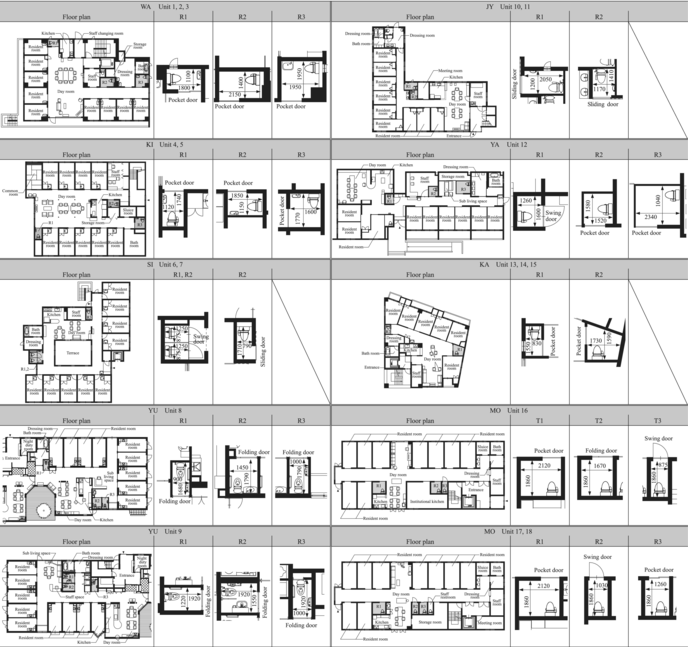
The survey targeted eight facilities (18 units) randomly selected from 45 facilities that responded, “available for continued research” in the questions from Survey A (Tables 3 and 4). Each GH facility is equipped with two or three restrooms accessible to residents in shared spaces.8 Generally, residents in GH facilities are elderly individuals with mild to moderate dementia who are capable of living independently. However, even when dementia progresses after moving in, residents often continue to live in the units due to factors such as the inability to transfer to a dedicated facility or family preferences, resulting in a few residents with severe dementia within the units. Similarly, in Survey B, some units in each GH included residents with severe dementia and those who use wheelchairs.
| Name of group home | Average level of care (requiring long-term care level) | Number of residents | Date opened | Photograph date | Interview date | |
|---|---|---|---|---|---|---|
| Male | Female | |||||
| WA | ||||||
| Unit 1 | 2.4 | 4 | 5 | Apr. 1, 2014 | Jul. 24, 2015 | Nov. 30, 2015 |
| Unit 2 | 2.6 | 3 | 6 | |||
| Unit 3 | 2.8 | 3 | 6 | |||
| KI | ||||||
| Unit 4 | 2.5 | 1 | 8 | Mar. 15, 2011 | Jul. 30, 2015 | Dec. 9, 2015 |
| Unit 5 | 1.7 | 1 | 8 | |||
| SI | ||||||
| Unit 6 | 2.5 | 1 | 8 | Feb. 2, 2011 | Jul. 27, 2015 | |
| Unit 7 | 3.6 | 0 | 9 | |||
| YU | ||||||
| Unit 8 | 2.7 | 0 | 9 | Nov. 1, 2010 | Jul. 15, 2015 | Dec. 9, 2015 |
| Unit 9 | 2.3 | 0 | 9 | |||
| JY | ||||||
| Unit 10 | 3.1 | 2 | 7 | Apr. 1, 2006 | Oct. 2, 2015 | Dec. 11, 2015 |
| Unit 11 | 2.9 | 2 | 7 | |||
| YA | ||||||
| Unit 12 | 3.3 | 0 | 9 | Oct. 1, 2004 | Jul. 16, 2015 | Dec. 2, 2015 |
| KA | ||||||
| Unit 13 | 3.8 | 1 | 5 | Aug. 1, 2004 | Sep. 17, 2015 | Dec. 2, 2015 |
| Unit 14 | 3.5 | 1 | 5 | |||
| Unit 15 | 3.0 | 1 | 5 | |||
| MO | ||||||
| Unit 16 | 3.3 | 0 | 9 | Oct. 1, 2003 | Sep. 29, 2015 | Dec. 22, 2015 |
| Unit 17 | 3.2 | 0 | 9 | |||
| Unit 18 | 2.8 | 1 | 8 | |||
2.2.2 Survey Method
To understand the actual state of restroom signs in each GH, the survey (referred to as Survey B) documented all restroom signs displayed within the facilities, including “content,” “font size,” “position,” and “height.” The measurement criteria for “height” and “font size” followed the conditions outlined in Table 5. Following this, interviews were conducted with staff members working in each unit to evaluate the specifications of the restroom signs. However, due to facility-related constraints, no interviews were conducted at Facility SI.
| Item | Measurement standard |
|---|---|
| Display height | Height from floor to center of sign |
| Text size |
|
3 Analysis of Needs for Restroom Signs in GHs
This chapter clarifies the fundamental needs for restroom signs, derived from Survey A, as essential knowledge for their consideration and planning.
3.1 Current State of Restroom Signs
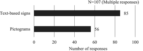
The presence or absence of restroom signs and the combined use of different types of signs in each GH were summarized as shown below (Figures 1 and 2). The results revealed that 90% of GHs displayed some form of sign to identify restrooms. Analyzing the number of GHs by displayed content, “text-based signs” were displayed in 85 GHs (79%), indicating high demand as they were commonly used across many facilities. In contrast, “pictograms” were displayed in only 56 GHs (52%). Examining the combined use of different content types in restroom signs, only nine GHs (8%) displayed “pictograms” alone, while nearly all GHs with restroom signs tended to include text-based signs alongside pictograms.

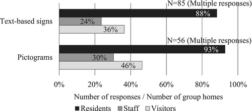
3.2 Primary Target Audience for Restroom Signs
The primary target audience for restroom signs was summarized by displayed content (Figure 3). The results showed that for both text-based signs and pictograms, “residents” were overwhelmingly identified as the target audience, with responses ranging from 88% to 93%. Responses indicating “visitors” as the target audience were relatively high at 36%–46%, likely because restrooms within the units are also used by visitors. On the other hand, only 23%–30% of responses indicated “staff” as the target audience. These findings suggest that GH staff primarily consider residents as the main target audience for restroom signs, while visitor usage is regarded as a secondary effect.
3.3 Purpose of Displaying Restroom Signs
For GHs that identified “residents” as the target audience for restroom signs, the primary purposes of the sign were summarized by content type (Figure 4).
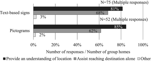
The results showed that responses for “provide an understanding of location” ranged from 81% to 85%, while “assist reaching destination alone” ranged from 62% to 68%, with similar trends observed for both text-based signs and pictograms. These findings suggest that the role of restroom signs in GHs is to serve as a cue for residents to identify locations and to assist their independent movement to restrooms as much as possible. Previous papers [6, 10] have indicated that elderly residents with dementia tend to have difficulty interpreting pictograms. However, the results of Survey A showed no significant differences in the stated purposes of display between text-based signs and pictograms. As mentioned in Section 3.1, this is likely because pictograms are often displayed alongside text-based signs, which may influence their effectiveness. For the “other” category, responses for both text-based signs and pictograms included “depends on the user,” indicating that needs may vary depending on the progression of dementia.
4 Consideration of Design Elements for Restroom Signs Targeted at Elderly With Dementia
This chapter summarizes design elements for restroom signs designed for the elderly with dementia, based on the findings from Survey B on restroom signage displayed in GHs within Tokyo. The restroom signs found in each GH were either “wall-mounted” signs posted parallel to the wall or the wall around the door, or “protruding” signs posted perpendicular to the wall. Furthermore, there were no examples of the use of light sources such as spotlights or interior signs, or of designs such as door coloring.
4.1 Classification of Restroom Signs
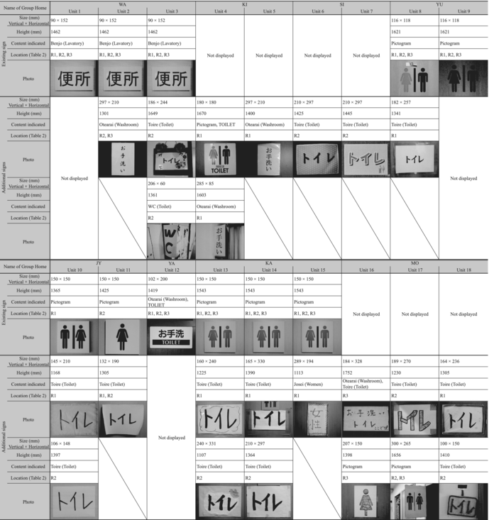
The restroom sign content displayed in each GH was summarized (Table 6). Restroom signs in the surveyed GHs were classified into two categories: restroom signs planned and installed by the designers at the time of the building's construction (referred to as “existing signs”) and those displayed by staff after the facility's opening (referred to as “additional signs”). Among the 18 units surveyed, 15 units had additional signs. In eight of these units, despite the presence of existing signs, staff had added additional signs, resulting in restroom signage being duplicated. Excluding Facility SI (Units 6 and 7), where interviews could not be conducted, staff members from units with additional signs were interviewed about their evaluation of existing signs. The reasons cited for installing additional signs included “inappropriate display content,” “display position is too high,” and “no existing signs installed (despite the necessity of restroom signs)” (Table 7). This suggests that the installation of additional signs is driven by the inadequacy of existing signs in meeting the visibility requirements for individuals with dementia. Furthermore, when staff at GHs with additional signs were interviewed about their effectiveness, all respondents reported that the additional signs had a certain level of effectiveness in guiding residents.
4.2 Examination of the Display Contents of the Restroom Signs
4.2.1 Trends in Display Content
4.2.1.1 Text-Based Signs
An analysis of restroom sign content in each GH revealed that 17 out of 18 units displayed text-based signs (Table 6). Additional signs featuring text-based content were observed in 15 units, excluding Units 1, 9, and 12, and were used either as “text-only signs” or “combined pictograms and text.” Even in Units 1 and 12, where additional signs were not observed, text-based content was included in the existing signs. These findings, consistent with the high demand for text-based signs observed in Section 3.1 among GHs in Tokyo, suggest that when planning restroom signs suitable for individuals with dementia, it is crucial to directly indicate that the location is a restroom using text-based signs.
4.2.1.2 Pictograms
An analysis of the use of pictograms in GHs revealed that nine out of 18 units displayed pictograms designed in accordance with JIS Z8210, the Japanese Industrial Standard for the design of pictograms used in public facilities. Facilities YU (Units 8 and 9), JY (Units 10 and 11), and KA (Units 13–15) had pictograms included in their existing signs. However, except for Unit 9, staff in these units added text-based signs as additional signs. Additionally, Units 4, 16, and 17 displayed pictograms as additional signs, all of which included text-based signs alongside them (Table 6). Furthermore, interviews with GHs that reported “inappropriate content in existing signs” revealed that Units 10, 11, and 13 noted similar concerns, stating that elderly individuals with dementia often have difficulty interpreting pictograms. This observation aligns with findings from previous papers [6, 10].
On the other hand, in Unit 9, only pictograms were displayed and utilized. Staff interviews revealed opinions such as, “With the current condition of the residents, guidance is possible using pictograms alone.” A previous paper [10] also reported that elderly individuals with mild dementia can understand pictograms as well as healthy individuals. The average level of care in Unit 9 was 2.3, indicating relatively mild conditions, suggesting that no issues have arisen under the current circumstances. However, considering the situation in other GHs and the findings in Section 3.1, where few GHs utilized pictograms alone, it can be argued that relying solely on pictograms, which artificially link information to images, may lead to insufficient information in the long term. Therefore, when using pictograms, it is necessary to consider supplementary measures such as including text-based signs alongside them.
4.2.2 Display Methods for Text-Based signs
4.2.2.1 Font Size
Previous papers [7, 9] have highlighted the importance of displaying large text in restroom signs based on staff evaluations9. Additionally, in Section 4.1, one of the reasons cited by staff for installing additional signs was the small size of the text on existing signs. This indicates that font size is a critical specification to consider when planning restroom signs. Therefore, the font sizes of text-based signs displayed in each GH, based on both existing signs and additional signs, were analyzed to determine font sizes suitable for visibility by elderly residents with dementia.
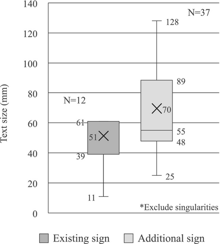
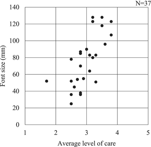
The font size of existing signs had a median of 39 mm (approx. 111 pt10), while additional signs had a median font size of 55 mm (approx. 157 pt). This indicates a tendency for staff to use larger text in additional signs to make them easier for residents to identify (Figure 5). Furthermore, an analysis of the relationship between the level of care in each unit and the font size of restroom signs showed a trend where larger font sizes were used as the level of care increased (Figure 6). Based on the analysis of additional signs, the font sizes of restroom signs showed a concentration between 48 mm and 55 mm for the lower limit, suggesting that a font size of approx. 50 mm (approx. 143 pt) is appropriate. For the upper limit, there was variability, as each interval from the maximum value to the third quartile and from the third quartile to the median was about 35 mm, showing a relatively even distribution. On the other hand, as indicated in our second paper [4], the primary target for restroom signs should be elderly individuals with moderate dementia that generally correspond to a level of care around 3. According to Figure 6, the font size distribution for residents with a level of care around 3 ranged approx. between 30 mm and 90 mm. Therefore, it can be inferred that a maximum font size of around 90 mm (approx. 257 pt) would accommodate the progression of dementia effectively.
Additionally, the frequent placement of restrooms at the end of hallways in GHs, the visibility of door-mounted signs from a distance, the tendency to use large font sizes, and the presence of protruding signs in Units 3, 4, and 17 all suggest that restroom signs may have been designed with consideration for long-distance visibility. Indeed, signs indicating the names of restrooms or similar facilities are reported to serve a guiding function from a distance when they are highly distinguishable.11 Furthermore, Namazi's study [13] observed a tendency for restroom usage to increase when restrooms were visible from a distance. Considering font sizes for long-distance visibility, Akase [15] proposes an 80 mm font size as a standard for a viewing distance of 25 m. Based on this, font sizes ranging from approx. 50–90 mm (approx. 143–257 pt) would likely ensure adequate visibility even in facilities the size of GHs. In conclusion, when examining font sizes based on additional signs, a range of 50–90 mm, adjusted according to viewing distance, appears to be appropriate.
4.2.2.2 Font Type
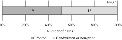
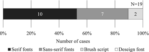
The usage trends of fonts in text-based additional signs were analyzed. First, an overview of the production methods for text-based additional signs showed that 19 cases (51%) were printed, while 18 cases (49%) were handwritten or created using non-print methods (Figure 7). Next, the fonts used in printed text-based additional signs were categorized into “serif fonts,” “sans-serif fonts,” “brush script,” and “design fonts”12. The analysis revealed that “serif fonts” were used in 10 cases (53%), while “sans-serif fonts” were used in seven cases (37%) (Figure 8). Although there was no significant difference in the usage rates of serif and sans-serif fonts, sans-serif fonts, with their uniform line thickness, are generally considered more legible for signage13. However, as restroom signs in additional signage tend to use large font sizes, it is likely that readability is ensured primarily through font size rather than font type.
4.2.2.3 Background and Text Color
The selection tendencies for background and text colors in additional signs were summarized (Table 8). The most common combination observed was a white background with black text, accounting for 62%, while other color combinations were used in significantly smaller proportions. Additionally, only combinations with light backgrounds and dark texts were utilized, while combinations with dark backgrounds and light texts were not observed. In general, greater lightness contrast between the background and text is considered to enhance visibility14, and this study also observed a tendency to adopt color combinations with significant lightness contrast. On the other hand, many printed additional signs were created by printing black text on white printer paper, suggesting that the creation process also influenced these results.
| Text color (%) | |||||
|---|---|---|---|---|---|
| Black | Blue | Red | Brown | Multi colored | |
| Background color | |||||
| White | 62 | 3 | 5 | 0 | 3 |
| Yellow | 5 | 0 | 0 | 0 | 0 |
| Light blue | 3 | 3 | 3 | 0 | 0 |
| Light red | 0 | 0 | 3 | 0 | 0 |
| Light brown | 0 | 0 | 0 | 5 | 0 |
| Wood (dark brown) | 0 | 0 | 3 | 0 | 0 |
| Multicolored | 3 | 0 | 0 | 0 | 0 |
- Note: N = 37.
4.3 Examination of the Layout Plan for Restroom Signs
4.3.1 Display Height
As noted in Section 4.1, one of the reasons staff cited for installing additional signs was the inappropriate display height of existing signs, which hindered residents' visibility. To examine a display height suitable for individuals with dementia, the visual height during hallway movement with independent walking was analyzed based on the average eye height and visual field range of men and women over 80 years old15 (Figure 9). The visual height was then compared with the display heights of existing signs and additional signs in each GH to determine appropriate display heights. It should be noted that protruding restroom signs, which were intentionally placed at high positions for long-distance visibility, were excluded from this analysis.
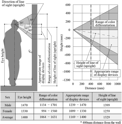
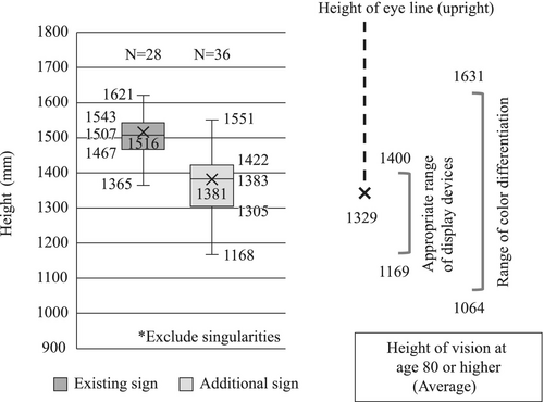
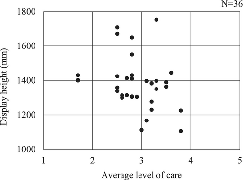
When considering visibility while moving down a hallway using a handrail, the average visual field range for men and women at a distance of 400 mm from the wall includes an eye height of 1329 mm, an appropriate range of display devices of 1169–1400 mm, and color discrimination limits of 1064–1631 mm (Figure 9). In comparison, the median display height of existing signs is 1507 mm, indicating a tendency for signs to be displayed higher than the appropriate range of display devices for residents (Figure 10). On the other hand, the median display height of additional signs is 1383 mm, which falls within the appropriate range. Furthermore, additional signs tend to cluster on the upper side of the appropriate range of display devices, from the third quartile (1422 mm) to the first quartile (1305 mm). An analysis of the relationship between the display height of additional signs and the average level of care showed no bias or correlation, suggesting that changes in display height due to increased care levels are minimal (Figure 11). Based on these findings, when planning the display height of restroom signs using additional signs as a benchmark, a height of approx. 1300–1400 mm is considered appropriate.
4.3.2 Display Position on the Surface
Based on the display positions of restroom signs installed around restroom doors in GHs, the suitability of display positions for visibility by elderly residents with dementia was examined (Figure 12). The display position of restroom signs, both existing and additional, was most commonly on the door surface. In Japanese GHs, where doors are aligned in close proximity with narrow spacing, displaying signs on the door surface is likely considered the most effective for identifying their location. In the case of residents' room signs, products that can be used to replace names are sometimes used, and residents' personal items16 are sometimes placed, so there is a tendency for the sign itself to have a lot of depth. Consequently, these signs were often unsuitable for installation on sliding door surfaces [3]. In contrast, restroom signs had a lower need for content replacement and showed no evidence of decorative elements being displayed. As a result, the thickness of these signs was minimized, making it possible to install them on door surfaces.
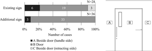
In contrast, in the case of Unit 3, the sliding door lacked a stopper function, posing a risk of residents tripping on doors that closed automatically. As a result, the restroom door was routinely kept open during operation. Consequently, the door surface could not be used as a display area, and restroom signs were instead displayed on the surrounding wall surfaces. Based on the above, the door surface is considered the most appropriate display position for restroom signs aimed at visibility by individuals with dementia. However, it is important to note the potential for operational scenarios where doors are kept open due to functional issues. In such cases, displaying signs on the surrounding wall surfaces must also be considered.
4.3.3 Relationship between Existing Sign and Additional Sign Display Positions
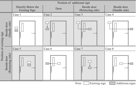
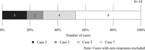
The positional relationships between existing signs and additional signs, in cases where both were displayed together for restroom signage, were categorized to identify trends (Table 9, Figure 13). Note that four protruding restroom signs were excluded from the analysis as they were designed for long-distance visibility. Overall, both existing and additional signs were frequently displayed on door surfaces, making Case 7 the most common. Additionally, four restroom signs in Units 11 and 13 corresponded to Case 5, where text-based additional signs were displayed directly below existing pictogram signs. These existing signs were displayed at heights of 1425 and 1543 mm, which are close to the optimal range. This suggests that staff may have added information to the existing signs by displaying the additional signs in a complementary manner.
4.4 Comparison of Design Elements
As noted in Section 1.2, the DSDC Audit Tool and the Fukuoka City Guidelines include guidance on signage as part of their recommendations for spatial design aimed at supporting individuals with dementia. In contrast, the authors discussed the design elements for residents' room signs in our first paper [3] and examined the specifications for restroom signs in this study. In this section, the design elements for these different types of signage are compared to identify differences and key characteristics (Table 10).
| Items | DSDC audit tool | Fukuoka City Guidelines | Residents' room signs [4] | Restroom signs (this study) |
|---|---|---|---|---|
| Content of display | ||||
| Content | Use of words and pictograms |
|
Displaying the resident's name is important | Displaying text-based information is important |
| Content size | — | Choose an appropriate size considering visibility distance. | Appropriate font size: 30–50 mm (approx. 86–143 pt) | Appropriate font size: 50–90 mm (approx. 143–257 pt) |
| Font type | — | — | Readability in each GH is ensured more by font size than by font type | |
| Color |
|
Provide contrast between diagrams and backgrounds. | Ensure contrast between text and background (especially black text on a white background) | |
| Layout plan | ||||
| Display height | 1.2 m from the floor | Approx. 1.2 m from the floor | 1.2–1.4 m (lower range for depending on residents' conditions) | 1.3–1.4 m (lower range if only for viewing directly in front of the door) |
| Position on the display surface | On the door (excluding guiding signs) |
|
Near the handle-side wall or on the door | On the door |
4.4.1 Content of Display
The DSDC Audit Tool and the Fukuoka City Guidelines recommend using “words or text” and “pictures or pictograms” for signs. In contrast, the findings from our first paper [3] and this study indicate that text-based signs, such as residents' names or the word “restroom,” are particularly important for conveying meaning. These forms of signs correspond to semantic memory, as discussed in Section 1.1. According to Asada's study [18] on the causes of dementia among individuals aged 65 and older in urban areas, Alzheimer's disease—which affects episodic memory—accounts for approx. 68 of cases, while frontotemporal lobar degeneration (FTLD), which impacts semantic memory, accounts for only about 1. This suggests that semantic memory tends to remain intact for most elderly individuals with dementia, making the use of text-based signs related to semantic memory an effective method. Conversely, displaying pictograms or artificially assigned symbols alone may result in a lack of sufficient information.
The appropriate font size for signs is not specified in the DSDC Audit Tool, and the Fukuoka City Guidelines only include a general recommendation to “use an appropriate size.” In contrast, it was determined that the font size for residents' room signs should be 30 to 50 mm (approx. 86–143 pt), while restroom signs require a font size of 50–90 mm (approx. 143–257 pt). Residents' room signs tend to use smaller font sizes than restroom signs and do not include protruding types, suggesting they are intended for visibility at relatively close distances. On the other hand, restroom signs require larger font sizes than residents' room signs, as they are designed with long-distance visibility in mind.
The choice of font is not specified in either the DSDC Audit Tool or the Fukuoka City Guidelines. In contrast, both our second paper [4] and this paper indicate that as long as readability is ensured through adequate font size, there is relatively high flexibility in font selection.
The DSDC Audit Tool and the Fukuoka City Guidelines emphasize the importance of creating contrast between text and background in color selection. This principle is a fundamental consideration for all sign planning, not limited to those designed for elderly individuals with dementia. Similarly, both our second paper [4] and this paper found that the signs displayed in each GH were designed with contrast between text and background.
4.4.2 Layout Plan
To ensure the visibility and effectiveness of signs, placement is also a crucial factor. Both the DSDC Audit Tool and the Fukuoka City Guidelines recommend a display height of 1.2 m. In contrast, our second paper [4] established that the center height of residents' room signs should range from 1.2 to 1.4 m above the floor, with a preference for lower placement depending on the residents' conditions. For restroom signs, this study identified a display height of 1.3–1.4 m based on the actual placement trends in GHs, where long-distance visibility is also a consideration. However, for close-range visibility, such as when standing directly in front of the door, there is no significant difference in other specifications or conditions. In such cases, positioning the sign toward the lower end of the 1.3–1.4 m range is deemed more appropriate.
The DSDC Audit Tool recommends displaying signs on door surfaces, while the Fukuoka City Guidelines suggest displaying them on door surfaces or, when doors are kept open during operation, also on the handle side of the door. In contrast, findings from our second paper [4] and this paper reveal that in GHs, where doors are aligned in close proximity, it is crucial to display signs in positions that clearly indicate which door they correspond to. Specifically, displaying signs on the door surface or the handle-side wall is considered appropriate. However, for both residents' rooms and restroom signs, cases were observed where doors were kept open during operation or where signs with added thickness could not be installed on sliding doors. In such situations, the handle-side wall, which is easily visible when residents open the door, becomes an important placement position.
5 Conclusions
This study aimed to provide insights for planning restroom signs designed for individuals with dementia. It focused on understanding the needs of caregiving staff in group homes for elderly individuals with dementia and identifying design elements for restroom signs visible to individuals with dementia.
5.1 Needs for Restroom Signs Designed for Elderly Individuals With Dementia
Restroom signs were found to be displayed in 90 of the GHs surveyed. Among these, text-based signs were displayed in 79 of GHs, indicating a high prevalence. Pictograms were observed in 52 of GHs; however, only 8 of GHs used pictograms exclusively, with most cases combining them with text-based signs.
The primary roles of restroom signs in GHs are to serve as visual cues for residents to identify locations and to support independent movement to restrooms as much as possible. Additionally, as a secondary effect, the use of visitors is also taken into consideration.
5.1.1 Design Requirements for Restroom Signs Targeting Elderly Individuals with Dementia
Restroom signs displayed in each GH can be categorized into existing signs, which were planned and installed by designers at the time of the building's construction, and additional signs, which were put up by staff after the facility opened. The primary reason for the use of additional signs is that existing signs often fail to meet the visual recognition requirements of elderly individuals with dementia.
5.1.2 Contents to Display on Restroom Signs
When planning restroom signs for elderly individuals with dementia, it is crucial to use text-based signs that explicitly indicate the restroom. Conversely, pictograms, which rely on artificially associated visual information, may often lack sufficient detail when used alone. Therefore, when using pictograms, it is necessary to include accompanying text-based elements to ensure clarity.
When considering the font size for text-based additional signs, a size between 50 and 90 mm (approx. 143–257 pt.) is deemed appropriate, as it can accommodate the progression of dementia. While there is a possibility that restroom signs are designed with visibility from a distance in mind, the suggested font size range is considered sufficient for ensuring readability even from afar within the scale of GH facilities.
In additional signs, approximately half utilized printed text, with the fonts predominantly divided between Mincho and Gothic styles. However, readability appeared to rely more on increasing font size than on the specific type of font used.
For background and text color selection in additional signs, a white background with black text was frequently used, and there was a noticeable tendency to select color combinations with significant lightness contrasts. Only combinations with a light background and dark text were observed, while those with a dark background and light text were not utilized. Additionally, these color choices seemed to be influenced by the practicalities of the sign creation process.
5.1.3 Consideration of Layout Plan for Residents' Room Signs
When considering the additional signs displayed in each GH as a benchmark, a height of 1300 to 1400 mm from the floor to the center of the restroom sign is deemed appropriate. Compared to residents' room signs described in the prior study [4], restroom signs tended to be placed slightly higher, likely to accommodate visibility from a distance. Conversely, when considering only close-range visibility, it is advisable to position the sign toward the lower end of this appropriate height range.
The most suitable display position for restroom signs is on the door surface. However, in some GHs, restroom doors were observed to remain open during use due to functional issues. When planning signs, it is important to account for such cases. If such scenarios are anticipated, displaying signs on the surrounding wall near the door should also be considered.
Acknowledgments
In writing this study, I would like to express my heartfelt gratitude to Dr. Yukiko Mori, MD from the Department of Neurology, Showa University School of Medicine, for her repeated valuable advice. I would also like to extend my sincere thanks to the staff, residents, and their families of the group homes who understood and cooperated with the implementation of the survey. This study is a collaborative research project conducted with Kaori Mori, Mami Fujita, and Hikaru Yamada, who were affiliated with the Katsumata Laboratory, Department of Architecture, Faculty of Engineering, Tokyo City University.
Conflicts of Interest
The authors declare no conflicts of interest.
Endnotes
Open Research
Data Availability Statement
The data that support the findings of this study are available from the corresponding author upon reasonable request.


