Scale-Dependent Inverse Temperature Features Associated With Crashes in the US and Japanese Stock Markets
Abstract
Some complex systems (e.g., an ecosystem) in direct contact with an environment can be assigned the temperature of the environment. Other complex systems, such as human beings, can maintain a core temperature of 36.5°C in environments with different temperatures, at least for a short period of time. Finally, for complex systems such as financial markets, whose environments we understand very little of, is there even a reasonable way to define a temperature? It is clear that human beings are almost never in thermal equilibrium with their surroundings, but can financial markets achieve detailed balance independently at all scales, or is information flow in such systems different at different scales? If we combine the information-theoretic picture with the thermodynamics picture of entropy, temperature is the driving force for changes in information content of a system. From an interactions point of view, the information content of a financial market can be computed from the cross correlations between its stocks. In their 2015 paper, Ye et al. (2015) constructed the normalized graph Laplacians in different time periods based on strong cross correlations between stocks listed on the New York Stock Exchange. By writing the partition function in terms of polynomials of the normalized graph Laplacian, Ye et al. computed the average energy E, entropy S, and inverse temperature β = 1/kBT. This led us to an information-based definition of the inverse temperature. In this work, we investigated the inverse temperature β(ϵ, n) at different times n and scales ϵ for two mature financial markets, using the S&P 500 and Nikkei 225 cross sections of stocks from January 2007 to May 2023. In the dynamics of β, the most prominent features are peaks at various times. We identified five esoteric and seven characteristic peaks and studied how they change with scale ϵ. The latter consists of a negative power-law dip followed by a positive power-law rise, with exponents narrowly distributed between 0.3–0.4. In addition, we constructed heat maps of β that reveal positive-, negative-, and infinite-slope cascades that hint at their possible exogenous and endogenous origins. Notably, the heat map of β confirmed that the 2007−2009 Global Financial Crisis was an endogenous crash in the US market, which in turn caused an exogenous crash in the Japanese stock market. To better understand the evolution of β, we analyzed ΔJ (the difference in the number of links) and ΔQ (the difference in the number of triangles) and found they oscillate in time. Occasionally, very intense swings of ΔQemerge over all scales, suggesting significant market-level reconstructions at these times.
1. Introduction
In statistical thermodynamics, we write the macroscopic thermodynamic state functions and variables in terms of averages over a large number of microscopic variables. These microscopic variables obey Newton’s Laws or the Schrodinger equation, but it is impossible to specify all the initial conditions necessary for solving the large number of equations. Instead, we compute their averages, by assuming that we can only measure the total energy experimentally, and thus, all microscopic configurations i with the same total energy Ei are equally likely with probability [1]. This leads us to define the microcanonical ensemble (for an isolated system whose total energy is conserved), the canonical ensemble (for a system that can exchange energy with an infinitely large heat bath in such a way that over a long time, there is no net exchange of energy between the system and the heat bath), and the grand canonical ensemble (for a system that can exchange both energy and particles with the heat bath). In the microcanonical ensemble, the temperature T is not defined, but the entropy S = kB ln Ω can be defined through the multiplicity function Ω. For the canonical ensemble, the temperature T is defined as a property of the heat bath, and the entropy S = kB ln Ω(E) = −kB∑ipi ln pi can be defined in the same way. Finally, for the grand canonical ensemble, we attribute to the heat bath both a temperature T and a chemical potential μ. For the rest of this paper, let us restrict our discussions to the canonical ensemble, where the probability of a microscopic configuration s with total energy Es is proportional to exp(−βEs), and β = 1/kBT is the inverse temperature of the heat bath.
For simple systems, whose variables have short-range interactions, there are three equivalent definitions of entropy. In classical thermodynamics, Clausius showed using a combination of isothermal and adiabatic processes that there exists a state function S whose change dS = dQ/T can be related to the heat gained dQ in a reversible process at temperature T [2]. If we combine this with the first law of thermodynamics dE = dQ + dW, where dW = −PdV, then we can write dE = TdS − PdV, where E is the internal energy, p is the pressure, and V is the volume of the system. This lets us conclude that β = (∂S/∂E)V,N, where β = 1/kBT is the inverse temperature. In statistical mechanics, the entropy S = kB ln Ω is the consequence of the postulate of equal a priori probabilities (due to Maxwell) [3, 4]. Here, Ω(E) is the multiplicity of the microcanonical ensemble or the canonical ensemble with total energy E. The equivalence between the first thermodynamic definition of entropy and the second statistical definition of entropy can be established by fiat, if we want the two descriptions to agree. Finally, we have the information-theoretic entropy S = −kB∑ipi ln pi, which is popularized by Shannon [5]. Starting from , we can write the normalized probabilities as , where is the partition function. In terms of the partition function, we can show that E = −(∂lnZ/∂β). Thereafter, we write the Helmholtz free energy F = E − TS in terms of the internal energy E, the entropy S, and the temperature T, and we can show from the derivative ∂/∂T(F/T) that F = −kBT ln Z. If we then write E and F explicitly in terms of , we can show that S = −kB∑ipi ln pi. This establishes the equivalence between the thermodynamic definition of S and the information-theoretic definition of S.
- 1.
The entropy S(p1, p2, …, pW) is a continuous function of the probabilities p1, p2,…, pW, and cannot depend on other state variables.
- 2.
The probabilities pi ≥ 0 are all positive, and (i.e., the distribution of probabilities can be normalized). If these probabilities are the same, S will take its maximum value.
- 3.
S should remain the same when states that never occur are added to the system. In other words, adding a new state W + 1 to the system will not change S, if pw+1 = 0.
- 4.
Suppose we have two independently ergodic subsystems A and B, then we will have S(AB) = S(A) + S(B). On the other hand, if A and B are dependent on each other, then the information of the two systems is S(AB) = S(A) + S(B|A), where S(B|A) is the conditional entropy.
| Process | SER | Sext | SMEP |
|---|---|---|---|
| Pólya | ((1 − qj)/γ)·1/N· log (N) | −∑i log (Pi) | |
| SSR | 1 + (1/2)log (W) | S1,1 = −∑iPi· log (Pi) |
The first two axioms represent what we desire for an entropy function, while the third axiom allows us to compute the entropy when part of the configuration space is not accessible (e.g., when the system does not have a high enough energy). Khinchin added the fourth axiom to ensure that the entropy is additive [6], but inspired by the nonadditive entropy introduced by Tsallis [7–9], Thurner, Klimek, and Hanel relaxed this fourth axiom [10] so as to classify the space of entropy functions that remain possible. They found that this can be conducted by defining the (c, d)-entropy , using the (c, d) values as equivalence classes. When (c = 1, d = 1), we recover the Boltzmann–Gibbs–Shannon entropy, whereas for (c = q, d = 0), Sc,d(p) is the Tsallis entropy. Last but not least, when (c = 1, d > 0), we end up with the Anteneodo–Plastino entropy [11].
Ultimately, we have detailed balance at all energy scales in simple thermodynamic systems, where small exchanges of energy sum to zero on their own, as do large exchanges of energy. These energy exchanges linking thermodynamic and statistical entropy are thus governed by a single parameter, the temperature T of the environment. For complex systems, which can remain far from equilibrium for extended times, we can have net flow of energy in one direction at a small energy scale, and a net flow of energy in the opposite direction at larger energy scales. Nevertheless, if the net flow of energy over very long times is balanced across all scales for a complex system, as an extension to the zeroth law of thermodynamics, we can assign to it the temperature of the environment. However, for financial markets, this cannot be performed. Ghashghaie et al. first suggested that the information cascade in the foreign exchange market is analogous to the energy cascade in hydrodynamic turbulence [12]. This was later confirmed by Mantegna and Stanley for the S&P 500 index between January 1984 to December 1989 [13, 14]. Independently, Beck generalized the Langevin equation with constant temperature to one with fluctuating temperature and showed that the velocity in the latter follows a Tsallis distribution [15, 16]. Beck used this superstatistics approach (in which a fluctuating temperature drives a fluctuating velocity) [17] and a simple model of energy dissipation in fully developed turbulence to explain why velocity differences at different length scales follow the Tsallis distribution. Inspired by Beck, Kozaki and Sato investigated high-frequency S&P 500 data from August 1997 to December 2006 and found that the returns at different time scales are well fitted by q-Gaussian distributions, while the inverse temperature β follows a Γ distribution [18]. Studying the US dollar–German mark exchange rates from October 1992 to September 1993, Kozuki and Fuchikami concluded that the volatility (a quantity indicating the level of risk in financial markets) corresponds to the temperature of market, and its fluctuations lead to intermittency in the dynamics of the exchange rate [19].
Indeed, it is natural for us to think of a market with low volatility as “cold,” and one with high volatility as “hot.” The dynamics of volatility is intermittent, meaning that there can be sudden switches from low volatility to high volatility, or vice versa. These sudden switches prompted both economists and econophysicists to define market states (beyond simply bullish or bearish) based on their volatilities. In his seminal paper, Hamilton [20] used Markov switching methods to differentiate between distinct market regimes in the nonstationary postwar US real gross national product (GNP) time series. Since Hamilton’s work, Schwert [21], Turner, Startz, and Nelson [22], and Hamilton and Susmel [23] applied Markov switching methods to time series data to estimate volatility and its changes, and how these are related to financial crashes, business cycles, risk premium, etc. More recently, Schaller and Norden [24] have improved this approach by proposing a multivariate specification for the model. They collected the US Center for Research in Security Prices (CRSP) value-weighted monthly data for the period January 1929 to December 1989 and found that the stock returns imply different states, when the time series can undergo mean switching, variance switching, or both. Similarly, Bautista [25] used the Markov regime shifting methods to investigate the weekly aggregate Philippines stock return data from February 1987 to October 2000 and found the volatility rising four times. In particular, the last rise occurred four months before the 1998 Asian Financial Crisis. Econophysicists also contributed significantly to the identification of market states. In 2002, Marsili [26] applied the “clustering of days” method to daily return data of 2000 New York Stock Exchange (NYSE) stocks from January 1, 1990, to April 30, 1999, and identified 6 market states. Applying time series segmentation on index time series from the US [27–29] and Japanese [30] markets between mid-1990s and late-2000s, we also found six or seven market states, differentiated primarily by their volatilities. Since then, the most common method used to identify market states is based on the clustering of cross correlations between stocks. Using the components of S&P 500 from 1992 to 2010, and about 300 NYSE stocks from 2007 to 2010, Munnix et al. [31] identified eight distinct states. Later, Chetalova, Schäfer, and Guhr [32] identified six different states in the time series cross section of 258 National Association of Securities Dealers Automated Quotations (NASDAQ) stocks from January 1992 to December 2013. In particular, they found state 5 was the most unstable state near the 2008 Global Financial Crisis. Following these, Rinn et al. [33] identified eight market states from 306 S&P 500 stocks from 1992 to 2012, whereas Pharasi et al. [34] found four market states in a 194-stock cross section of the S&P 500 components from January 2, 1985, to December 30, 2016, and five market states in a 165-stock cross section of the Nikkei 225 components from January 4, 1985, to December 30, 2016. Finally, we also found the work of Stephen, Gu, and Yang [35], who converted the time series of the NASDAQ and S&P 500 indices from 3 January 2000 to 14 November 2014 to visibility graphs of six market states.
Since we think of temperature as interchangeable with volatility, the general consensus in the econophysics literature is that “temperature changes” are associated with transitions between market states. In particular, Ye et al. [36] used the cross correlations between stocks as a proxy for their interactions and visualized these time-varying quantities in the form of threshold-filtered unweighted networks. They then inferred the graph Laplacians L of these networks, treated the exponential of the trace of L as the partition function, and thereafter performed series expansions to approximate the temperature T, entropy S, and internal energy E of the networks. They applied this method to analyze the dynamics of the NYSE and the Drosophila gene expression network and found that network characteristics are consistently associated with extreme events in their dynamics. While they believed that they have understood the universal features of such events in the Drosophila gene expression network, they confessed to not completely understand features in the NYSE. We realized that the main difference between the gene regulatory network and the stock network is the former being exact (up to experimental uncertainties), while the latter is obtained by filtering at a fixed but arbitrary threshold. Econophysicists wrestled with this limitation for many years, but we believe that the correct approach is to consider the network at all scales, via the filtration process in topological data analysis.
In this paper, we describe in Section 2 how we collect raw data from various stock markets, how we preprocess the time series cross section, before analyzing their cross correlations. Here, we do not continue with the identification of persistent homology in the data but use the filtration process as a means to keep all scales in view. First of all, we found most of the market-crash features that Ye et al. have found in Section 3. However, because we vary the scale of the threshold network, we can also see how these inverse temperature features β change with time t and with scale ϵ. Of the crashes found in our datasets (see Table 2), there is a subset of esoteric features, each changing with scale differently from the rest. We also found a subset of features with very similar characteristics, consisting of a negative dip followed by a positive peak, each of which we can fit to power laws. Using heat maps showing how the oscillatory dynamics of network parameters ΔJ and ΔQ depend on time and scale, we explain in Section 4 how these characteristic features arise from the critical parameter 3 − x as it crosses zero during market crashes. In Section 5, we make concluding remarks.
| Crash | Start date (end date) | High | Low | Country |
|---|---|---|---|---|
| Financial crisis of 2007–2008 | 16 September 2008 (February 2009) [37] | 1561 | 683 | United States |
| 2009 Dubai debt standstill | 27 November 2009 [38] | United Arab Emirates | ||
| European sovereign debt crisis | 27 April 2010 (end of 2012) [39] | Europe | ||
| 2010 Flash crash | 2:32 p.m., 6 May 2010 (3:08 p.m. 6 May 2010) [40] | 10,460 | 9870 | United States |
| August 2011 Stock markets fall | 1 August 2011 (4 October 2011) [41] | 1370 | 1074 | United States |
| 2015-16 Chinese stock market crash | 12 June 2015 (February 2016) [42] | 4478 | 2860 | China |
| 2015-2016 Stock market selloff | 18 August 2015 (June 2016) [43] | 18,312 | 17,504 | United States |
| 2018 Cryptocurrency crash | 20 September 2018 (December 2018) [44] | 19,783 | 5500 | |
| 2020 Stock market crash | 24 February 2020 (7 April 2020) [41] | 3386 | 2237 | |
| 2022 Stock market decline | 3 January 2022 (October 2022) [45] | 4796 | 3666 | |
| 2022 Russian stock market crash | 16 February 2022 (October 2022) [46] | 4261 | 1944 | Russia |
2. Data and Methods
2.1. Data
Using Python’s pandas_datareader module, we download from Yahoo! Finance the daily prices of the component stocks of S&P 500 and Nikkei 225, both from January 1, 2007, to May 31, 2023. After the initial download, we postprocessed the S&P 500 financial time series cross section as follows. First, some of the data may include “NaN’s” and we needed to replace them with “0’s.” Also, if the time series contains more than 50% “0’s”, we remove this ticker symbol from the list. For the remaining stocks, we applied standardization and also computed their returns. For delisted or renamed stocks, Yahoo! Finance does not offer their historical prices, and we had to download them separately from the website Investing.com. For our analyses in Sections 3 and 4, we split the data into three 5-year periods: (i) 2007–2012, (ii) 2013–2018, and (iii) 2019–2023. For the first 5-year period (2007–2012), 117 tickers from S&P 500 were missing, and we retrieved the missing data for 97 of them from Investing.com. In comparison, over the second 5-year period (2013–2018), only 60 tickers from S&P 500 were missing, and we recovered 49 of them from Investing.com. No S&P 500 tickers were missing for the third 5-year period.
For Nikkei 225, the change in historical components can be found in the following website (https://indexes.nikkei.co.jp/nkave/archives/file/history_of_nikkei_stock_average_component_changes_en.pdf). We programmed a Python script, which reads the Nikkei 225 change file, to reconstruct the component tickers in each year. Using these, we downloaded the respective time series data from Yahoo! Finance. Compared to S&P 500, the components of Nikkei 225 are more stable, and therefore, we do not need to retrieve missing data from Investing.com.
2.2. Ultrametric Distances From Cross Correlations
2.3. Networks From Correlation Filtering
In [36], Ye et al. chose to keep the top 5% of cross correlations Cij for each time window. If C0(n) is the minimum value of the cross correlations kept in time window n, they would construct a network whereby stock i and stock j are connected if Cij ≥ C0(n). By doing so, they keep roughly the same number of links in the network, even as C0(n) may vary from time window to time window. Econophysicists have in the past experimented with such networks obtained by threshold filtering, that is C-threshold filtering [47–52], but this is not a popular method because of the ambiguity associated with the choice of the threshold C0(n); thus, P-threshold filtering [53, 54] was also proposed to ameliorate this limitation. Ultimately, we would be required to select a significance level p; however, the network implied by p = 0.001 would be different from that implied by p = 0.01, which would in turn be different from that implied by p = 0.1. A more natural choice of such would be one that is immune to variations in p.
From our previous works in TDA [55–57], we found a hierarchy of persistence levels in each of the networks. In addition, we found that for very small or very large ϵ, the clusters formed have trivial topologies; that is, it is either isolated nodes with only a few links or a single cluster with all nodes connected with many links per se. In view of this, we construct in this paper threshold-filtered networks using dij < ϵ and vary the threshold over the range 0.8 ≤ ϵ ≤ 1.8. In this way, we consider all scales simultaneously, to discover persistent networks at different scales.
2.4. Statistical Mechanics of the Graph Laplacian
3. Results and Discussion
3.1. Dynamics of the Inverse Temperature
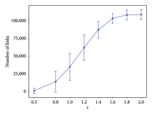
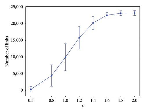
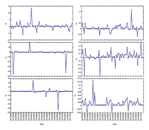
In Figure 1, we show the number of links that are formed for the two markets. Their quantities are evaluated at different ϵ from February 2007 to November 2022. The number of links are increasing with ϵ and saturate around ϵ = 1.5. Next, we show in Figure 1 the features of β as a function of time, between February 2007 to January 2012 (Figures 2(a) and 2(d)), between February 2012 and January 2018 (Figures 2(b) and 2(e)), and between February 2018 and October 2022 (Figures 2(c) and 2(f)). For all (Figures 2(a), 2(b), and 2(c) for S&P 500 and 2(d), 2(e), and 2(f) for Nikkei 225), the three left subfigures are for (top to bottom) ϵ = 0.8, 1.0, 1.2, whereas the three subfigures on the right are for (top to bottom) ϵ = 1.4, 1.6, 1.8. As we can see from these figures, the most prominent features are strong positive/negative peaks that appear at certain times. For example, in Figure 2(b), at ϵ = 1.0, we have two strong negative peaks in May 2012 and June 2017 and a strong positive peak in December 2013. The most pronounced negative peak, with value −114, can also be seen in Figure 2(d), ϵ = 0.8, at July 2008. These are similar to the features shown by Ye et al. in Figure 5(a), and in greater details in Figure 3(a) of their paper [36], but with a different scale in each time window.
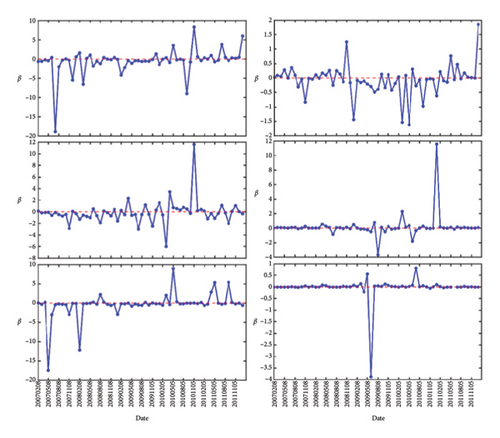
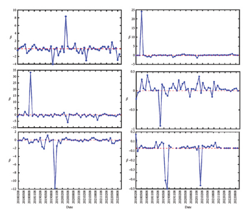
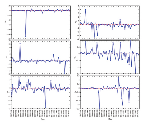
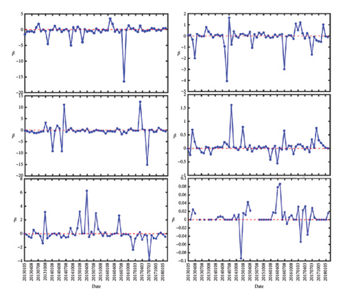
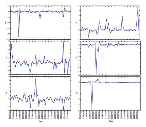
In Figure 2(a), there is a peak in Jan 2011 that started out with value β = +8 at ϵ = 0.8, became β = +12 at ϵ = 1.0, disappeared at ϵ = 1.2, reemerged with value β = −0.7 at ϵ = 1.4, becoming strongly positive with value β = +11 at ϵ = 1.6, and before falling to β = +0.2 at ϵ = 1.8. This suggests that the inverse temperature peaks can be strongly scale-dependent.
3.2. Scale Dependence of Inverse Temperature
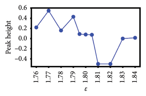
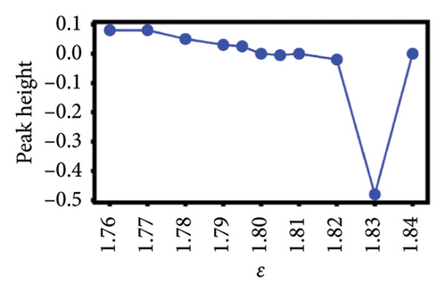
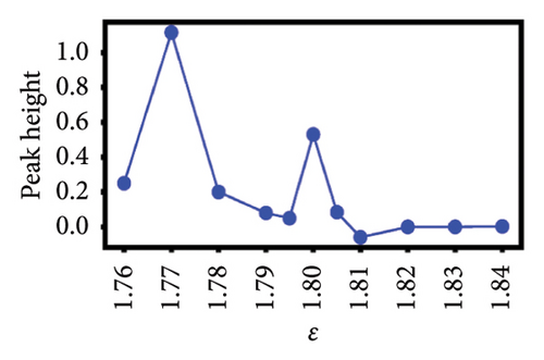
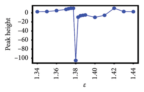
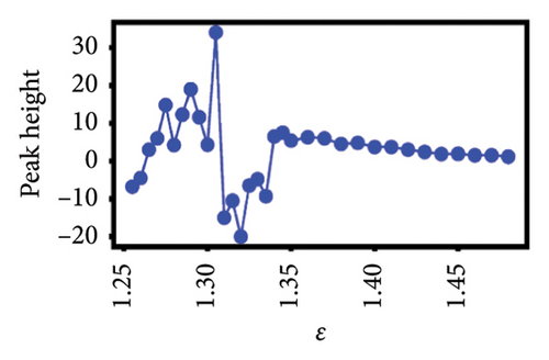
To better understand the scale dependence of these peaks, we selected 12 of the least ambiguous peaks (meaning features at specific times that appear to change continuously with scale) and found that they change very sharply with scale over the very narrow ranges that we investigated. We found that it is possible to classify the 12 peaks according to how they vary with scale. In Figure 4, we show the group of five esoteric peaks, whose dependences on scale are very different from each other, and also from the group of seven characteristic peaks as shown in Figure 5.

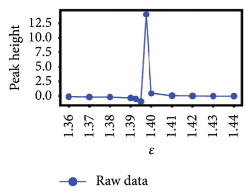
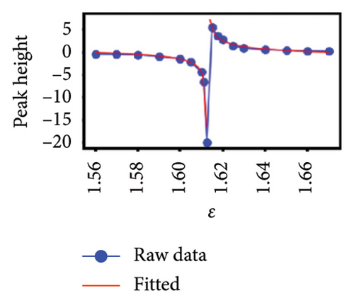
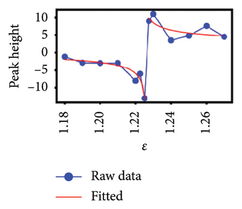

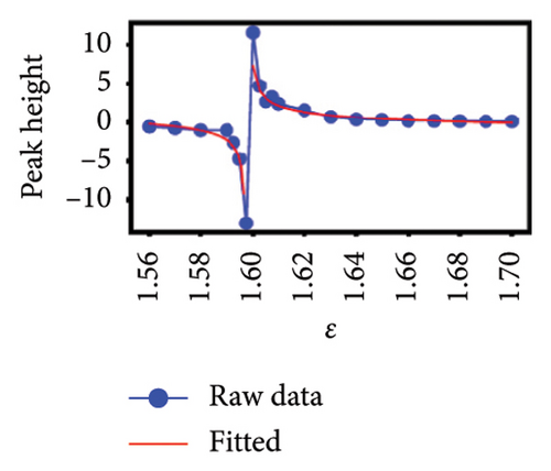
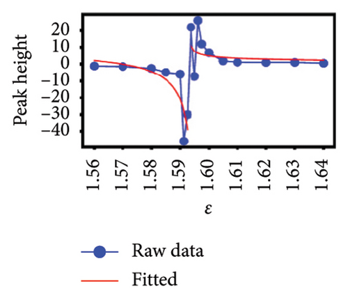
Our natural instinct was to compare the timings of these characteristic peaks from Figure 5 with known market crashes as shown in Table 1 for the US and Japanese stock markets. Apart from Figure 5(a), there were no matches. On the other hand, two of the esoteric peaks from Figure 4 coincided with the August 2007 Subprime Crisis and the November 2008 Lehman Brothers Crisis. We will delve deeper into this apparent lack of agreement in Section 4. Nevertheless, the power-law fits to negative dips and positive rises in six of the seven characteristic peaks as functions of scale ϵ as shown in Figure 5 suggested that the negative dips and positive rises are symmetric in terms of both amplitude and exponent. The amplitudes associated with the dips and rises are not universal, but the exponents b± seem to be narrowly distributed between 0.3–0.4. For S&P 500, (b−, b+) is (0.39, 0.40), (0.32, 0.33), and (0.44, 0.41) for Figures 5(a), 5(c), 5(d), which suggests that these exponents are likely to be universal across events in the US market. For Nikkei 225, (b−, b+) is (0.65, 0.34), (0.11, 0.005), and (0.32, 0.33) for Figures 5(e), 5(f), 5(g), and the spreads between b− and b+ are larger, but if we compare b+ = 0.34 in Figure 5(g) with (b−, b+) = (0.32, 0.33) in Figure 5(f) and the exponents for S&P 500, it is likely that the exponents b± may even be universal across markets.
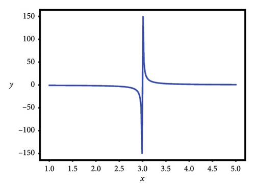
The shape of β as a function of x is shown in Figure 3.
4. Scale-Dependent Heat Map Analysis of β
In Section 3, we have shown how the characteristic peaks are discovered and argued the cause of their appearance from equation (9). However, in the explorations conducted in Section 3, we plot the time and scale dependences separately. In this section, we will explore the time-scale dependences of β(n, ϵ) simultaneously and systematically using a heat map visualization of sharp changes in β for 0.8 < ϵ < 1.8. We pick this range of ϵ because we have observed that nontrivial topological changes occur here more often than elsewhere.
We construct the heat maps of x − 3 as follows. Using equation (9), we computed ΔJ(n, ϵ) and ΔQ(n, ϵ) using the time series data collected from S&P 500 and Nikkei 225. ΔJ, ΔQ are then arranged in a (row, column) format, where the rows represent different periods n, and columns represent different scales ϵ. These arrays are then visualized using the MATLAB function pcolor, where a jet colormap and a value range −10 < β < 10 for coloring are chosen. The raw heat maps are then postprocessed with imgaussfilt, which is a MATLAB-based Gaussian filtering function of 2-D images. We used a sigma value of 2.5, to reduce the noise level in the heat maps, where sharp boundaries are generated. Finally, we added white contour lines at x = 3, so as to mark where the characteristic peaks are expected to reside.
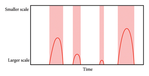
In Figure 6, we show schematically what we expect to see in the heat map, where the x-axis denotes different time periods, while the y-axis denotes different scales of interest. In this figure, the bell-shaped curve in red denotes the level sets x = 3, where β⟶±∞ following the negative dip and positive rise shape as shown in Figure 4 for the characteristic peaks. As we go from x < 3 to x > 3, or from x > 3 to x < 3, the network characteristics ΔQ and ΔJ change sharply, suggesting a critical transition in the stock market. In a typical market crash, we expect first a market-level response at the largest scale, followed by market reorganizations at smaller and smaller scales. This represents an initial information flow from large to small scales. For the market crash to end after market reorganizations are complete, we expect information to flow back from small to large scales to stabilize the market, giving rise to the expected bell shape.
4.1. Heat Map of S&P 500
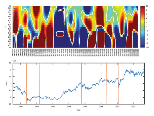
We show in Figure 7(a) the heat map (top row) and price data (bottom row) of the S&P 500. Five vertical orange bars are used to mark five major market crashes, namely, the (1) Nov 2008 Lehman Brothers Crisis, (2) 2010 flash crash, (3) 2015 Chinese stock market crash, (4) 2018 cryptocurrency crash, and (5) 2020 COVID-19 crash. Instead of the simple picture we expected in Figure 6, the level sets of x = 3 seen in the heat map of Figure 7(a) is significantly more complex. Nevertheless, we observe three main types of features associated with the x = 3 level set: (i) negative slopes, (ii) positive slopes, and (iii) infinite slope. The infinite-slope feature (region marked by blue dotted lines in Figure 7(b)) tells us that there is simultaneous network reorganization across all scales. These, therefore, represents market crashes. The negative-slope (cone-like region marked by fuchsia pink dotted arrows in Figure 7(a)) feature tells us that network reorganizations occur first at smaller scales, before such reorganizations occur at larger scales. These possibly suggest endogenous forward cascades of correlation network reorganizations from smaller to larger scales. Finally, we can interpret the positive-slope features (inverted cone-like region marked by purple blue dotted arrows in Figure 7(a)) as possibly exogenous backward cascades of correlation network reorganizations from larger to smaller scales, although a more rigorous validation to confirm these is required. From the heat map in Figure 7(a), we see that these three features are not isolated. In other words, a new cascade can start before an old cascade ends. Sometimes, they can even interfere with each other. This reminds us how complex the stock market is.
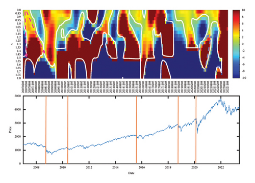
More importantly, a market crash following an endogenous or exogenous cascade need not be the result of this cascade, as the causality would need to be established more carefully. However, since the market crash is extended in time, we can check whether it is an exogenous or endogenous, by checking for its early slope before the slope becomes infinite. Looking at the heat map in Figure 7(a), we identified a first (slower) forward cascade starting in (May 2007, ϵ = 0.8) and a second (faster) forward cascade starting in (May 2008, ϵ = 0.8), and it seemed like the interactions between these two (the two level sets touching each other) resulted in the November 2008 Lehman Brothers Crisis. A forward cascade continued from the market crash, at a speed (dϵ/dt) close to that of the first forward cascade, before dissipating in May 2009 at a scale of ϵ ≈ 1.7. The picture we derive from this part of the heat map suggests that the Global Financial Crisis that started with the 2007 Subprime Crisis, and reached a crescendo with the 2008 Lehman Brothers Crisis, was an endogenous event that shook up the entire US market.
Following the official end of the Global Financial Crisis in Mar 2009 (based on macroeconomic indicators), we found a backward cascade starting in February 2009 at a scale of ϵ = 1.6, slowing down as it propagated, and eventually ending in May 2009 at a scale of ϵ = 0.9. This is likely to be market reorganization signaling the end of the crisis. Furthermore, when we compare the forward and backward cascades, we realized that the forward cascade was associated with decreasing index values, while the backward cascade was associated with increasing index values. Next, we examined the COVID-19 crash, which started in (December 2019, ϵ = 1.0) with a forward cascade, before ending in (July 2020, ϵ = 1.35). Right after its ending, we observed a reverse cascade that started at ϵ = 1.6 and ended in (August 2021, ϵ = 1.05). Finally, the infinite-slope feature observed in February 2022 across all scales is likely triggered by the Ukraine–Russia War.
4.2. Heat Map of Nikkei 225
Comparing the Nikkei 225 to the S&P 500, we found a heat map (Figure 7(b)) with more infinite-slope and negative-slope features, but fewer positive-slope features. We can only confidently associate two infinite-slope stripes, the first between January–October 2007 and the second between May–November 2008 to the Global Financial Crisis, since these are close in time to the Subprime Crisis and Lehman Brothers Crisis. There was a period of calm and positive growth in the Nikkei 225, between mid-2012 to mid-2016, which corresponded to a largely blue swath in the heat map. Thereafter, there are a series of infinite-slope features, one starting in 2016, the next starting in 2018, the last quarter of 2019 to the first quarter of 2020, the last quarter of 2020 to the first quarter of 2021, and finally, from October 2021 to May 2022. It is possible the last infinite-slope feature is associated with the Ukraine–Russia War, if not for the fact that this feature started earlier. The second last infinite-slope feature started at around the same time as a sudden consistent rise in Nikkei 225 and ended when this consistent rise ended after the first quarter of 2021. We do not know the cause of this bull run.
If we go back further, we find an infinite-slope feature (1.6 < ϵ < 1.8) straddling the last quarter of 2019 and the first quarter of 2020. Again, this is likely to be related to the COVID-19 crash, but the negative-slope feature that preceded it could not be possibly related to COVID-19, since the earliest news of this novel disease dated back only to October 2019 in China. It is possible, though we cannot further confirm it, that this negative slope feature is related to the Japan–South Korea Trade Dispute, when Japan and South Korea removed each other from the trade white list. Going further back, the infinite-slope feature of 2018 coincided with the US–China Trade War, and even further back, the negative-slope feature starting in March 2016 coincided with the lowest point of Nikkei 225 that year might have been the result of Chinese boycott of South Korean and Japanese brands following the July 2016 announcement of the deployment of THAAD missile defense system in South Korea. Naturally, without a more rigorous causal analysis, these remain merely speculations.
To summarize, we found more infinite-slope features in Nikkei 225 compared to S&P 500, which suggests there are more endogenous cascades in the US market (see, e.g., the review by Sornette et al. [58], where they distinguish between market crashes caused by exogenous factors, and those that have no apparent external triggers, i.e., endogenous), in contrast to a highly reactive Japanese market. This is consistent with the findings of many previous stock-market linkage and causality studies comparing US and Japanese indices by using correlation analysis [59], vector autoregressive model [60], Grangler causality [61], nonlinear causality [62], and also continuous Morlet wavelet transform (CWT) technique [63, 64] that found events in the US market leading those in the Japanese market. Unlike the CWT technique, which reveals features at different time scales, our filtration approach that is complementary to the CWT reveals features at different correlational scales (which are “spatial” in nature).
4.3. Heat Maps of ΔJ and ΔQ
In Sections 4.1 and 4.2, we associate sharp changes in the inverse temperature β to sudden reorganizations in the network structure. However, we do not know whether these reorganizations are driven by ΔJ, the change in the number of links, or whether these reorganizations are dominated by ΔQ, the change in the number of closed triangles. To link the observed changes in the heat map of β to specific changes in ΔJ and ΔQ, we plot the heat maps of these quantities in Figure 8.
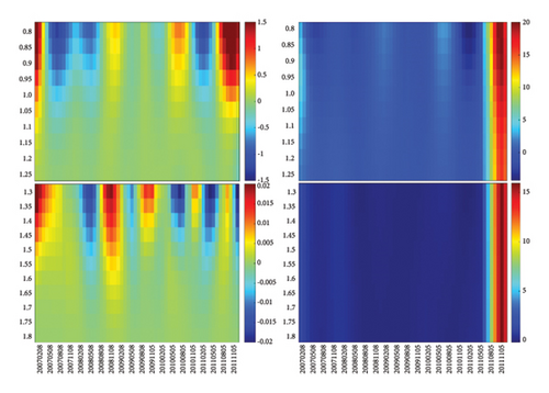
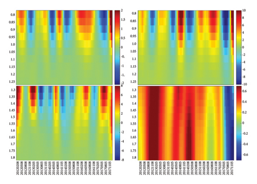
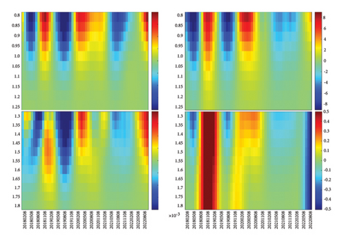
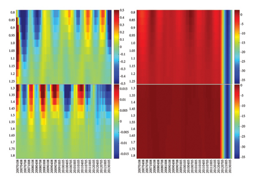
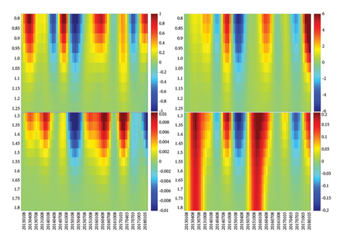
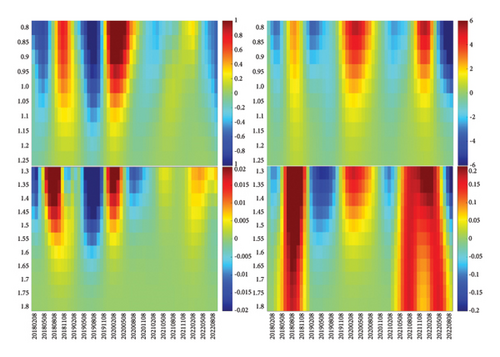
As we can see in Figure 8, there are quasiperiodic reorganizations in ΔJ and ΔQ, with red (positive) swings going to larger scales than blue (negative) swings in general, but there are a small number of swings (both positive and negative) extending across all scales. These two quantities are exact at each scale, and thus, their observed oscillations are more reliable (unlike β, whose expression is approximate). While it is possible to see features when ΔJ and ΔQ are in sync, it is far more likely to see strong features show up in the heat map of 3 − x when ΔJ and ΔQ are out of sync with each other. To develop an intuition on this tension between ΔJ and ΔQ, let us start with networks that we understand well. First, for a random network with links, the number of triangles is close to zero. Hence, whatever ΔJ might be, x = ΔQ/ΔJ ≈ 0 because ΔQ is so much smaller. Therefore, if we vary the number of links in a random network by varying the probability p, the heat map of β would be a single color. Certainly, x would be far from the critical value of 3. On the other hand, if we start close to a complete network, with p ≲ 1, then we will have on average links and triangles, and thus, while . This tells us that x = ΔQ/ΔJ ∝ 3p2≲3. This means that, if we vary p by randomly thinning out or adding links, x will also remain constant. In other words, x changes with time or with scale, only if ΔQ leads or lags ΔJ in time. This can happen if triangular links are preferentially deleted when the number of links is decreased or preferentially added if the number of links is increased.
With this in mind, let us focus first on swings where ΔJ was approximately in sync with ΔQ. By this, we mean that ΔJ and ΔQ have roughly the same depth (extension to larger scales) and breadth (persistence in time). For the S&P 500, one such example was found in Figure 8(c), where the first prominent swing in ΔJ and ΔQ is blue, followed by a red swing, a blue swing, and a broad red swing. In this sequence of swings, we find that the two blue swings (June 2018 and August 2019) have approximately the same depths and widths in ΔJ as in ΔQ. If these two blue swings in ΔJ and ΔQ are perfectly in sync, we would not see any feature in the heat map of x − 3.
In Figure 8(c), the red swing (December 2018) between the two blue swings is equally wide for ΔJ and ΔQ, but the swing ΔQ > 0 is deeper than ΔJ > 0. While this should produce an observable feature on the heat map of β = (x − 3)−1, the heat maps of ΔJ and ΔQ are easier to understand, because they relate directly to changes in the correlation network at different scales, and we can tell ΔJ > 0 from ΔJ < 0, as well as ΔQ > 0 from ΔQ < 0. We believe this red swing is associated with the US–China trade war crash, which started on September 17, 2018 (when the index value is 2929), and ended on December 17, 2018 (when the index value is 2416), according to the S&P 500.
Lastly, let us scrutinize the very intense ΔQ > 0 swing observed at the end of Figure 8(a), from mid-2011 to end-2011. In Figure 8(a), there appears to be no oscillations in the blue region leading up to the intense swing, due to the choice of color scales being skewed by the very intense ΔQ > 0 swing. When we change the color scales to those shown in Supporting Figure S1, red and blue swings (ΔQ > 0 and ΔQ < 0, respectively) leading up to the intense swing become much more obvious in Supporting Figure S1(a) for 0.8 < ϵ < 1.25. After experimenting with different color ranges, we convinced ourselves that there are no significant swings apart from the ones shown in Supporting Figure S1(b) for 1.3 < ϵ < 1.8. From the historical chart of S&P 500, the only event we can associate with this swing is the start of an 8-year growth period (2012–2019) in the US markets that came to an end with the 2020 COVID-19 pandemic.
When there is a red or blue swing in ΔJ (ΔQ), the number of links (triangles) increases or decreases, respectively. Most of the time, these swings are limited in scale and also limited in time. A swing that extends across all scales signifies a market-level event, which can be a market crash or a bull run. We see signatures of market-level events only in ΔQ. In December 2018, both swings are red, that is, ΔJ > 0 and ΔQ > 0 (increases in both number of links and number of triangles), we have the US–China trade war crash. Similarly, when both swings are red in May 2020, we find the COVID-19 crash. In contrast, the network reorganization event in the second half of 2011 involves a strong growth in the number of triangles (ΔQ > 0) that is not accompanied by a corresponding strong growth in the number of links. In other words, before mid-2011, the number of triangles was small in the network. This increased dramatically during the intense ΔQ > 0 swing, mostly through rewiring (and not addition) of links. This network reorganization sets the stage for an 8-year growth period in the US markets.
For Nikkei 225, we identified four market-level red swings (ΔQ > 0) and one market-level blue swing (ΔQ < 0). Based on scales shown in the color bars, we see that the sole blue swing between May 2012 and February 2013 (see Figure 8(d) and Supporting Figure S2) is significantly more intense than the four red swings. This coincides with a shorter bull run in the Japanese market from 2013 to mid-2015. Unlike the start of the US bull run, this blue swing in ΔQ straddled across a red and blue swing in ΔJ and therefore represents a dramatic drop in the number of triangles, while the number of links remains roughly constant. It would be interesting to observe a growth in the US markets after a blue swing ΔQ < 0, but the only one that we can find started in Jun 2022 (see Figure 8(c)). By the end of the data, it is not clear that the blue swing is over, even though we can find on Yahoo! Finance consistent growth in the US markets after March 2023. The first two of the four market-level red swings ΔQ > 0 occur in Figure 8(e): (1) between February and October 2013 and (2) between October 2015 and July 2016. According to the Nikkei official website, the first swing is related to Abenomics, which refers to former Japanese Prime Minister Abe’s three arrows economic policy: (1) bold monetary easing, (2) a flexible fiscal policy, and (3) a growth strategy to stimulate private sector investment [65]. As mentioned in the Nikkei official website, the second swing is likely caused by the crash in the Shanghai Composite Index. The last two of the four market-level red swings occur in Figure 8(f): (1) between August 2018 and February 2019 and (2) between May 2021 and August 2022. Based on its timing and comparison against Figure 8(c), we believe that the third swing is related to the trade war between China and the United States. Interestingly, the first two market-level red swings in Figure 8(e) did not correspond to any market crashes in Japan.
5. Conclusions
In this work, we ask whether there is a reasonable way to define a temperature for financial markets? Can they achieve detailed balance independently at all scales, or is information flow in such systems different at different scales? To answer these questions, we used the inverse temperature β defined by Ye et al. [36] and tracked it over time for scale ϵ = 0.8, 1.0, 1.2, 1.4, 1.6, and 1.8; we then examine the peaks of β, to see how they evolved with ϵ. For seven characteristic peaks that we identified, we fitted the negative dip and positive rise to power laws and found their exponents b± narrowly distributed between 0.3–0.4.
For a more systematic analysis, we constructed heat maps of β from the same data and identified positive-, negative-, and infinite-slope cascades in the heat maps based on whether a cascade is from a smaller ϵ to a larger ϵ, or vice versa. For the US market, we found more negative slope cascades than in the Japanese markets, corroborating with previous stock market linkage and causality studies comparing the US and Japanese indices. Notably, during the Global Financial Crisis from 2007 to 2009, an endogenous cascade appeared first in the United States and then caused an exogenous crash to occur in the Japanese market.
To delve deeper into the evolution of β with time and scale, we examined further the heat maps of ΔJ and ΔQ. When ΔJ and ΔQ are in sync, β remains constant. However, this does not mean that ΔJ and ΔQ are not changing with time and scale. In fact, we found red/blue swings of ΔJ and ΔQ in time, with their amplitudes also changing with time. Occasionally, a positive feature at time t at smaller scales continues into larger scales, implying a network reorganization of the same nature across multiple scales. We also found, at some times, a positive feature at smaller scales becoming a negative feature at larger scales. This tells us that there is a change in the nature of network reorganization across scales, which we see more of in the β heat maps. In addition, there are very intense swings that appear in time across all scales. These are market-level events because they involve organizations of entities across all scales. We identified three intense swings in the United States, which are associated with (1) the 8-year bull run, (2) the China–US trade war, and also (3) the COVID-19 crash. Similarly, in the Japanese market, we identified four intense red swings and one intense blue swing. The first red swing corresponds to (1) the Japanese markets’ reactions to Abenomics, (2) the crash in the Shanghai Composite Index, (3) the China–US trade war, and (4) the COVID-19 crash. Finally, the intense blue swing corresponds to a shorter bull run in the Japanese market from 2013 to mid-2015.
Conflicts of Interest
The authors declare no conflicts of interest.
Funding
This work was financially supported by the Ministry of Education, Singapore under the grant (Grant number: MOE-000442-00).
Supporting Information
Supporting Figures.
Supporting Figure S1: We plot ΔQ as in Figure 8(a). (a) Is for 0.8 <ϵ < 1.25, and (b) is for 1.3 < ϵ < 1.8. The range of color bars is selected purposely for better visualizations of the red/blue oscillations.
Supporting Figure S2: We plot ΔQ as in Figure 8(d). (a) Is for 0.8 <ϵ < 1.25, and (b) is for 1.3 < ϵ < 1.8. The range of color bars is selected purposely for better visualizations of the red/blue oscillations.
Open Research
Data Availability Statement
The data that support the findings of this study are openly available in DR-NTU at https://researchdata.ntu.edu.sg/dataset.xhtml?persistentId=doi:10.21979/N9/6RNYM0.


