Inequality in Mortality in Spain*
Submitted November 2020.
We thank the participants in the Economic History seminar at Universitat Pompeu Fabra for their useful comments.
Abstract
We analyse the evolution of mortality rates in Spain by age and gender between 1990 and 2018. We compare municipalities, ranked by socio-economic status (SES) and grouped into bins of similar population size, to study changes not only in levels but also in inequality in mortality across the SES spectrum. We document large decreases in mortality rates throughout the period for all age groups, including children, even after 2000, and continuing after the Great Recession. These declines are stronger for boys and men, who had higher mortality rates to begin with. We find that inequality in mortality across municipalities was low among the young by 2018, while it was higher among adult men and older women. Inequality in fact increased over the period for older men. We explore the role of different causes of death and find that this increase in inequality is driven by stronger improvements in cancer-related mortality among men living in richer areas. These improvements are not found among women, given their increases in mortality due to lung cancer.
I. Introduction
Before the COVID-19 pandemic, Spain was projected to become the country with the highest life expectancy in the world by 2040.1 Life expectancy had been increasing steadily over the previous decades, fuelled by declines in mortality in all age groups. Because averages hide potential variation in health and longevity by socio-economic status, it is relevant to understand how those gains in life expectancy are distributed.
We analyse the evolution of inequality in mortality in Spain during the period 1990–2018. Income inequality was mostly decreasing during the first years of this period, but it started to increase after the 2008 financial crisis, which hit the Spanish economy particularly hard.2 Our analysis focuses on age-specific mortality and considers inequality across small geographical areas, based on municipalities, ranked by an index of economic deprivation. By considering inequality across similar-sized areas ranked by relative deprivation, we overcome concerns of selective migration and of compositional changes within socio-economic groups over time.
We find substantial decreases in mortality for all age groups throughout the period, particularly pronounced for men, and even for children. Inequality in mortality across municipalities was low among the young and changed little over time.
We also find substantial increases in inequality among adult and older men. The observed increases in inequality do not appear to be related to the Great Recession, as we observe no relevant changes in trends after 2008. They are instead driven by larger declines in cancer-related mortality in richer (less-deprived) areas.
We contribute to the literature by providing evidence on changes in inequality in mortality by age and gender for a large European country. Spain has a tax-based universal health insurance system, and most health care is provided free of charge by public hospitals and primary care centres. These features might mitigate the impact of income inequality on health and mortality. However, Spain was strongly affected by the 2008 financial crisis, and experienced a substantial increase in income inequality and sizeable cutbacks in the health budget.3 It is remarkable that we find steady declines in mortality for all age groups, including after the Great Recession. Our results also show essentially no inequality in the period 2016–18 for most age groups below 50.
Several studies have documented the extent of inequality in health and mortality rates in Spain, but they have been mainly limited to few specific regions.4 These regions have also been used in international studies comparing socio-economic inequalities in mortality across European countries.5,6
Recently, Regidor et al. (2014, 2016) have used data for the whole of Spain and their two studies are closely connected to our work. They study the trends in mortality by socio-economic group, and changes in inequality in mortality at the province level. However, these analyses could be confounded by compositional changes within socio-economic groups or by selective migration of healthier individuals from poorer to richer provinces over time.
Our study is the first analysis documenting the evolution of inequality in mortality in Spain for all age groups, accounting for compositional changes within socio-economic groups, while also addressing selective migration concerns by comparing mortality rates across areas of similar population size.
II. Data and methodology
We combine information from death-certificate microdata, the local population registry and the census, all provided by the Spanish National Statistics Institute, for years 1990–02, 2000–02, and 2016–18. In order to construct mortality rates, we use death counts by municipality of residence, gender, five-year age group, and year from the death certificates, together with population counts at the same level from the local population registry.7 We use census data in 1991, 2001 and 2011 to construct a ‘deprivation index’ for each year at the municipality level. The index combines municipality-level information on high school dropout rates (fraction of the population older than 16 who did not finish compulsory education),8 unemployment rates (unemployed as a fraction of the labour force), and the share of dwellings located in buildings that are not in good condition.9
While these data sources contain information on the whole Spanish territory, the municipality of residence is censored in death-certificate microdata for municipalities under 10,000 inhabitants, and in the census for municipalities under 20,000 inhabitants. For these smaller municipalities, only the province and an indicator of municipality size is available. Thus, we aggregate information on small localities within each province into two groups: one for all municipalities of fewer than 10,000 inhabitants, and another for all municipalities with a population between 10,001 and 20,000 inhabitants.
The municipality is the finest level of geographical disaggregation for which the necessary information is available to perform this type of analysis. The total number of municipalities in our data, including the fictitious ones that group smaller towns, ranges from 380 in 1990 to 489 in 2018, an increase due to migration from smaller to larger municipalities over time. The average municipality population size in our sample is around 100,000 inhabitants, while the median is 45,000 inhabitants.10
In order to construct the multiple deprivation index (MDI), we first standardise each of the three components in each year (by subtracting its mean and dividing over its standard deviation), and then we add up the three z-scores. Figure A.1 in the online Appendix shows that there is strong persistence in the value of the deprivation index for municipalities over time.
We rank municipalities from lower to higher values of the deprivation index (from less- to more-deprived areas, or from rich to poor), and we then group municipalities into 20 ‘bins’, each accounting for approximately 5 per cent of the total Spanish population in each year.11 This process is done separately for 1990 (using values of the index in 1991), 2000 (using the index in 2001) and 2016 (using values of the index in 2011). In Section IV.1, we explore the robustness of our findings to ranking municipalities by average income in 2016 instead (as income data at this level of geographical disaggregation are only available from 2015 onwards). Figure A.2 in the online Appendix shows the average characteristics of the bins in different years.
We construct mortality rates for each year, bin, gender, and each of the following age groups: 0–4, 5–19, 20–49, 50–64, 65–79, and 80 and older. We age-standardise mortality rates in each year using the population structure in 2016.12 Finally, we smooth mortality rates by taking the average of the three one-year mortality rates in each period. As a result, what we call the smoothed one-year mortality rate in 1990, for instance, is actually the average of one-year mortality rates in 1990, 1991 and 1992.
III. Inequality in mortality in Spain, 1990–2018
Part A
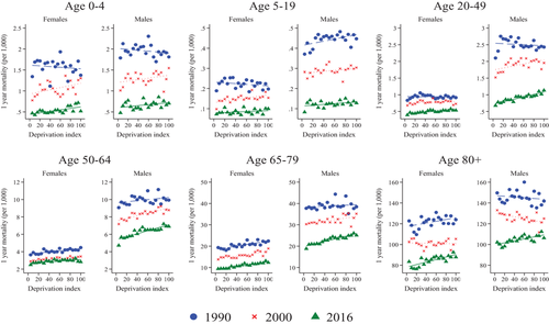
Figure 1 presents the main results for our analysis of inequality in mortality. We show mortality rates in 1990–92, 2000–02 and 2016–18 by our deprivation index, separately by gender and for six age groups.
Age-specific mortality by deprivation rank
Note: This figure shows the evolution of one-year mortality rates (smoothed over three years) for each gender and age group by bin, with bins ranked by a multiple deprivation index combining rates of high school dropout, unemployment and poor housing conditions in 1991, 2001 and 2011, respectively. Each dot (‘bin’) represents average values for groups of municipalities accounting for approximately 5 per cent of the total Spanish population in that given year. Bins are ordered from lower to higher deprivation, so that a positive slope implies lower mortality in richer areas. Mortality rates are age-adjusted using the 2016 population.
We first focus on levels. We find large declines in mortality rates in all age groups and in both subperiods (the 1990s and the 2000s), represented by the drop in the level from the 1990 line to the 2016 line in all panels. This drop is very pronounced for children, especially under the age of 5. For instance, the mortality rate for boys under 5 was about 2 in 1990, while it was down to 0.5–0.7 in 2016.
We observe larger drops for men compared with women (especially in less-deprived areas). For instance, in the age group 5–19, the mortality rate fell from around 0.2 per 1,000 in 1990 to slightly below 0.1 in 2016 for girls, while the fall for boys is much larger, from about 0.4 to about 0.1. Note also the large fall among men aged 20–49 between 2000 and 2016.
We next focus on inequality in mortality rates between more- and less-deprived areas, captured by the slopes of the lines. The slopes (and their standard errors) are reported in Table 1. Inequality in mortality is very low among children, as illustrated by the very flat slopes for age groups 0–4 and 5–19, and there is little change in inequality over time, with the lines being close to parallel in the three periods.
| Lowest MDI | Highest MDI | Slope of regression line | p-value | ||||||||
|---|---|---|---|---|---|---|---|---|---|---|---|
| 1990 | 2000 | 2016 | 1990 | 2000 | 2016 | 1990 | 2000 | 2016 |  |
 |
|
| (1) | (2) | (3) | (4) | (5) | (6) | (7) | (8) | (9) | (10) | (11) | |
| Men | |||||||||||
| 0–4 | 1.787 | 1.011 | 0.477 | 1.811 | 1.545 | 0.705 | –0.005 | 0.009 | 0.006 | 0.082 | 0.731 |
| (0.005) | (0.006) | (0.004) | |||||||||
| 5–19 | 0.371 | 0.283 | 0.083 | 0.447 | 0.304 | 0.128 | 0.003** | 0.001 | 0.001* | 0.305 | 0.799 |
| (0.001) | (0.001) | (0.001) | |||||||||
| 20–49 | 2.102 | 1.519 | 0.678 | 2.431 | 1.956 | 1.133 | –0.004 | 0.015** | 0.018*** | 0.055 | 0.637 |
| (0.006) | (0.005) | (0.002) | |||||||||
| 50–64 | 9.067 | 7.173 | 4.713 | 9.930 | 8.781 | 6.904 | 0.030 | 0.076*** | 0.087*** | 0.028 | 0.517 |
| (0.019) | (0.011) | (0.011) | |||||||||
| 65–79 | 37.740 | 30.284 | 18.805 | 38.436 | 35.198 | 25.095 | 0.052 | 0.179*** | 0.303*** | 0.159 | 0.068 |
| (0.122) | (0.034) | (0.027) | |||||||||
| 80+ | 149.687 | 133.044 | 102.056 | 141.868 | 124.964 | 106.206 | –0.174 | –0.466*** | 0.479*** | 0.263 | 0.000 |
| (0.238) | (0.158) | (0.103) | |||||||||
| Women | |||||||||||
| 0–4 | 1.341 | 0.776 | 0.468 | 1.376 | 1.304 | 0.517 | –0.004 | 0.013** | 0.009*** | 0.040 | 0.518 |
| (0.008) | (0.006) | (0.002) | |||||||||
| 5–19 | 0.189 | 0.098 | 0.073 | 0.198 | 0.154 | 0.100 | –0.001 | 0.002*** | 0.001 | 0.007 | 0.088 |
| (0.001) | (0.001) | (0.000) | |||||||||
| 20–49 | 0.833 | 0.681 | 0.394 | 0.916 | 0.728 | 0.533 | –0.000 | 0.002 | 0.006*** | 0.454 | 0.061 |
| (0.002) | (0.002) | (0.001) | |||||||||
| 50–64 | 3.635 | 2.887 | 2.488 | 4.471 | 3.449 | 2.819 | 0.031*** | 0.022*** | 0.020*** | 0.165 | 0.725 |
| (0.006) | (0.004) | (0.005) | |||||||||
| 65–79 | 19.334 | 13.757 | 9.388 | 22.401 | 18.886 | 12.302 | 0.198*** | 0.184*** | 0.179*** | 0.762 | 0.884 |
| (0.034) | (0.032) | (0.014) | |||||||||
| 80+ | 122.681 | 102.551 | 83.426 | 123.899 | 105.367 | 87.799 | 0.425** | –0.037 | 0.609*** | 0.047 | 0.001 |
| (0.188) | (0.135) | (0.116) | |||||||||
- Note: Columns 1–6 report the means of (smoothed) one-year mortality rates for each gender and age group in 1990, 2000 and 2016, in the bin of municipalities with lowest and highest deprivation, respectively. Columns 7–9 report the coefficient (and standard error in parentheses) of the fitted regression line in each year. Column 10 reports the p-value for the null hypothesis that the slopes are equal in 1990 and 2000, and column 11 for the null that slopes are equal in 2000 and 2016. In columns 7–9, ***, ** and * indicate significance at the 1, 5 and 10 per cent levels, respectively.
More inequality in mortality is illustrated by steeper positive slopes. Inequality is higher among the elderly compared with the young, especially in the more recent periods. For example, the slope takes value of 0.5 for men aged 80+ and 0.3 for men aged 65–79 in 2016 (see Table 1), versus 0.02 for men aged 20–49 and 0.001 for boys aged 5–19.13
Regarding changes in inequality, there is little change among adult women, and there are low levels of inequality throughout the period for women below 65. We do find important increases in inequality in mortality among adult and older men, with marked and significant positive slopes in 2016 in all groups above age 19.
In the final period (2016–18), Figure 1 (and Table 1) show very low levels of inequality among both men and women below the age of 50, but significant and sizeable inequality for men above the age of 50 and women above the age of 65. In Section IV, we explore the role of the Great Recession and different causes of death in accounting for these trends.
IV. Understanding the changes in mortality over time
Part B
1 Robustness to the ranking variable
In the results presented so far (in Figure 1 and Table 1), we rank municipalities using our composite deprivation index. We also explore the robustness of our results to ranking municipalities by per capita income instead. Per capita income by municipality is only available starting in 2015.
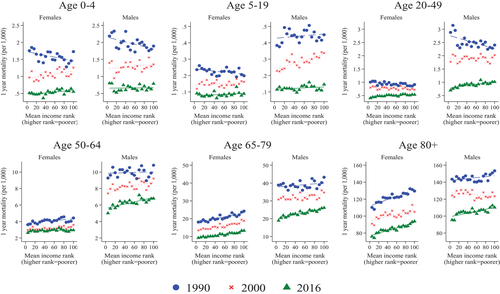
Our main analysis ranks municipalities using a deprivation index that varies over time and combines information on local unemployment rates, educational attainment and housing quality (see Section II). We perform the same analysis using a time-invariant alternative ranking variable: average income in each municipality in 2016. The data are provided by the Spanish National Statistics Institute, and are restricted to municipalities of at least 100 inhabitants.14 We use information on average income per capita in each municipality, and rank localities by descending order of this variable. The results are presented in Figure 2. Our main conclusions are unchanged when using this alternative ranking variable Instituto.15
Age-specific mortality by average income rank
Note: This figure shows the evolution of one-year mortality rates (smoothed over three years) for each gender and age group by bin, with bins ranked by decreasing average income in 2016. Each dot (‘bin’) represents average values for groups of municipalities accounting for approximately 5 per cent of the total Spanish population in that given year. Bins are ordered from higher to lower income, so that a positive slope implies lower mortality in richer areas. Mortality rates are age-adjusted using the 2016 population.
2 The role of the Great Recession
We have documented an increase in inequality in mortality among adult men between 1990 and 2018. In this section, we ask to what extent this increase can be attributed to the 2008 crisis, which led to higher income inequality and affected men's employment particularly hard.
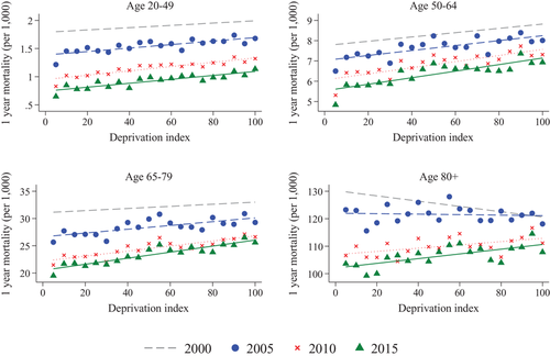
To this end, Figure 3 presents mortality rates for men, for several periods from the year 2000 to 2018. The slopes and the p-values for the differences between the slopes over time are reported in Table A.1 in the online Appendix.
Age-specific mortality for men before, during and after the 2008 crisis
Note: This figure shows the evolution of one-year mortality rates (smoothed over three years) for adult men by age group and bin, with bins ranked by a multiple deprivation index combining rates of high school dropout, unemployment and poor housing conditions in 2011. Each dot (‘bin’) represents average values for groups of municipalities accounting for approximately 5 per cent of the total Spanish population in that given year. Bins are ordered from lower to higher deprivation, so that a positive slope implies lower mortality in richer areas. Mortality rates are age-adjusted using the 2016 population.
First, note that the four lines are close to parallel in the first two panels in Figure 3, corresponding to age groups 20–49 and 50–64. We find no significant changes in inequality before or after the crisis for men below 65 (see also the first row of Table A.1). Second, for men aged 65–79, the significant increase in inequality takes place before the crisis (2000–05). Third, for the older age group (80+), we observe increasing inequality before the crisis, which continues between 2005–07 and 2010–12, but not after 2010–12. We find no significant increases in inequality for any age groups after 2010–12.
To us, these results suggest that the observed increases in inequality in mortality among older men cannot be attributed to the Great Regression, as these had started before the crisis. We find that the fall in mortality rates (in levels) continues after 2008 at a similar pace as before, and the ongoing increases in inequality do not appear to accelerate. Thus, perhaps surprisingly, the deep economic recession did not translate into lower life expectancy in the following 10 years, on average, or into higher inequality in health, at least as captured by mortality rates.
Figures 1 and 3 do show an important (and close to parallel) drop in mortality levels among men aged 20–49 after the onset of the crisis. This may be related to the large negative employment shock experienced by men during the recession, especially in high-risk sectors such as construction. We explore this possibility further in the next section.
3 The role of different causes of death
In order to understand the large declines in mortality and the increase in inequality among men, we next analyse trends in mortality by cause of death.
a) The role of treatable and preventable causes
We follow the classification of avoidable mortality into ‘treatable’ and ‘preventable’ causes by OECD/Eurostat (2019). Preventable mortality includes causes of death that can be avoided mainly through public health interventions and primary prevention (e.g. lung cancer or traffic accidents). Treatable mortality, in turn, refers to causes of death that can be avoided with timely and effective health care interventions, for instance with hospital care after the onset of disease (e.g. breast cancer).16 This classification is based on the international statistical classification of diseases and related health problems (ICD-10) codes.
We restrict the analysis to the year 2000 onwards, as these are the years for which causes of death are classified with ICD-10 codes in our data. Because the classification of avoidable mortality only applies to the population younger than 75, we do not show results for the oldest group in this analysis.17 We use the deprivation index in 2011 as the ranking variable.
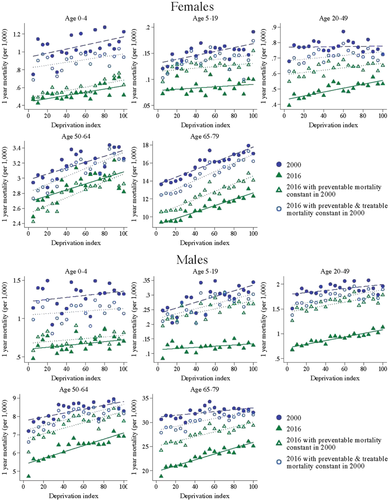
In order to visualise the relative importance of preventable and treatable causes, Figure 4 compares actual mortality in 2000 and 2016 with counterfactual mortality in 2016 under different scenarios. The first scenario (represented by green hollow triangles) keeps preventable mortality constant at 2000 values. The second scenario (represented by blue hollow circles) keeps both preventable and treatable mortality (i.e. all avoidable mortality) fixed at their 2000 levels.
Actual and counterfactual mortality in 2016, with preventable and treatable mortality constant at 2000 levels
Note: These figures compare actual mortality in 2000 and 2016 with counterfactual mortality in 2016 if preventable mortality had remained constant in 2000 values (green hollow triangles), and with counterfactual mortality in 2016 if all avoidable mortality had remained constant in 2000 (blue hollow circles). Bins are ranked by the multiple deprivation index in 2011.
In order to construct counterfactual mortality in 2016 keeping preventable (or all avoidable) mortality constant, we subtract from the total mortality rate in 2016 the preventable (or avoidable) mortality rate in 2016, and add instead the preventable (or avoidable) mortality rate in 2000, for each age group, gender and bin.18
Our results in Figure 4 show that the large fall in mortality observed for children younger than 5 can be mostly accounted for by the declines in treatable mortality. Preventable mortality changed little in this group from 2000 to 2016, as shown by the green hollow triangles (showing 2016 mortality if preventable mortality is kept at 2000 values) being very close to the green solid triangles (actual 2016 mortality). In contrast, blue hollow circles (representing 2016 mortality if both preventable and treatable mortality had remained constant) show much higher values. The difference between the blue hollow circles and the green hollow triangles indicates the decline in treatable mortality. The difference between the blue solid circles, representing mortality in 2000, and the blue hollow circles shows in turn the share of the mortality decline that cannot be explained by preventable or treatable causes. For children younger than 5, this difference is relatively small, which suggests that almost all of the mortality decline can be explained by avoidable causes (in particular, treatable causes).
For most other groups, we see larger declines in preventable mortality compared with treatable mortality. This is the case for both men and women in age groups 5–49, although the pattern is stronger for men. For those aged 5–19, those decreases were larger in more deprived areas, leading to a decrease in inequality. The opposite is true for those aged 20–49, for whom inequality increased. For men older than 50, we also see larger decreases in preventable mortality than in treatable mortality, but the increase in inequality that we documented in Section III arises from all types of causes: preventable, treatable, and the remaining causes.
An interesting exception to this pattern is women older than 50, for whom we see larger declines in treatable mortality than in preventable mortality. This is particularly the case for women aged 50–64, for whom preventable mortality actually increased over this period, with larger increases in richer areas. As a result, we observe a decrease in inequality in avoidable mortality.
Figure A.3 in the online Appendix shows that this increase in preventable mortality for women aged 50–64 was due to an increase in mortality from lung cancer, which was larger in the least-deprived (richer) areas. This figure compares preventable mortality in 2000 with actual preventable mortality in 2016 and with counterfactual preventable mortality in 2016 if lung cancer mortality had remained at its 2000 levels. The results of this exercise show that the increase in mortality from lung cancer among women was large enough to outweigh the declines in all other preventable causes.
Why did mortality from lung cancer increase for women during this period? Figure A.4 depicts the evolution of mortality from lung cancer for men and women aged 50–64 and 65–79 in the least- and most-deprived areas, from 1990 to 2016. Mortality from lung cancer is higher for men than for women, but this difference declined substantially over the period, particularly in richer areas, which experienced large declines in mortality from lung cancer among men, but substantial increases among women.
These trends are likely linked to the patterns of adoption and cessation of smoking observed in Spain over the past few decades.19 Until the 1970s, smoking was much more common among men than women, with significant convergence documented starting around 1970. Higher-educated women drove the increase in smoking in the 1970s, while lower-educated women followed in the 1980s.
Mortality from lung cancer thus seems to be one of the factors explaining the smaller declines in mortality experienced by adult women, and the increased inequality in mortality observed among older men.
b) The role of specific causes of death
Finally, we explore the role of specific causes of death in explaining the main patterns, focusing on the most prevalent by age and gender. Figures 5 and 6 show the contribution of the two main causes of death in each group to the observed changes in levels and inequality in mortality from 1990 to 2016, for adult and elderly men and women.
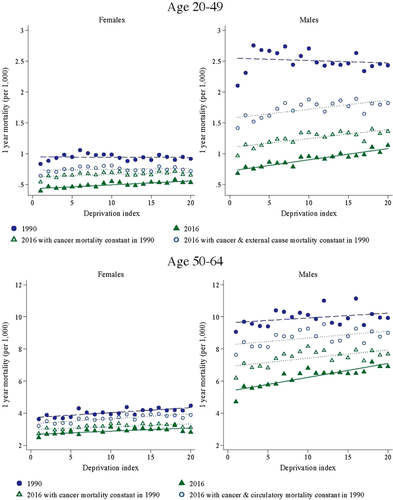
Actual and counterfactual mortality in 2016, with first two causes of death constant in 1990: adults
Note: These figures compare actual mortality in 1990 and 2016 with counterfactual mortality in 2016 if mortality from the first cause of death in each group had remained constant in 1990 values (green hollow triangles), and with counterfactual mortality in 2016 if mortality from both the first and second cause of death had remained constant in 1990 (blue hollow circles). Bins are ranked by the multiple deprivation index in 1991 and 2011, respectively.
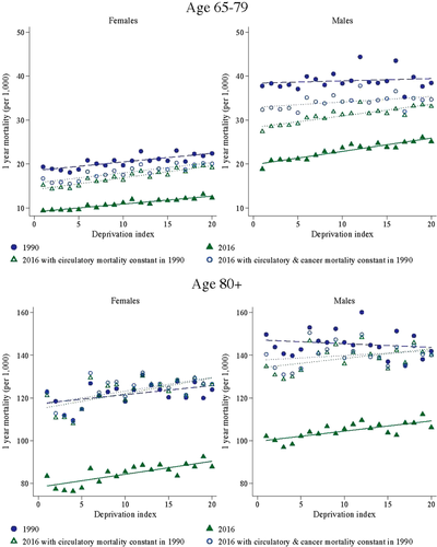
Actual and counterfactual mortality in 2016, with first two causes of death constant in 1990: elderly
Note: These figures compare actual mortality in 1990 and 2016 with counterfactual mortality in 2016 if mortality from the first cause of death in each group had remained constant in 1990 values (green hollow triangles), and with counterfactual mortality in 2016 if mortality from both the first and second cause of death had remained constant in 1990 (blue hollow circles). Bins are ranked by the multiple deprivation index in 1991 and 2011, respectively.
We compare actual mortality levels in 1990 and 2016 with counterfactual mortality in 2016, keeping mortality from the first cause of death constant at 1990 levels (green hollow triangles), and with counterfactual mortality in 2016, keeping mortality from both the first and second cause of death constant at their 1990 levels (blue hollow circles). We treat each chapter in the ICD classification as one cause of death.20
Mortality from cancer and external causes were the two main reasons for death in the 20–49 age group in 1990. We see modest improvements in these causes among women, and more substantial declines among men, especially from external causes. External causes include traffic accidents, an important cause of preventable mortality in this group. They also include workplace accidents, which may have fallen as a result of declining male employment between 2008 and 2013, especially in the construction sector. The declines among men were distributed fairly equally across the socio-economic spectrum, so they do not explain the increase in inequality observed in this group.
In all groups older than 50, cancer and circulatory conditions are the first two causes of death. While declines in mortality from cancer are responsible for a significant share of the decline in mortality for younger groups, mortality from circulatory disease is more important for the older groups. For those older than 80, in particular, virtually all of the decline in mortality can be accounted for by declines in mortality from circulatory problems.21
For women, we observe little improvement in mortality from cancer. The improvements in mortality from some frequent types of cancer, such as breast cancer, are shadowed by the increased mortality from lung cancer. For men, in turn, we see substantial declines in mortality from cancer, particularly for ages 50–64, which were more pronounced in richer areas.
Mortality from cancer is thus responsible for most of the increase in inequality in mortality among older men. This can be seen in the fact that the gradient in mortality in 1990 is virtually parallel to counterfactual mortality in 2016 if mortality from cancer had remained at 1990 values. That is, inequality would not have increased if mortality from cancer had not changed. Improvements in mortality from circulatory disease, however, seem to explain little of the increases in inequality.
V. Conclusions
We analyse mortality rates in Spain by age and gender between 1990 and 2018. We rank municipalities by an index of average economic deprivation, and we group them into bins of similar size in terms of population. This allows us to study changes in mortality rates in levels, but also changes in inequality in mortality between poorer and richer areas.
We document large decreases in mortality rates throughout the period for all age groups, including children, even after 2000 (and even after the Great Recession). These declines are stronger for boys and men, who had higher mortality rates to begin with.
We find that inequality in mortality across municipalities is low among the young by 2016–18, but higher among adult men and older women. Inequality in fact increased between 1990 and 2016 for older men. We explore the role of different causes of death and find that this increase in inequality is explained by larger improvements in cancer-related deaths among men living in richer areas. These improvements are not found among women, who instead suffered increases in their mortality rates due to lung cancer.
References
- 1 Foreman et al., 2018.
- 2 Anghel et al., 2018; Ferrer-i-Carbonell, Ramos and Oviedo, 2013.
- 3 Bernal-Delgado et al., 2018.
- 4 Borrell et al., 1999, 2008; Martínez et al., 2009; Regidor et al., 2003.
- 5 Huisman et al., 2005; Kulhánová et al., 2014; Mackenbach et al., 2008, 2015.
- 6 Bohácek et al. (2018) use harmonised panel data from 10 European countries, England, and the US, and study inequalities in life expectancy at age 50 by education and gender during the period 2002–15.
- 7 Data from the local population registry are only available from 1996 onwards. For earlier years, we use data from the 1991 census.
- 8 A high school degree is equivalent to ISCED 2.
- 9 The census classifies the state of buildings as dilapidated, bad, deficient or good. We construct this variable as the share of houses in each municipality that are located in buildings that are not in good condition (i.e. in a dilapidated, bad, or deficient condition).
- 10 We can alternatively perform the same analysis at the province level (there are 50 provinces in Spain). Our main conclusions are robust to this alternative level of aggregation.
- 11 In order to smooth the size of these bins, we follow Currie and Schwandt (2016) and split the two largest municipalities (Madrid and Barcelona) into 10 smaller municipalities with identical values of the multiple deprivation index and one-tenth of deaths and population.
- 12 That is, we apply the five-year age-group-specific mortality rate in each year to the weight that each five-year age group has within the broader age group in 2016, separately for each bin and gender.
- 13 Note that the slopes are negative for men aged 80 or older in 1990 and 2000, indicating higher mortality in richer places. However, this result is not robust to alternative ranking variables (see Section IV.1 and Figure 2).
- 14 Instituto Nacional de Estadística, 2020.
- 15 The results are also robust to ranking areas by their values of the multiple deprivation index in 2011, instead of re-ranking in each year as in the main specification. These results are available upon request.
- 16 See the introduction of this special issue for a more comprehensive definition.
- 17 We show results for the age group 65-79 as in the main analysis to ease the comparison of these results with those in Section III.
- 18 Note that some causes of death, particularly cardiovascular conditions, are classified as being 50 per cent preventable and 50 per cent treatable.
- 19 Schiaffino et al., 2003.
- 20 For example, mortality from cancer represents mortality from causes C00-D49 (Neoplasms, chapter 2 of ICD-10 codes). Causes of death are classified in our microdata with ICD-9 codes before 1999, and with ICD-10 codes thereafter.
- 21 We also explore the role of different causes of death in accounting for the negative slopes observed for men aged 80+ in Figure 1. We find that these are not driven by cardiovascular problems, but by mortality from cancer, in particular lung and prostate cancer, which were more prevalent in richer areas.


