Integrative Analysis of PPAR and Immune Pathways in Hepatocellular Carcinoma: Constructing a Prognostic Risk Model Using TCGA Data
Abstract
Background: Hepatocellular carcinoma (HCC) is a leading cause of cancer-related mortality worldwide, with its pathogenesis intricately linked to metabolic and immune dysregulation. This study aims to elucidate the molecular mechanisms underpinning HCC by analyzing metabolic and immune-related pathways and constructing a prognostic risk model.
Methods: We utilized data from The Cancer Genome Atlas (TCGA) to analyze genomic and clinical characteristics of HCC. Techniques such as single-sample gene set enrichment analysis (ssGSEA), weighted gene coexpression network analysis (WGCNA), and gene set variation analysis (GSVA) were employed to explore the interplay between metabolic pathways, immune responses, and HCC progression. In addition, a prognostic risk model was developed using univariate Cox regression and LASSO regression analysis based on PPAR signaling and immune-related genes.
Results: Our ssGSEA results indicated a significant involvement of metabolism-related pathways in HCC. The WGCNA identified key immune-related genes, with particular modules correlating with macrophage activity. The prognostic model, comprising five key genes, effectively stratified patients into low- and high-risk groups, with implications for overall survival (OS). Further analyses revealed the model’s correlation with clinical characteristics and immune-related indexes, suggesting its utility in predicting HCC progression.
Conclusion: This study provides a comprehensive molecular portrait of HCC, emphasizing the role of metabolic reprogramming and immune responses. The prognostic model offers potential for personalized therapeutic strategies and improved clinical outcomes. Future research should focus on validating these findings and exploring the therapeutic potential of targeting metabolic and immune pathways in HCC.
1. Introduction
Liver cancer, especially hepatocellular carcinoma (HCC), is one of the most common and deadliest cancers around the globe. Its occurrence and death rates vary a lot depending on where you are, thanks to different risk factors in different regions [1]. Chronic hepatitis B (HBV) and hepatitis C (HCV) infections are the biggest culprits, especially in places such as Asia and Africa, where these infections contribute to a huge chunk of HCC cases [2].
Now, let us talk about peroxisome proliferator–activated receptors (PPARs)—a mouthful, but basically, these are proteins that act as transcription factors, controlling which genes get turned on or off [3]. PPARs are crucial in handling how our cells develop, differentiate, and metabolize things such as fatty acids. They even have a hand in the development of tumors [4]. You can find them in many animals, including humans. There are three types of PPARs: PPAR-alpha (PPARA), PPAR-delta (PPARD), and PPAR-gamma (PPARG) [5]. Each type plays a different role in how our cells and metabolism work. PPAR-alpha, for instance, is mostly in the liver, muscles, heart, and kidneys, and it deals with lipid metabolism and energy production [6]. PPAR-delta, on the other hand, is spread out in a lot of tissues but is most common in the brain, fat, and skin, helping to regulate energy balance, insulin sensitivity, and inflammation [7]. PPAR-gamma is mostly found in fat tissue and is the key for things such as fat cell development, insulin sensitivity, and glucose management [8].
The connection between PPARs and cancer—especially liver cancer—is a pretty complex and evolving field of study. Since PPARs are major players in metabolism, they have been linked to the rise and progression of various cancers, including HCC [9]. PPAR-alpha, for instance, has been found to both promote and suppress tumor growth in liver cancer [10]. On one side, activating PPAR-alpha helps burn off fatty acids, lowering lipid accumulation—a known risk factor for HCC [11]. But on the flip side, it can also fuel liver cancer under certain conditions, likely by causing oxidative stress and inflammation [12].
PPAR-gamma, though, is generally seen as a good guy when it comes to cancer, activating PPAR-gamma can encourage cells to mature properly, stop them from overgrowing, and even trigger cancer cells to self-destruct. In liver cancer, drugs that activate PPAR-gamma have shown promise in slowing down tumor growth and preventing it from spreading [13]. But, of course, we need more research to fully understand how all this works in real life.
As for PPAR-delta, its role in liver cancer is still up for debate. Some research studies suggest that it might help liver cancer cells grow and survive, while other studies point to it possibly holding some cancer-fighting potential. Plus, PPARs do not act alone—they interact with other signaling pathways, such as Wnt/β-catenin and PI3K/Akt, which only makes things more complicated. These pathways influence crucial processes such as cell growth, death, and blood vessel formation, all of which play a big role in cancer development [14].
2. Methods
2.1. Data Acquisition and Preprocessing From The Cancer Genome Atlas (TCGA)
For this study, we pulled genomic and clinical data from TCGA, focusing on the HCC dataset. We grabbed the data from TCGA data portal, which offers a goldmine of open-access reference data. The dataset we used included genomic sequencing data (such as RNA-Seq and whole-exome sequencing) and the matching clinical info.
2.2. Differential Gene Expression and Pathway Enrichment Analysis
We used the limma package in R to run differential gene expression analysis, which works great for both microarray and RNA-Seq data. First, we normalized and log-transformed the dataset to smooth out any technical bumps. To fit a linear model for each gene, we used the lmFit function, which was customized to reflect our experimental setup. Then, we applied limma’s empirical Bayes moderation through the eBayes function. This helps stabilize variance estimates, which is especially helpful when dealing with smaller datasets. We ran moderated t-tests for statistical testing and adjusted p values using the Benjamini–Hochberg method to keep the false discovery rate (FDR) in check. Genes were flagged as differentially expressed if they met the FDR threshold (usually less than 0.05), and in many cases, if they showed a certain fold change. To get the biological meaning behind the findings, we performed a functional enrichment analysis using databases such as Gene Ontology (GO) or KEGG.
2.3. Weighted Gene Coexpression Network Analysis (WGCNA)
We used the WGCNA to dig into the gene correlation patterns in the normalized RNA-Seq data. First, we picked a soft-thresholding power using the pickSoftThreshold function in the WGCNA to ensure the network followed a scale-free topology. From there, we created a weighted adjacency matrix and transformed it into a topological overlap matrix (TOM), which captures how genes are connected. By clustering the TOM, we identified modules of tightly connected genes. Then, we correlated these modules with clinical traits to find gene networks that really mattered biologically. We focused on significant modules, highlighting genes that had high module membership and were linked to important traits. For these key modules, we generated network plots to visualize the complex gene relationships.
2.4. Single-Sample Gene Set Enrichment Analysis (ssGSEA)
We used the ssGSEA to figure out how specific gene sets were enriched in each sample. The ssGSEA looks at the activity of pathways and biological processes in individual samples. We chose relevant gene sets, usually representing known pathways, from sources such as MSigDB. For each sample, the ssGSEA ranked genes based on their expression and calculated an enrichment score for each gene set. This score shows how much the genes in a set are coregulated (up or down) within a sample. After normalizing the enrichment scores across samples, we could compare pathway activities across the group, helping us understand what is driving the complexity of diseases such as cancer.
2.5. Gene Set Variation Analysis (GSVA)
We ran GSVA using the GSVA package in R, which is a handy tool for estimating gene set enrichment variation across samples. Unlike other methods, GSVA does not need class labels. We picked relevant gene sets from MSigDB, and GSVA gave us enrichment scores for each set in each sample. This gave us a better view of how active (or inactive) different biological pathways were across the samples.
2.6. Construction of the Prognostic Prediction Model Using Cox Regression and LASSO Regression
To build a model that predicts survival outcomes, we started with univariate Cox regression using the survival package in R. This helped us pick out variables that had a statistically significant impact on the prognosis. Then, we ran LASSO regression with the glmnet package to refine the list of predictors. LASSO is great at handling high-dimensional data because it selects variables and regularizes them, which helps prevent overfitting. We used ten-fold cross-validation to determine the best lambda value, which controls the strength of LASSO’s penalty. With the trimmed-down list of predictors, we moved on to multivariate Cox regression to build the final model. This step allowed us to check the combined effect of our selected predictors on survival outcomes while adjusting for confounders. We made sure the proportional hazards’ assumption held up using Schoenfeld residuals. To validate the model, we looked at its predictive accuracy using Harrell’s concordance index (C-index) and checked calibration plots.
2.7. shRNA Construct Design and Generation
To create the shRNA constructs, we designed gene-specific shRNA sequences using handy online tools such as the RNAi Design Tool (Dharmacon) to get the best knockdown efficiency possible. We synthesized, annealed, and then cloned the oligonucleotide sequences into the pLKO.1-puro vector (Addgene, #8453), which uses the human U6 promoter to drive shRNA expression. As a control, we made a nontargeting (scramble) shRNA, cloning it into the same vector. The ligation reactions were transformed into competent DH5α E. coli, and we picked the successful ones by growing them on LB agar plates with 100 μg/mL ampicillin. Positive clones were then screened using colony PCR and confirmed by Sanger sequencing. Once validated, the shRNA constructs were amplified in bacterial cultures and purified using the EndoFree Plasmid Maxi Kit (Qiagen) to prep them for the next steps.
2.8. Wound Healing Assay
We used the wound healing assay to check how well liver cancer cells could migrate after treatment. The liver cancer cells were grown in 6-well plates until they hit around 90% confluence in a complete growth medium. Then, we made a scratch down the middle of the cell layer with a sterile 200 μL pipette tip. After that, the wells were gently washed with PBS to get rid of any floating cells, and we added fresh serum-free medium with the treatment of choice. We took images of the wound area at 0 h and at different time points afterward using an inverted microscope to track the healing process.
2.9. Data Analysis Method
To ensure the data analysis was solid, we took several preprocessing steps, such as data normalization and log-transformation, and used the right statistical methods to control for potential biases. We integrated several bioinformatics tools and statistical techniques—limma for differential gene expression, WGCNA for gene network analysis, ssGSEA and GSVA for pathway enrichment, and Cox regression with LASSO for building the prognostic model. Together, this provided a comprehensive and reliable framework for analyzing the data. For transparency and reproducibility, all the computational codes and scripts used in the analysis are detailed in the supporting material.
3. Results
3.1. ssGSEA Analysis Shows Metabolism-Related Scores in HCC Patients
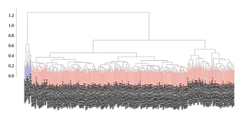
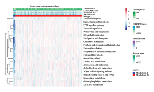
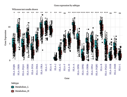
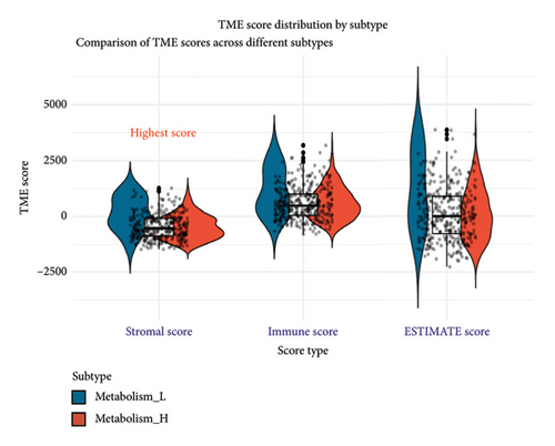
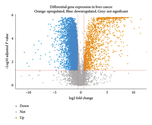
To explore how metabolism-related pathways are linked in the HCC cohort, we ran ssGSEA (Figure 1(a)). Several metabolism-related pathways stood out, including fatty acid biosynthesis, elongation, degradation, ketone body synthesis, steroid biosynthesis, and primary bile acid biosynthesis. We also looked at pathways such as glycerophospholipid, arachidonic acid, and linoleic acid metabolism, along with others related to fat digestion, cholesterol, and PPAR signaling. To better evaluate these pathways, we split the HCC patients into low- and high-metabolism groups based on their median metabolism-related scores. Most patients fell into the high-metabolism group, meaning they were enriched in these metabolism pathways. The heatmap we created clearly showed the metabolism-related scores across the cohort (Figure 1(b)). Then, we checked the correlation between HLA-related genes and these metabolism groups. Turns out, patients with lower metabolism scores had higher expression levels of certain HLA-related genes such as HLA-DQB1, HLA-DRB1, HLA-DQA1, and several others (Figure 1(c)). We also analyzed the link between metabolism scores and the tumor microenvironment (TME). Here, patients with low metabolism scores had higher stromal scores while there was no significant difference in immune and ESTIMATE scores (Figure 1(d)). Lastly, we did a differential gene expression analysis to identify genes tied to the PPAR signaling pathway. In the group with lower PPAR activity, we found 8951 differentially expressed genes, with 7399 downregulated and 1552 upregulated (Figure 2(a)).
3.2. WGCNA Reveals Key Immune-Related Genes
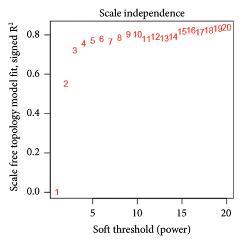
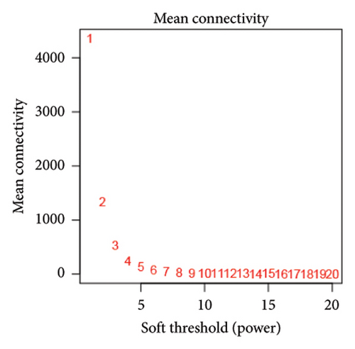
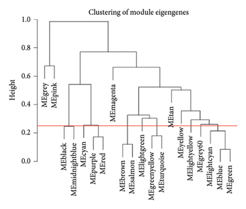
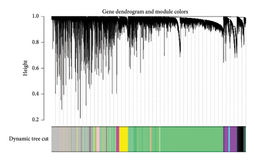
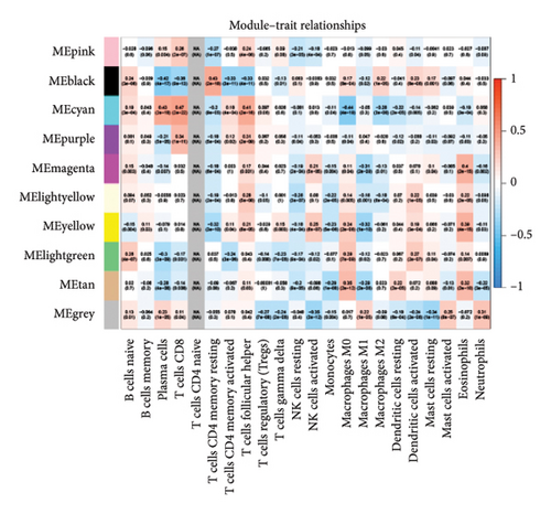
We also performed WGCNA to find genes connected to immune-related pathways. Figure 2(b) shows how we chose the best soft-thresholding power (around six) to ensure the network had a scale-free topology. As expected, increasing the power decreased the mean connectivity, creating sparser networks. In Figure 2(d), the dendrogram helped us spot clusters of highly connected genes (modules), showing relationships between different gene modules. In Figure 2(e), we mapped these modules with their corresponding color codes. Using this method, we identified 10 key gene modules tied to immune-related pathways in HCC. Notably, the METAN module stood out due to its strong connection with macrophages. These METAN-related genes were further analyzed for their roles in immune pathways.
3.3. Building a Risk Model Based on PPAR Signaling Pathway
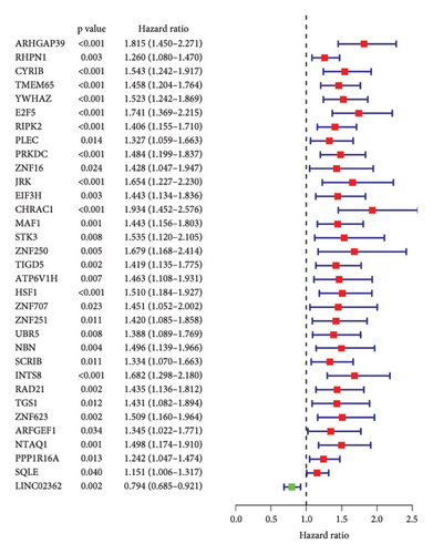
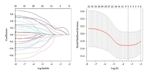
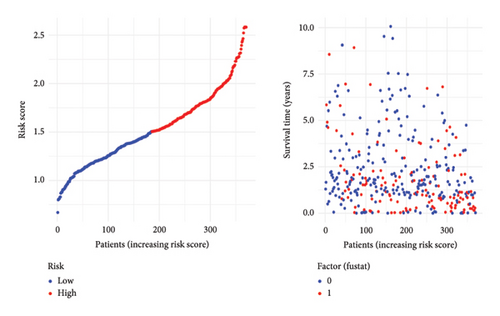
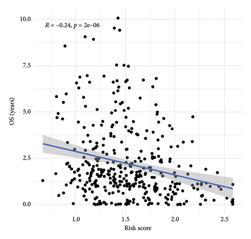
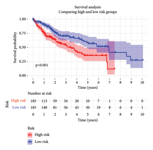
To predict outcomes for HCC patients, we evaluated the prognostic value of genes involved in PPAR and immune-related pathways. We started with the univariate Cox regression analysis, which flagged 33 genes as being linked to the HCC prognosis (Figure 3(a)). We then used LASSO regression to narrow it down to five genes: ARHGAP39, E2F5, CHRAC1, PPP1R16A, and LINC02362. For each patient, we calculated a risk score using the following formula: Risk score = ARHGAP39∗0.1879 + E2F5∗0.2102 + CHRAC1∗0.1465 + PPP1R16A∗0.0716 + LINC02362∗−0.0565 (Figure 3(b)). We split patients into low- and high-risk groups based on these scores (Figure 3(c)). The analysis showed that patients in the high-risk group had significantly worse overall survival (OS) (Figure 3(d)). The higher the risk score, the worse the prognosis (Figure 3(e)).
3.4. Correlation Between Risk Model and Clinical Characteristics in HCC
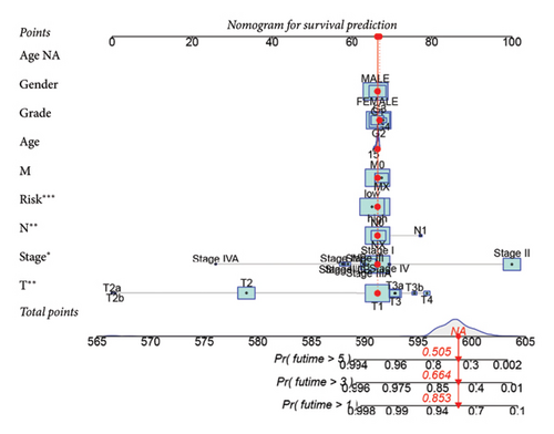
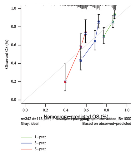
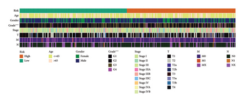
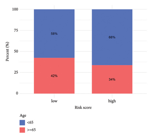
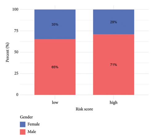
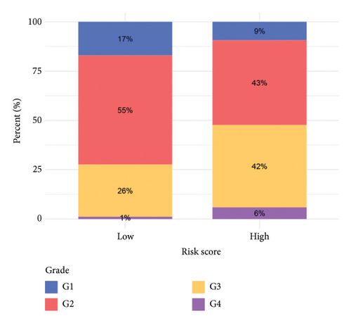
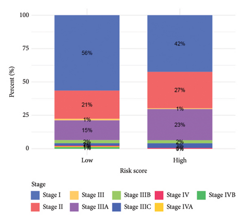
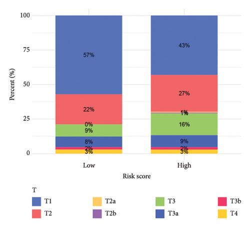
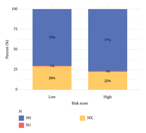
To improve the predictive power of our model, we combined the risk score with clinical characteristics using a nomogram (Figure 4(a)). The calibration curve showed that this model performed well in predicting outcomes for the HCC cohort (Figure 4(b)). When we looked at how the risk model related to clinical features, we found that higher risk scores were associated with more advanced HCC grades (Figure 4(c), 4(d), 4(e), 4(f), 4(g), 4(h), and 4(i)). Simply, the higher the risk score, the more severe the disease.
3.5. Risk Model Ties Closely to Immune-Related Markers in HCC
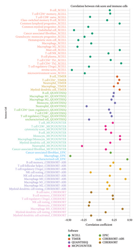
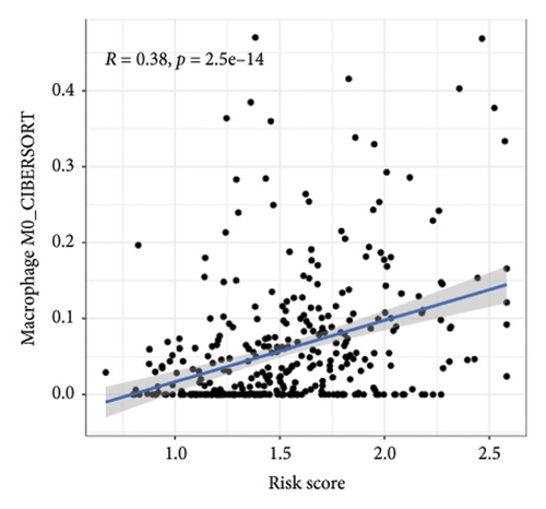
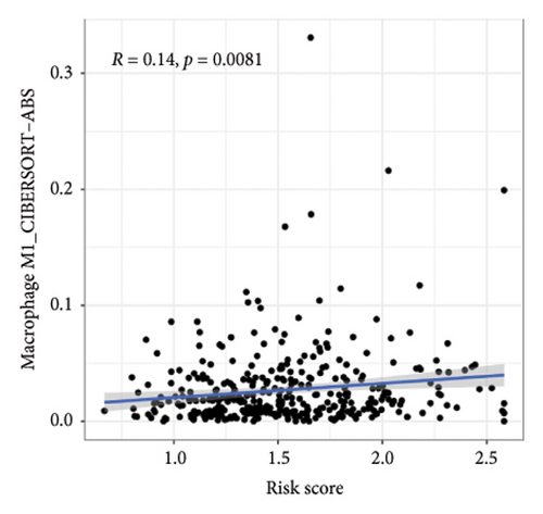
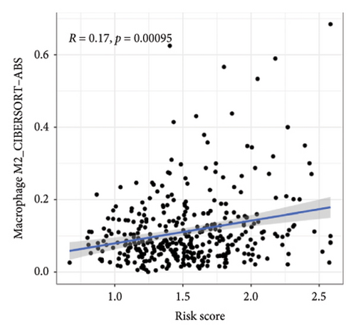
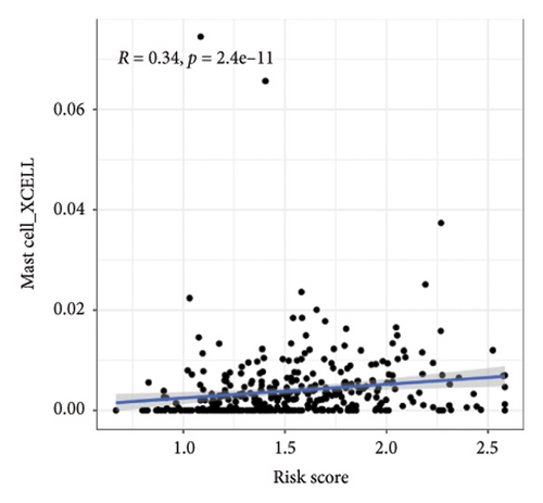
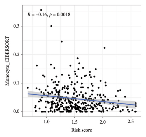
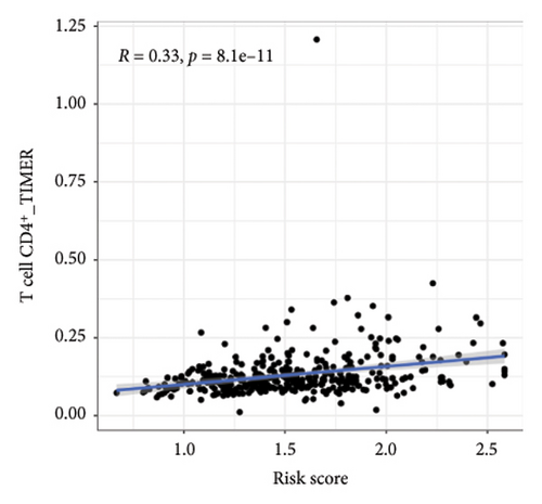
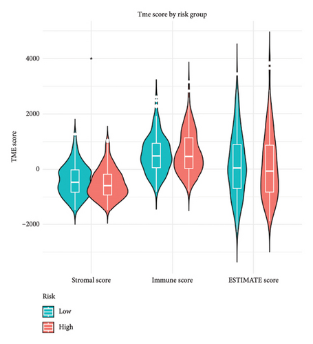
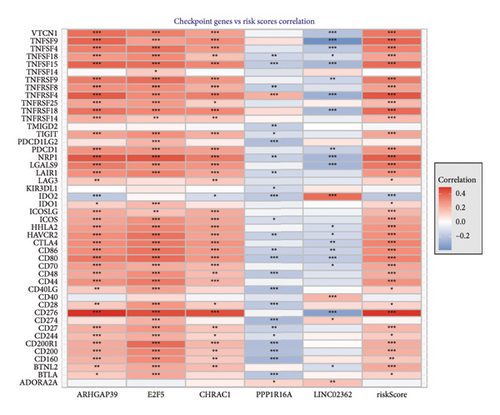
We then explored how the risk model linked to immune-related factors. Using various immune-related algorithms, we found that cells uch as M1, M0, M2 macrophages, mast cells, and CD4+ T-cells were positively correlated with higher risk scores, while monocytes were negatively correlated. Looking at the TME, lower risk scores were tied to higher stromal scores, but there was not a significant link between the risk score and immune or ESTIMATE scores. Finally, we examined how immune checkpoint-related genes correlated with the risk score. ARHGAP39, E2F5, and CHRAC1 were positively correlated with risk, while PPP1R16A and LINC02362 showed negative correlations (Figure 5).
3.6. GSVA Results Highlight Pathway Modulations
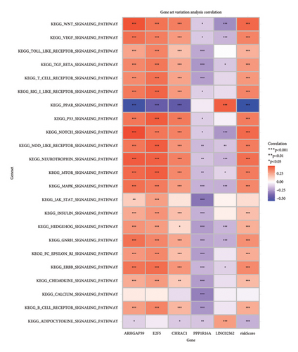
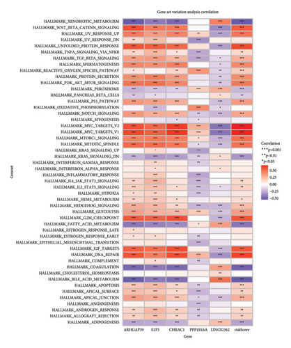
To get a deeper understanding of the pathway activity, we used GSVA. The heatmaps gave us a clear view of how certain pathways were modulated based on gene expression. For instance, the WNT signaling pathway showed a strong positive association with genes such as APC and AXIN2, while the TGF beta pathway had a strong negative correlation with EP300, suggesting it might be suppressed. When we looked at HALLMARK gene sets, the TNFA signaling via NFKB and hypoxia pathways showed strong positive correlations with several genes, while the apoptosis pathway had a negative link to CDKN1A and LGALS1, hinting at a potential block in apoptotic processes (Figure 6).
3.7. The Wound Healing Assay Revealed the CHRAC1 Can Promote the Invasion in Liver Cancer Cell Line
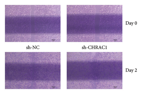
Liver cancer cells transfected with CHRAC1-targeting shRNA showed a significant reduction in wound closure compared to cells transfected with control shRNA (scramble). At 24 h postscratch, the CHRAC1 knockdown group exhibited a slower rate of wound healing. These findings suggest that CHRAC1 plays a key role in enhancing the migratory and invasive capabilities of liver cancer cells. The results were consistent across multiple replicates, confirming the robust effect of CHRAC1 on cancer cell invasion (Figure 7).
4. Discussion
This study takes a deep dive into HCC by analyzing both genomic and clinical data, shedding light on the complex nature of this disease. By using advanced bioinformatics tools, we have highlighted how genetic changes, metabolic shifts, and immune responses all play a role in HCC’s development and progression. A big takeaway from our findings is the key role that metabolic pathways—especially those tied to fatty acid metabolism and PPAR signaling—play in HCC. Metabolic reprogramming seems to be more than just a side effect of cancer; it is likely driving the disease. The fact that many HCC patients showed higher metabolism-related scores suggests that targeting these metabolic pathways could be a powerful therapeutic approach. These metabolic shifts likely reflect the tumor cells’ altered demands for energy and growth, hinting that if we can disrupt these processes, we might slow or stop tumor progression. Our study also uncovers an interesting connection between HCC and the immune system. We found that HCC cases with higher metabolism scores had lower expression of HLA genes, which points to a potentially immunosuppressive environment. This is a particularly exciting find, as it suggests that therapies targeting metabolic pathways could also help boost the immune response, making immunotherapies more effective in treating HCC. By applying the WGCNA, we dug deeper into the immune pathways and found gene networks closely tied to macrophage activity. Macrophages, known for their flexibility, can either help tumors grow or fight them, depending on their state. This dual role is a bit of a double-edged sword—it is tricky, but it also opens up new therapeutic opportunities. If we can figure out how to reprogram these macrophages, we might find a way to either block their tumor-supporting actions or enhance their tumor-fighting abilities. Our prognostic model, which combines genes involved in PPAR signaling and immune responses, marks a step forward in personalizing HCC treatment. This model can sort patients into different risk groups based on their genetic profiles, which could help doctors better predict outcomes and tailor treatments accordingly. The fact that our model also ties in with clinical characteristics and immune markers makes it a promising tool for guiding treatment decisions. On top of that, the GSVA results gave us a clearer picture of the signaling pathways at play in HCC. We found strong links between certain gene expressions and pathways such as WNT and TGF-beta signaling, giving us deeper insights into the molecular processes driving HCC. These findings open the door to develop targeted therapies that could fine-tune these pathways and potentially improve the effectiveness of current treatments. In summary, our study highlights the multifaceted nature of HCC and underscores the potential of combining metabolic and immune-targeted therapies. The insights we have gained not only deepen our understanding of HCC at both the molecular and clinical levels but also pave the way for future research aimed at turning these discoveries into practical treatments. As we move forward, it is critical to validate these findings in clinical trials and explore how metabolic and immune-modulating therapies might work together to combat HCC more effectively.
Disclosure
The research was conducted independently and was not influenced by any external, commercial, or financial interests.
Conflicts of Interest
The authors declare no conflicts of interest.
Funding
This study was not supported by any funding.
Open Research
Data Availability Statement
The datasets analyzed in this study are publicly available from The Cancer Genome Atlas (TCGA) database (https://portal.gdc.cancer.gov/). Additional data supporting the findings of this study, including intermediate analysis results, can be made available by the corresponding author upon reasonable request.


