Printing the light
Abstract
This paper explores the relationship between additive and subtractive mixing for colour printing. Using Spectraval mica pigments (Merck)—marketed as RGB pigments—colour is generated by selective reflection and prints are based on additive colour mixing principles, that when printed onto black paper, create white and a range of colours. Although currently used mostly for decorative effects, they can be the basis of additive 'process' inks, that present new opportunities for and challenges to traditional print markets. The viewing angle dependency of their selective reflection favours applications in security printing similar to the holograms on bank cards for example. Traditional measurement and modelling methods are difficult to apply due to the layering and irregular dispersion of pigments.
1 INTRODUCTION TO THE CHALLENGE
The challenge here is: how one can exploit printing effects to achieve colours that can enhance colour reproduction, primarily where specular activity as presented in complex coloured objects and scenarios are understood to demonstrate more challenging reproduction requirements, for example, the specular activity reflected and refracted light on metallic surfaces, the scatter of the microparticles in textiles, paints and cosmetics, or the structural colour that arises from shells, bird feathers and butterfly wings. The angular distribution of scattered light can be used to simulate or render the appearance of materials. However, colour reproduction relies heavily upon accurate measurement and modelling of the light scattering properties of these materials.
The subject of this dark-side article proposes how to combine two key components: printing with pigments, which is a subtractive process, and mixing spectral colour to obtain light, which is an additive process.
The aim here is to address printing methods by exploring the use of colourless mica pigments printed onto black paper, that only when combined, translates into colour. However, this additive–subtractive method of printing is difficult to reproduce due to unpredictable light scattering properties. Classic colorimetric methods rely on the measurement of thin film ink printed onto white paper. However, as these inks are printed onto a black paper, accurately measuring and predicting structural colour, classic colorimetry and modelling do not provide an overriding solution.
2 A BRIEF HISTORY OF ADDITIVE COLOUR MIXING
Light could be considered as the most significant force of nature, and yet its complexity continues to challenge. One cannot refer to light without acknowledging the existence of darkness. Lastly, that which could be considered as the essential component of light, our perception of colour exists in our mind.
Since the seventeenth century, significant discoveries that have influenced our contemporary understanding of colour perception and reproduction included works by Sir Isaac Newton (1643–1727), Jacob Christoph Le Blon (1667–1741) and James Clark Maxwell (1831–1879). Newton hypothesised that light was composed of particles of different sizes, red being the largest and violet the smallest.1 Le Blon described the process of subtractive three colour printing using red, blue and yellow (using pigments).2 Maxwell demonstrated his theory of trichromacy through his demonstration using photography3 of exposing an image by overlaying red, green and blue-tinted slides.
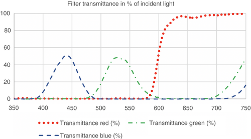
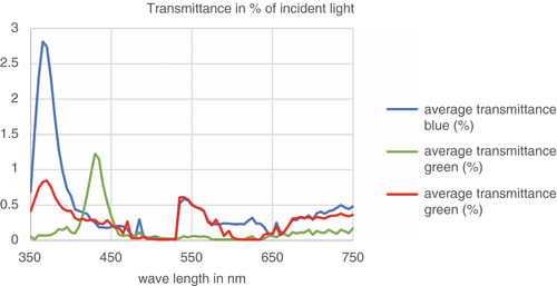
From Figure 1, it becomes clear that by stacking the three filters will lead to no transmission of light. Each filter transmits only in a relatively narrow range and absorbs the rest of the spectrum. Overlaying red, green and blue-tinted slides and looking at them in transmission will result in the loss of all image information. The difference between the measurements in Figures 1 and 2 is striking. The printed RGB (red, green, blue) pigments in Figure 2 demonstrate that almost all light is reflected and that any colour can be seen as surprising. When traditional printing with pigments, no light is reproduced and as more pigment is applied, results in a reduction in luminance in proportion to how much white is removed. White, or the lightest regions, are reliant on the whiteness of the substrate, and these regions are a result of an absence of ink.
3 HOW CAN WE PRINT THE LIGHT WITH PIGMENTS?
Subtractive colours work with reflected rather than transmitted light. Emulating the additive process, television screens and monitors through a side-by-side fixed arrangement of primary colours of red, green and blue dots, interdigitate the appearance of a smooth continuous transition of between light to dark colours. RGB mixing with spectra as in Figure 1, requires a precise halftone registration on white paper so that the dots do not overlap, or we need RGB inks which have less exclusive spectra. For RGB printing, the ink is printed from a negative plate. The process cannot be performed with inks with the same spectrum as the filters in Figure 1 unless the dots (or pixels) are side by side in the print (or display).
Merck has developed a set of selectively reflecting inks: Spectraval pearlescent pigments. The thin mica plates are polydispersed and have diameters ranging from 5 to 25 mm, which are too big for inkjet printing. To record the selective reflection of the pigments, we measured the transmittance spectra of the linseed oil inks as a function of wavelength with an HP ultraviolet-visible spectrometer. The data were averaged over 5 nm intervals. The red ink is red in reflection and green in transmission, the blue and green are somewhat yellow in transmission. Assuming that scattering can be neglected, the pigments reflect the light which is not transmitted. As illustrated in the difference between the spectra in Figures 1 and 2, green colour perception is not generated by transmittance between 470 to 600 nm, but a reflection of almost the whole spectrum, except between 400 and 470 nm, ie blue is transmitted.
Blue is achieved by reflecting between 470 and 630 nm, and red by reflecting between 470 and 630 nm and 600 to 680 nm. From Figure 2, it is clear that almost all light is reflected and that any colour can be seen as surprising. On white paper, the pigments are practically invisible since the scatter from the white substrate fills the dips in reflection. Therefore, the pigments have to be printed onto a black substrate to perceive a colour (Figure 3).
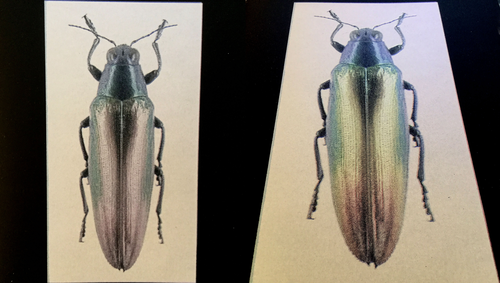
As demonstrated in Figure 3, the same photograph of a beetle is photographed directly above, resulting in a desaturated appearance, and at an angle revealing a more comprehensive range of colours. The chromatic variability of these microstructure pigments is mainly due to the stacking and irregular dispersion of pigments, thus creating a three-dimensional (3D) effect.
We aim to be able to exploit these materials for the reproduction of light, which may well go some way to address more challenging images that contain unusual geometry. These images contain highlights or specular activity. Likewise, images of insects, birds and iridescent surfaces such as glass and pottery that are difficult to photograph and reproduce represent ideal subjects. However, their corresponding printed images using RGB pigments are likewise a challenge to photograph.
4 OPEN ISSUES
So far, we have explored light and two-dimensional (2D) images, but 2.5D and 3D reproduction also remain an issue. By 2.5D we are interested in physically reproducing the textural qualities of materials, for example the minute variations of a material created by the changes in orientation, density and distribution of tiny particulates of the surface.4 On a practical level, scatter defines many visual appearance attributes of materials, but the angular distribution of the scatter is hard to predict.
The microstructure of a material and its angular distribution of optical scatter can be achieved by goniometric measurement but does not provide geometrical information. Some measurement devices work well in acquiring complex geometries but do not provide colour information. Reflectance transformation imaging (RTI) uses computational photography method that captures surface texture and colour of an object and provides 3D virtual information using traditional photographic techniques and presents some opportunity for exploitation for reproduction.5
In principle, red, green, and blue are the primary colours from which all the other colours can be derived and mixing these colours produces the (complementary) secondary colours—cyan, magenta, and yellow (CMY) which each reflects one-third of the spectrum. In schools, we are taught red, yellow and blue are the primary colours. However, what is termed as primary is highly arbitrary and outdated.6 Therefore, how can we move beyond the restrictive CMY to develop a radically different approach that is aligned to printing with light rather than subtracting from it?
Although we have presented some examples that explore initial aspects of printing, these are far from being solved, and more thoughts have arisen during the process of making and writing this dark-side article. Our concluding and open question is: why do we continue to print in CMYK (cyan, magenta, yellow, black) colours? Although CMYK+ is the standard in the industry and will continue to be the dominant commercial model, some colours inhabiting a different gamut—luminous, iridescent, interference and structural—cannot be reproduced using CMYK inks. Gloss and silver are added to the inkjet range (where CMYK are overprinted) can assist in achieving metallic effects. However, with the opportunity to print using RGB pigments presents an opportunity to create a range of alternative effects and with modification, a different gamut can be achieved.
Biographies
Carinna Parraman is Professor of Colour, Design and Print, and Director of the CFPR. She leads a cross-disciplinary research team comprising scientists and technologists, designers, artists, and researchers. She is leader of Expanding Excellence in England (E3), exploring the future of printing and fabrication, alongside traditional methods of making.
Susanne Klein is a physicist by training and has lived and worked in the UK since 1995, first as a Royal Society Research Associate at the University of Bristol, and then as a Senior Research Scientist at Hewlett Packard Labs Bristol. She has been appointed an EPSRC Manufacturing Fellowship at the Centre for Fine Print Research starting January 2018. She is working on the reinvention of old printing technologies, such as Woodburytype and Lippmann photograph.


