Visual Exploration of Dynamic Multichannel EEG Coherence Networks
Abstract
Electroencephalography (EEG) coherence networks represent functional brain connectivity, and are constructed by calculating the coherence between pairs of electrode signals as a function of frequency. Visualization of such networks can provide insight into unexpected patterns of cognitive processing and help neuroscientists to understand brain mechanisms. However, visualizing dynamic EEG coherence networks is a challenge for the analysis of brain connectivity, especially when the spatial structure of the network needs to be taken into account. In this paper, we present a design and implementation of a visualization framework for such dynamic networks. First, requirements for supporting typical tasks in the context of dynamic functional connectivity network analysis were collected from neuroscience researchers. In our design, we consider groups of network nodes and their corresponding spatial location for visualizing the evolution of the dynamic coherence network. We introduce an augmented timeline-based representation to provide an overview of the evolution of functional units (FUs) and their spatial location over time. This representation can help the viewer to identify relations between functional connectivity and brain regions, as well as to identify persistent or transient functional connectivity patterns across the whole time window. In addition, we introduce the time-annotated FU map representation to facilitate comparison of the behaviour of nodes between consecutive FU maps. A colour coding is designed that helps to distinguish distinct dynamic FUs. Our implementation also supports interactive exploration. The usefulness of our visualization design was evaluated by an informal user study. The feedback we received shows that our design supports exploratory analysis tasks well. The method can serve as a first step before a complete analysis of dynamic EEG coherence networks.
1. Introduction
A functional brain network is a graph representation of brain organization, in which the nodes usually represent signals recorded from spatially distinct brain regions and edges represent significant statistical correlations between pairs of signals. Currently, increased attention is being paid to the analysis of functional connectivity at the sub-group level. A sub-group is defined as an intermediate entity between the entire network and individual nodes, such as a community or module which is composed of a set of densely connected nodes (Ahn et al. [APS14]). Such a group of nodes can represent a certain cognitive activity that requires brain connectivity.
Data-driven visualization of functional brain networks plays an important role as a pre-processing step in the exploration of brain connectivity, where no a priori assumptions or hypotheses about brain activity in specific regions are made. This type of visualization can provide insight into unexpected patterns of brain function and help neuroscientists to understand how the brain works. An important goal of visualization is to facilitate the discovery of groups of nodes and patterns that govern their evolution (Reda et al. [RTJ*11]). Recent techniques mostly focus on the visualization of static electroencephalography (EEG) coherence networks. Here, we focus on the evolution of groups of nodes over time, that is dynamic communities, which has received less attention so far in the neuroscience domain. Although some visualization approaches have been developed for dynamic social networks, these approaches cannot be directly applied to brain networks, since they do not maintain the spatial structure of the network, that is, the relative spatial positions of the nodes. Visualization approaches that do not take into account the physical location of the nodes make it hard to identify how the functional pattern is related to brain regions.
An EEG coherence network is a two-dimensional (2D) graph representation of functional brain connectivity. In such a network, nodes represent electrodes attached to the scalp at multiple locations, and edges represent significant coherences between electrode signals [HRA*95, MSvdHdJ06]. If there are many electrodes, for example 64 or 128, the term ‘multi-channel’ or ‘high-density’ EEG coherence network is commonly used. Traditional visualization of multi-channel EEG coherence networks suffers from a large number of overlapping edges, resulting in visual clutter. To solve this problem, a data-driven approach has been proposed by ten Caat et al. [tCMR08] that divides electrodes into several functional units (FUs). Each FU is a set of spatially connected electrodes which record pairwise significantly coherent signals. For a certain EEG coherence network, FUs can be derived by the FU detection method [tCMR08] and displayed in a so-called FU map. An example is shown in Figure 1. In such a map, a Voronoi cell is associated to each electrode position, cells within one FU have the same colour, circles overlaid on the map represent the barycentres of FUs, and the colour of the line connecting two FUs encodes the average coherence between all electrodes of the two FUs. Here, we extend this method to analyse dynamic EEG coherence networks.

In this paper, we provide an interactive visualization methodology for the analysis of dynamic connectivity structures in EEG coherence networks as an exploratory pre-processing step to a complete analysis of such networks. Experts from the neuroscience domain were involved in our study in two ways. First, they provided a set of requirements for supporting typical tasks in the context of dynamic functional connectivity network analysis. Second, we carried out an evaluation of our tool with a (partially different) group of experts from the neuroscience domain. One of the main requirements coming from the domain experts is that spatial information about the brain regions needs to be maintained in the network layout, a feature which is not present in most existing network visualization methods.
- an augmented timeline representation of dynamic EEG coherence networks with a focus on revealing the evolution of FUs and their spatial structures;
- the detection of dynamic FUs to identify persistent as well as transient FUs;
- a sorted representation of FUs and vertices per time step to facilitate the tracking of the evolution of FUs over time and the identification of brain regions that the FU members belong to;
- a time-annotated FU map, which is an extended FU map for detailed comparison of FU maps at two consecutive time steps;
- an online interactive tool that provides an implementation of the above methods.
- the introduction has been extended;
- details were added to the design description (Sections 3.1 and 3.2);
- a description has been added explaining how to order the lines corresponding to electrodes in the timeline representation for reducing edge crossings and enhancing visual traceability (Section 4.1.2);
- an explanation has been added how to assign colours to dynamic FUs for distinguishing dynamic FUs (Section 4.2.2);
- Figures 5 and 7 are new, as well as Figures 9 and 10 that replace figure 7 of the conference paper;
- more feedback has been included from the participants in the evaluation stage (Sections 5.2.1 and 5.2.2).
2. Related Work
Many techniques for visualizing dynamic networks have been developed; these are reviewed by Beck et al. [BBDW14]. These techniques can be classified into three categories: animation, timeline-based visualization and hybrid approaches. The most straightforward method is animation (Archambault et al. [APP11]). When an animation is used to visualize the evolution of networks, the changes are usually reflected by a change in the colour of the nodes. However, network animation is limited to a small number of time steps [RFF*08, RTJ*11]. When this number becomes large, the users have to navigate back and forth to compare networks since it is hard to memorize the states of networks in previous time steps, see Bach et al. [BHRD*15]. Some work has been done to help users easily capture network changes. These approaches aim to preserve the abstract structural information of a graph, called the mental map (Diehl et al. [DGK01], Misue et al. [MELS95]).
An alternative to animation is the timeline-based representation. A typical approach is the application of small multiples, in which multiple networks at different points in time are placed next to each other [BHRD*15]. This approach is limited by the size of the display screen: it is very hard to display entire graphs at once when the data set becomes large. Networks can be shrunk in size, but the corresponding resolution and detail are reduced [BHRD*15]. Besides, this type of small multiples makes it hard to track the evolution of networks, because corresponding nodes in different multiples have to be identified visually.
Interactive visual analysis of temporal cluster structures in high-dimensional time series was studied by Turkay et al. [TPRH11]. They presented a cluster view that visualizes temporal clusters with associated structural quality variation, temporal signatures that visually represent structural changes of groups over time, and an interactive visual analysis procedure. Van den Elzen et al. [vdEHBvW16] presented a visual analytics approach for the exploration and analysis of dynamic networks, where snapshots of the network are considered as points in a high-dimensional space that are projected to two dimensions for visualization and interaction using a snapshot view and an evolution view of the network. However, in both approaches the spatial nature of the data did not play a role or was absent from the beginning.
An extension of the timeline-based representation has been developed for visualizing the evolution of communities that is widely used for dynamic social networks (Sallaberry et al. [SMM13], Vehlow et al. [VBAW15], Liu et al. [LWW*13]). In this representation, nodes are aligned vertically for each time step and are connected by lines between consecutive time steps. For a certain time step, nodes in the same community form a block. As time progresses, lines may split or merge, reflecting changes in the communities. This visualization is based on the flow metaphor, as is used in Sankey diagrams (Riehmann et al. [RHF05]) or flow map layouts (Phan et al. [PXY*05]), where users can explore complex flow scenarios.
Specifically, the communities and nodes are sorted to reduce the number of line crossings, which can improve the readability of the graph [SMM13, VBAW15]. In addition, the colour of the nodes usually reflects the temporal properties of a community, for example the stability of a dynamic community or the node stability over time [VBAW15]. To allow interactivity, the order of the nodes can be manipulated by the user [RTJ*11]. However, this approach cannot be applied to dynamic brain networks directly since it visualizes the dynamic network while ignoring the spatial information of the network nodes, which is a crucial factor in the analysis of brain networks.
In addition, several other useful tools for visualizing brain networks have been introduced. Christodoulou et al. [CSTT11] present BrainNetVis to serve brain network modelling and visualization by providing both quantitative and qualitative network measures of brain interconnectivity. Xia et al. [XWH13] introduce BrainNet Viewer to display brain surfaces, nodes, and edges as well as properties of the network. Sorger et al. [SBS*13] discuss NeuroMap to display a structural overview of neuronal connections in the fruit fly's brain. Ma et al. [MKF*15] present an animated interactive visualization of combing a node-link diagram and a distance matrix to explore the relation between functional connections and spatial structure of the brain. Finally, Hassan et al. [HSK*15] introduce EEGNET to analyse and visualize functional brain networks from M/EEG recordings.
In spite of the many brain network visualizations that exist, none is effective for our goal, which is to visualize and explore dynamic networks for the tasks defined in Section 3.1. As we mentioned in Section 1, our approach is based upon the FU map method introduced by ten Caat et al. [tCMR07, tCMR08]. This approach has been co-developed with the Department of Clinical Neurophysiology of the University of Groningen and used to analyse coherence networks and validate them in a comparison of networks from young and old participants (ten Caat et al. [tCMR08]). Next, it was applied and validated in a joint study with the Department of Work Psychology of the University of Groningen about the influence of mental fatigue on coherence networks (Lorist et al. [LBtC*09], ten Caat et al. [tCLB*08]). Later, it was extended to the analysis of functional fMRI (functional Magnetic Resonance Imaging) networks by Crippa et al. [CR11].
3. Design
In this section, we first introduce the tasks that neuroscientists want to perform in the context of functional connectivity network analysis, then formulate the design goals that take into account the requirements following from the task analysis and describe the decisions we took when designing the visualization.
3.1. Requirements
We used a questionnaire to collect requirements from a small group of researchers who regularly employ brain connectivity analysis. Eight participants were involved in the requirements collecting stage, consisting of master and PhD students, a postdoc, an associate and a full professor; they came from different universities around the world: one from the United States, the rest from the Netherlands. The mean age of seven participants (one participant did not indicate his age) was 37.4 years; their experience in working with brain data varied from 0.5 to 30 years (mean: 11.9 years for seven participants, while the one participant who did not indicate his experience had at least 4 years of experience). To gain understanding of the requirements for (visual) analysis of brain data, the participants were asked to complete a questionnaire consisting of open-ended questions. The goal of the questionnaire was to understand the general problems the researchers are facing when analysing their data, the specific needs regarding network analysis, and the role of visualization in their data analysis.
- (1) The first part includes general questions, such as the goal of analysing data sets, the general analysis pipeline, tools used by the participants in their current research and the problems of these tools.
- (2) The second part focuses on network analysis, such as the purpose of analysing brain connectivity, the procedure of brain connectivity analysis, the properties of brain networks the participants want to compare and the problems they are facing in this process.
- (3) The last part is about the role of visualization in data analysis, such as the purpose of using visualization, the difficulties in visualizing (dynamic) data and preferences in visual encoding and interaction.
- Task 1: Provide an overview of coherence networks across time.
- Task 2: Identify the state of each coherence network, that is indicate significant connections between signals recorded from distinct locations.
- Task 3: Discover how functional connectivity is related to spatial brain structure at each time step.
- Task 4: Explore the evolution of functional connectivity structures over time. That is, determine at which time step and in which brain areas the connections and their spatial distribution change, to find the areas of interest in which connections are stable or strongly changing, as a starting point for further study.
- Task 5: Compare coherence networks between individuals or conditions. That is, indicate the differences between coherence networks of, for example patients and healthy individuals, or the differences of coherence networks between task conditions for single individuals. This can help neuroscientists to predict diseases or explain differences in human behaviour.
3.2. Design
Properties of brain connectivity networks that neuroscientists are interested in include the significant connections, as usually expressed in connectivity values above a threshold between brain activities recorded at distinct brain locations, the relation between functional connectivity and brain spatial structures, and how these relations change over time. In this section, we discuss our choices for representing the evolution of coherence networks over time, and the visual encodings adopted in the representation, that meet the requirements set out above.
Visualizing dynamic coherence networks requires that the changes of connections are shown. As mentioned in Section 2, animation or a timeline-based representation can be used to visualize dynamic coherence networks. Given the limitations of animation, we have chosen to base our method on the timeline representation for visualizing the evolution of communities in dynamic social networks (see Figure 3), because it can not only provide an overview but also the trend of changes in coherence networks over time (Task 1).
In this timeline-based representation, electrodes are represented by lines (Figure 3a). For each time step, to reflect the connections between electrodes and also consider their spatial information (Figure 1), we use the FUs proposed by ten Caat et al. [tCMR08]. An FU, which can be viewed as a region of interest, is a set of spatially connected electrodes in which each pair of EEG signals at these electrodes is significantly coherent. In the timeline representation, FUs are represented by blocks of lines (Figure 3). The blocks are separated by a small gap to distinguish different FUs (Task 2).
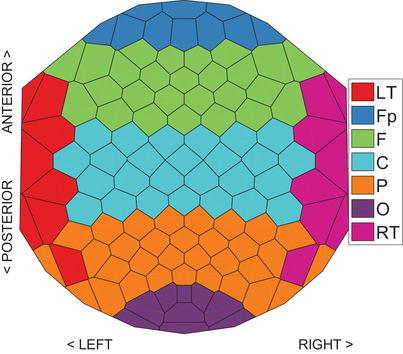
Since the representation based on FUs maintains the spatial layout of electrode positions, it is more intuitive compared to other representations when exploring the relationship between spatial structures and functional connectivity. For each FU in the timeline representation, we use the colour of the line to indicate which brain region the corresponding electrode originates from (Figure 2). In addition, to provide the exact location for each FU we provide a partial FU map for each block of lines in the timeline representation (Figure 3b). A partial FU map for a block of lines is a map where the electrodes included in this block are coloured black and the rest of the electrodes are coloured white (Task 3).
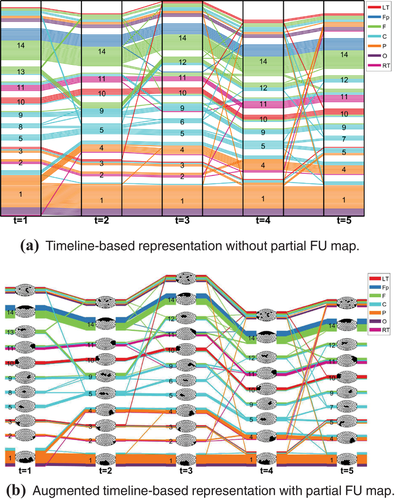
To help users identify the persistent or transient functional connectivity and to simplify the tracking of connections over time, we first pre-process the coherence networks to detect dynamic FUs. A dynamic FU is a set of similar FUs detected at consecutive time steps (a precise definition is provided in Section 3.3, Figure 4). A dynamic FU that persists across a wide span of consecutive time steps is a stable state across time (Figure 3a). Dynamic FUs which only exist for a small range of time steps are referred to as transient dynamic FUs (Task 4).

 , blue represents
  , cyan represents
  , green represents
  and magenta represents
  ; the white cells represent electrodes belonging to small FUs with size less than two.
The last main goal is to compare coherence networks between different conditions. To achieve this goal, we use a time-annotated FU map to demonstrate the differences between two consecutive FU maps (Figure 6). In this time-annotated FU map, we adopt a division of each cell into an inner and an outer region, such that the information of the previous/current state is encoded in the colour of the inner/outer cell, where the dynamic FU from each coherence network is mapped to the colour of the corresponding region. We consider this approach to be useful since it does not obscure the graph layout structure and it can provide details about changes of the node states (Task 5).
3.3. Data model and dynamic FU detection
In our visualization framework, we define a dynamic EEG coherence network as a sequence  of consecutive coherence networks, where N denotes the number of such networks, and
 is a coherence network at time step t defined by a set of vertices V and a set of edges
  . Each coherence network has the same vertex set V since the electrode set, and therefore the vertex set, is constant over time. In contrast, the edge sets
  change over time as coherences change over time.
3.3.1. FUs and FU map
For exploring the network while taking its spatial structure into account, the node-link diagram is considered to be more intuitive compared to other representations since its layout is based on the actual physical distribution of electrodes. However, the node-link diagram suffers from a large number of overlapping edges if the number of nodes exceeds a certain value. Therefore, the FU map can be used to better understand the relationship between connections and spatial structure (Figure 1).
The FU map was proposed to visualize EEG coherence networks with reduced visual clutter and preservation of the spatial structure of electrode positions. An FU is a spatially connected set of electrodes recording pairwise significantly coherent signals. Here, ‘significant’ means that their coherence is equal or higher than a threshold which is determined by the number of stimuli repetitions [tCMR08]. For each coherence network, FUs are displayed in a so-called FU map which visualizes the size and location of all FUs and connects FUs if the average coherence between them exceeds the threshold.
For each time step, FUs are detected by the method proposed by ten Caat et al. [tCMR08]. We denote the set of FUs detected at time step t by  , where
  is the number of FUs at time t.
3.3.2. Dynamic FU
To track the evolution of FUs, we introduce the concept of dynamic FU. Connecting FUs across time steps, a set of L dynamic FUs  is derived from the dynamic EEG coherence network S as follows. Each dynamic FU
  is an ordered sequence
  , where
  is the time step at which
  first appears,
  is the number of time steps during which
  lasts, and each
  is an FU at time step
  (Figure 4). That is, each dynamic FU
  is an FU whose members (i.e. included electrodes) are evolving over time as a result of the changing coherences between signals recorded by electrodes.
 and spatial similarity
  :
:
 (1)
(1) .
.  is defined as one minus the 2D Euclidean distance between the barycentres of C1 and C2. Note that this 2D Euclidean distance is normalized to the interval [0, 1] by scaling it to the maximum possible distance in an FU map. If
  is equal or higher than a threshold
  , then we consider these two FUs similar. Our similarity measure is inspired by Crippa et al. [CMLR11], but note that they used a dissimilarity measure rather than a similarity measure. Standard values of the parameters were chosen in our experiments, following the literature:
  [CMLR11] and
  [GDC10].
Require:  ;
;  ; similarity threshold θ.
Ensure:  is the dynamic FU l consisting of a series of similar FUs;
  indicates the dynamic FU that
  belongs to;
  is the number of dynamic FUs.
1: for i = 1 to  do
do
2: 
3: 
4: 
5: end for
6: 
7: for t = 2 to N do
8: for i = 1 to  do
do
9: 
10: end for
11: add all similarities 
 ,
,  between FUs in
  and
and  to
to  in descending order
12: while  do
do
13:
14: if  and
and 
 and
and  then
then
15:
16: 
17: 
18: end if
19: end while
20: for i = 1 to  do
do
21: if  then
then
22: 
23: 
24: 
25: 
26: end if
27: end for
28: end for
 : A set of FUs representing the dynamic FU
  .
.- A dynamic label
 that equals l when
  belongs to dynamic FU
  .
.  : A set of the common nodes of the FUs
  that are part of the dynamic FU
  .
. : A set of nodes contained in the FU
  .
.- A queue containing all similarities in decreasing order between FUs at consecutive time steps.
Algorithm 1 contains two major steps. The first one (lines 1–6) is the initialization step of the dynamic structures. The second one (lines 7–28) is the core step of detecting dynamic FUs. It merges the FU of the current time step with an existing dynamic FU or creates a new dynamic FU for it based on the FU similarity.
From the pseudo-code, the algorithm can be expected to have quadratic complexity in the number N of time steps. For the data considered in this paper, this did not present a problem. The FU detection was carried out as a pre-processing step. For a data set of 119 electrodes and five time steps, the computing time was in the order of 7 s on a modern laptop.
4. Dynamic Network Visualization
Our visualization design provides an interactive exploration of dynamic coherence networks. As discussed in Section 3, our design aims for helping users to understand the states of coherence networks, how these states are related to brain regions, how the states change over time, and where the differences occur between coherence networks at different time steps or under different conditions.
To this end, we employ three views: an FU map, a timeline-based representation and a time-annotated FU map. The FU map has already been described in Section 3.3.1. The timeline-based representation provides an overview of the evolution of FUs including both the changes in its composition and spatial information. The time-annotated FU map reveals the detailed content of the vertices and location of FUs, to facilitate the assessment of vertex behaviour in two consecutive FU maps and the comparison of FU maps obtained under different conditions.
4.1. Augmented timeline-based representation
The timeline-based representation has already been used in other contexts to visualize dynamic communities [SMM13, RTJ*11, LWW*13]. In this representation, time is mapped to the horizontal axis, while the vertical axis is used to position vertices represented by lines. We extended this representation to show the evolution of FUs. For a certain time step, lines grouped together represent corresponding electrodes forming FUs. Thus, the width of the grouped lines is proportional to the size of the FU in question, similar to what is done in Sankey diagrams or flow map layouts [RHF05, PXY*05]. The grouped lines are separated by a small gap to distinguish different FUs. The lines running from left to right represent the time evolution of the states of the coherence networks. When the grouped lines separate, this means that the corresponding FU splits, while the electrodes start to form an FU when lines forming different groups are joined together in the next time step. Thus, this split and merge phenomenon helps to investigate the evolution of FUs over time.
4.1.1. Including spatial information
To incorporate spatial information in such a timeline-based representation, we provide two methods. First, we encode the spatial information into the colour of the lines. To achieve this, we use an EEG placement layout based on underlying brain regions showing the location of electrodes. In this layout, electrodes are partitioned into several regions based on the EEG electrode placement system (Oostenveld and Praamstra [OP01]), and each region has a unique colour generated by the Color Brewer tool [HB03] (Figure 2). In the timeline-based view (Figure 3), the lines are coloured in the same way as the corresponding electrodes in the EEG electrode placement system of Figure 2, thus providing a mapping of each timeline to a specific spatial brain region.
However, the colour of the lines only provides rough spatial information (one of the seven brain regions). To assess the dynamics of a small number of coherence networks in more spatial detail, we augment the timeline-based representation by combining the evolution of FUs with partial FU maps through a method inspired by Vehlow et al. [VBAW15]. In a partial FU map, only one FU is displayed with its cells coloured black, while the cells of all other FUs are coloured white. For a given time step, each FU is visualized by a block of lines, followed by the corresponding partial FU map. For example, in Figure 3(b) each block of lines (labelled 1, 2, …, 14) represents an FU, except the top block which represents electrodes that do not belong to any FUs because their size is below the size threshold. Each block is followed by a partial FU map in which the corresponding electrodes in this FU are coloured black and the rest are white.
In Figure 3, dynamic FUs are tracked over five time steps, resulting in a total of 14 detected dynamic FUs. The larger FUs included in dynamic FUs D1, D14 (labelled in the figure by ‘1’ and ‘14’, respectively) are located in the Parieto-Occipital and Fronto-polar regions (Figure 2). The dynamic FUs D1, D5, D9, D10, D11, D14 exist for all time steps. Dynamic FU D1 splits at time step 2, creating a new dynamic FU D4 in addition to D1. Dynamic FU D11 significantly changes at time step 3: the electrodes coloured in blue disappear while other electrodes (coloured green) become part of it; at time step 4, D11 returns to the original state. This is also happening for D9, which changes a lot at time steps 2 and 3, but returns to the original state at time step 4 (Figure 3b).
4.1.2. Ordering of FUs and vertices
To help users easily track the evolution of FUs and their locations in the brain, FUs need to be ordered in such a way that the positions of FUs in the timeline-based view reflect their locations in the FU map. Within each FU, lines representing electrodes should be ordered in such a way that it is easy to find the electrode distribution within this FU.
To this end, we first order FUs based on the y-coordinate of their corresponding barycentres for each time step (Figure 3). The FUs with larger y-coordinate are placed above the FUs whose y-coordinates are smaller. If any FUs have the same y-coordinate, they are ordered based on their corresponding x-coordinate from left to right. Because FUs exchanging many electrodes over time usually are close to each other in the FU map, this ordering also makes for a stable layout to some extent.
To allow the viewer to understand the electrode distribution within each FU, we have chosen to order the vertices of an FU based on their location in the EEG placement layout (Figure 2). Within each FU, vertices are ordered based on the brain parts to which they belong. Vertices from the same brain regions are placed together, and they are ordered as follows: vertices from LT are placed at the top of the FU, followed by the vertices from Fp, F, C, P and O. Finally, vertices from RT are placed at the bottom of the FU. Thus, we do not optimize the view for minimum line crossings, since earlier experiments have shown that optimizing the layout for minimum line transitions often resulted in local layouts where some areas suffer from excessive crossings [RTJ*11]. In our case, the optimized layout for minimum line crossings would make it hard to understand the spatial distribution. Instead, we order vertices within the same brain region of FU  in the following way for reducing edge crossings and enhancing visual traceability: nodes will not move within an FU and lines representing these nodes do not intersect if they split in the next time step. This ordering needs to take into account the previous ordering of FUs. For example, if vertices v and
  from the same brain region are located in FU
  at time step t and in FUs
  ,
,  at time step
  , and FU
  is located above
  at time step
  , then v should lie at the upper position compared to
  in FU
in FU  at time step t. In practice, we first order vertices at the last time step
  . The vertices of the same FU and brain region at time step
  are ordered based on the FUs they belong to at the previous time step
  , such that if vertices v and
  of the same FU and brain region at time step
  come from FUs
  ,
,  at time step
  and FU
  is located above
  at time step
  , then v lies above
  at the last time step. Vertices of the same brain region and FU at time step
  are ordered based on the ordering of FUs at time step
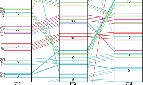
  . Figure 5 shows an example of ordering vertices. The labels of electrodes are arranged vertically on the left of the timeline representation. Each label is a combination of letters and a digit except for the electrodes located at the midline of the brain for which the label only has letters. The letter is to identify the general brain region and the number is to identify the hemisphere in question and the distance from the midline. A lowercase z is used to represent midline locations. For example, FCC1 lies over the fronto-central–central region to the left of the midline. Cz lies over the central cortex on the midline. At time step 1, they both belong to dynamic FU D8, while they both belong to the dynamic FU D9 at time step 2. They split at time step 3: FCC1 joins dynamic FU D12 while Cz joins dynamic FU D6 (Figure 5). Then FCC1 is placed above Cz at time steps 1 and 2.
4.2. Time-annotated FU map and vertex colouring
4.2.1. Time-annotated FU map
The timeline-based view provides an overview of the evolution of FUs over time, and the changes of states between consecutive time steps can be inferred from the line transitions. These transitions provide a rough indication of the difference between states at consecutive time steps. To focus on specific changes in the states of coherence networks between consecutive time steps, it is necessary to provide more detail about the behaviour of electrode signals. To achieve this, we provide a time-annotated FU map to facilitate the comparison of states of vertices between two consecutive FU maps. An example is shown in Figure 6.
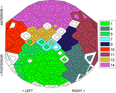
Here, we employ a technique inspired by the work of Alper et al.[ABHR*13]. Cells are divided into an inner and outer part; for simplicity, we will speak of ‘inner cell’ and ‘outer cell’. The information of the previous state is encoded in the colour of the inner cell, the information of the current state is encoded in the colour of the outer cell. Before we do this, each dynamic FU is assigned a unique colour to distinguish different dynamic FUs. This method preserves the FU map's structure, and it is intuitive to infer changes from the colours of the inner and outer cells. For the first time step, the colour of the inner cell is the same as that of the outer cell. For an FU at a given time step  , if the colour of the majority of inner cells is the same as their outer cells' colour, it means that this FU is relatively stable during these two consecutive time steps.
4.2.2. Vertex colouring
An appropriate colour encoding can provide useful information about dynamic networks. In Section 4.1.1, we use the line colour to indicate the regions where the corresponding electrodes come from (pure 3). We now use colour encoding to distinguish distinct dynamic FUs for easy comparison of electrode states at different time steps. Since the partitioning of brain regions is fixed among individuals, the assignment of colours in Section 4.1.1 is also consistent for different data sets. Here, we use an automatic method to assign colours to dynamic FUs. This implies that the colours of dynamic FUs may be different for different data sets and possibly similar to the colours of brain regions. Our method determines the colour of dynamic FUs according to the following criterion: dynamic FUs that overlap with respect to electrodes or time periods should be easily recognized by their colours. To achieve this, we use the colour assignment proposed by Dillencourt et al. [DEG06]. This approach assigns distinct colours to vertices of a geometric graph by embedding the graph into a colour space so that the colours assigned to adjacent vertices are as different from one another as possible. To extend this method to our vertex colouring problem, we construct a graph in which dynamic FUs represent nodes and pairs of nodes are adjacent if the corresponding dynamic FUs have overlapping electrodes or time windows. Then, the vertices of this graph are mapped to the colour space of interest in which each vertex has a unique coordinate representing a colour. It is also important to note that our goal is for adjacent vertices to be coloured differently. It does not matter how non-adjacent vertices, which are dynamic FUs that have no overlapping electrodes or time windows, are coloured. We applied the method to the dynamic FUs detected in Figure 3, and the result is shown in Figure 7. If there are many time steps, and thus many dynamic FUs, the number of vertices of the constructed graph is large, as well, and the generated colours would be not easy to distinguish. For this case, the colour assignment can be done with a time sliding window, where colours of dynamic FUs are computed for each data window, separately.
Note that this time-annotated FU map is not limited to the comparison of consecutive FU maps, but can also be used to compare FU maps obtained under different conditions, for example to compare the states between healthy individuals and patients.
4.3. Interaction
To support the interactive exploration of the states of coherence networks and their evolution over time, our visualization approach also incorporates brushing-and-linking techniques that help users to focus on a particular coherence network or dynamic FU of the dynamic coherence network. A prototype application was developed for this purpose [Ji17].
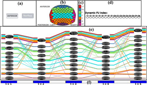
A screenshot of the user interface is shown in Figure 8. Figure 8(a) shows two buttons: one button (AugRep) is used to display the augmented timeline representation, and the other one (NorRep) is used to display the timeline representation without partial FUs. Users can find a time step of interest in the timeline representation and click on the time step (the blue area in Figure 8f) where they want to get more details, so that the corresponding FU map at that time step is displayed in Figure 8(b). Clicking on a particular FU in the timeline view, FUs belonging to the same dynamic FU will be highlighted in the timeline view, and the corresponding dynamic FU index also will be highlighted in Figure 8(d). Linked views are used for synchronous updating of the timeline representation and the FU map. This can help users to track the evolution of dynamic FUs. Following Vehlow et al. [VBAW15], the highlighting is accomplished by using 100% opacity for the selected item and a smaller opacity for the remaining items. If the mouse is moved over the blue area (time tick) in Figure 8(f), the associated time step is selected. Clicking on the white space between blue areas in Figure 8(f), the time-annotated FU map is displayed so that the user can compare the corresponding two consecutive FU maps. Within the timeline view itself, we also allow for zooming and panning techniques to investigate the evolution of larger coherence networks.
5. User Study
To evaluate the usefulness of our visualization design, we conducted an informal user study in which the participants explored the use of the dynamic coherence network visualization methods. During exploration, we collected online and offline feedback from the participants on the current and potential utility of our framework. Specifically, our goal was to assess how our visualization methods can help neuroscientists to analyse domain problems related to the identified tasks described in Section 3.
Five PhD students (three female and two male) participated in the study. The mean age of these participants was 30 years. Four participants regularly analysed EEG data; one used brain connectivity analysis while the others analysed event-related potential (ERP) data. They all have at least 2 years of experience with brain connectivity analysis. One participant was a computer scientist familiar with general visualization techniques and some familiarity with EEG data visualization. The first author met the participants at their research institutes, and carried out an evaluation interview. Note that the participants in the evaluation stage were not the same as the participants in the requirements collecting stage. The role of the participants in the requirement elicitation stage is to describe problems they are facing, whereas the role of participants in the evaluation stage is to evaluate the application design we proposed. We believe that the use of two different groups helps to remove a potential bias in the evaluation.
5.1. Evaluation procedure
During the interview, the purpose of the visualization method as well as the use of the implementation were explained first. Then, the participants were asked to explore data derived from an EEG experiment with four tasks and discuss their observations freely. These data were recorded from an oddball detection experiment, in which a P300 ERP is generated [MSvdHdJ06]. The P300 wave is a parieto-central positivity that occurs when a subject detects an informative task-relevant stimulus. The ‘P300’ name derives from the fact that its peak latency is about 300 ms, when a subject makes a simple sensory discrimination after the stimulus[Pic92]. In this experiment, participants (N.B.: not the same participants as those in our user study) were instructed to count target tones of 2 kHz (probability 0.15) and to ignore standard tones of 1 kHz (probability 0.85). After the experiment, each participant had to report the number of perceived target tones. For details of the experiment, see [MSvdHdJ06]. In our data, brain responses to 20 target tones were analysed in  segments of 1 second, sampled at 1 KHz. We first averaged over segments and then divided the averaged segment into five equal time intervals. For each time interval, we calculated the coherence network within the [8, 12] (alpha) Hz frequency band and detected FUs following the procedure described by ten Caat et al. [tCMR08]. We focused on this band as its related FU maps were interesting [tCMR08].
- (1) to explore the state of the coherence network at a certain time step;
- (2) to explore the relation between functional connectivity and brain regions;
- (3) to explore the evolution of coherence networks over time;
- (4) to compare consecutive FU maps of interest using the time-annotated FU map.
5.2. Results
We collected both the observations of participants during exploration and their feedback in the form of a questionnaire that was completed after they finished the exploration.
5.2.1. Results during exploration
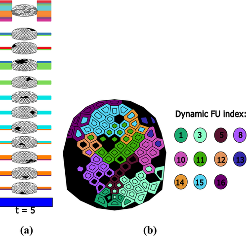
In general, the participants agreed that they can get a general picture of the dynamic networks from the timeline representation and then can subsequently use it for further exploration (Task 1). One participant said that connectivity in a certain brain area can be deduced from the thickness of the blocks of lines: the thicker the block, the more electrodes are connected in its corresponding FU (Task 2). In addition, the partial FU map was found to be very useful to locate the FUs on the scalp and to identify the constantly connected part across time (Task 3). Regarding the change in brain connectivity over time, one participant said that she can find the change in FUs over time from the transition of lines in the timeline representation and she can also analyse brain connectivity at a specific time step (Tasks 2 and 4). For example, at time step 5 there are many lines in the small FU (the top block of lines for time step 5) in which corresponding electrodes are less connected with other electrodes (see Figure 9a), which may be caused by the response fading out (Task 2).
Next, we describe a number of more specific observations made by the participants. For tracking the evolution of dynamic FUs, one participant found that the dynamic FUs of D3 and D15 are more stable across time, and furthermore that the majority of the electrodes in D15 comes from the P region; see Figure 10(a) (Tasks 1 and 4). Participants were mostly interested in the change of connections within regions (Tasks 3 and 4). The colour of lines, which is related to the division of the brain into seven regions, then is very useful: it can be used to find the state of connections within regions and between regions. For example, one participant found that dynamic FU D10 appears at the second time step and lasts for four time steps, but there is a big change at the third time step at which two electrodes come from the RT and F regions while at another time step all electrodes from the C region join (see Figure 10b). This could be interpreted as regions RT, F and C communicating information at that time step. She also found that F and C regions change a lot in composition, while the Fp and O regions are more stable across time when she selected the region index in Figure 8(c). She said that this may be related to the P300 experiment resulting in the F and C regions being more activated.
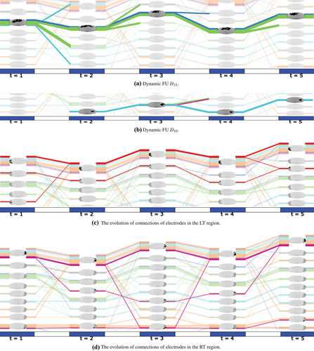
Participants were also interested in transient dynamic FUs (they called these ‘striking'), which only exist for a few time steps or exist at one particular time step only. Two participants who regularly used ERP analysis were particularly interested in the second and third time steps (Tasks 1 and 3). One participant first found dynamic FUs D11 and D15 to be very interesting since each of them includes a lot of electrodes which can be seen from the thickness of the blocks of lines and the partial FU maps. In particular, she found it interesting that dynamic FUs D10 and D11 appear at the second time step corresponding to the time interval of (201 and 400 ms), which may be related to the presence of a P300 component in the ERP. One participant also found that the LT and RT regions have similar patterns across time: most of their electrodes are involved in small FUs (see Figures 10c and d), which means they are less synchronized. The transient dynamic FUs, which only exist for one time step, include the dynamic FUs D2, D5, D6, D9, D17 and D18 (see the online demonstration [Ji17]).
One participant said that she could derive more detail about changes from the time-annotated FU map when she first identified some interesting part in the timeline representation. She also pointed out that the colour encoding in the time-annotated FU map could assist her to find changes per electrode (Task 5). One participant found that many electrodes in the F region change their states when she used the time-annotated FU map to compare the second and third FU map (Task 5). See Figure 9(b), where the colour of each inner cell represents the dynamic FU to which the electrode belongs at the second time step, while the outer cell colour represents the dynamic FU at the third time step. Colours of dynamic FUs are depicted by the circles to the right. The black cells indicate that they belong to FUs smaller than four cells.
In summary, participants are mostly interested in stable or transient dynamic FUs, and dynamic FUs appearing at a specific time step. These observations can serve as the starting point for further analysis.
5.2.2. Observations from questionnaires
- (1) How does the visualization reflect the coherence network at a certain moment in time? (Easy to understand/Insightful/I would be able to use it)
- (2) What do you think about the connections in the timeline representation? (Clear/Relevant)
- (3) What do you think about the relation between the grouped lines and their underlying spatial brain structure in the timeline representation? (Easy to understand/Insightful/I would be able to use it)
- (4) What do you think about the visualization of changes over time in the timeline representation? (Easy to understand/Insightful/I would be able to use it)
- (5) What do you think about the time-annotated FU map to facilitate the comparison of FU maps? (Easy to understand/Insightful/I would be able to use it)
For the first question, four of the participants (fully) agreed that the visualization is easy to understand and insightful, while three of them agreed they would be able to use it. When considering the properties of the connections in the timeline representation, all participants agreed that it is clear and three of them agreed it is relevant. For the third question, four of them agreed that it is easy to understand and all agreed it is insightful. Furthermore, all agreed that it is easy to understand the changes over time in the timeline representation and that it is insightful. Finally, all of them agreed that the time-annotated FU map is easy to understand and four of them agreed that it is insightful. Regarding the usability, the majority of the participants agreed that they would be able to use it; however, for each task there was one ‘disagree’ response.
The second part of the questionnaire contained open-ended questions that invited participants to give both positive and negative comments. Most participant thought the proposed visualization methods are useful: they can see how the FUs are distributed on the FU map and how these FUs change over time. One participant thought the FU map is very useful since it provides the specific localization of electrodes. When asked which of the timeline-representations (with or without partial FU maps) is better, one participant said that he preferred the representation with partial FU maps, because from this representation he could recognize the location of electrodes easily. Most participants thought the representations were useful and some stated that they can be used in several ways: to interpret the data; for presentation purposes; to compare several participants simultaneously and to investigate the dynamics in ERP experiments.
When asked whether anything could be improved or about further applications, two participants who work on ERP analysis said that this visualization could be used to analyse the change in ERP signals and for visualization of specific time steps.
In summary, the feedback we received from the user study was generally positive, which indicates the application potential of our method for visualizing dynamic EEG coherence networks. Some suggestions for further improvement have been made.
6. Conclusions and Future Work
Requirements for supporting typical tasks in the context of dynamic functional connectivity network analysis were obtained from neuroscience researchers. We designed an interactive method for visualizing the evolution of EEG coherence networks over time that meets the requirements. With this visualization, a user can investigate the relationship between functional brain connectivity and brain regions, and the time evolution of this relationship. In addition, we provided a time-annotated FU map, which can be used to facilitate the comparison of consecutive FU maps.
The user study suggests that our visualization method is potentially useful for dynamic coherence network analysis. However, our visualization method still has some limitations. First, the coherence between FUs at a certain time step is not reflected in the timeline-based representation. Therefore, a future improvement is to develop effective visual encodings to reflect the connections between FUs at a certain time step.
Another concern for our visualization method is its scalability. The order of electrodes and FUs at a certain time step is based on regions to which electrodes belong and barycentres of FUs. The ordering of electrodes will benefit the recognition of members for each FU, while the ordering of FUs will benefit the tracking of the evolution of dynamic FUs. However, for a dynamic coherence network in which there are many electrodes that switch their state often, the number of line crossings in the timeline-based view increases, especially when the number of electrodes increases. This makes the representation less readable. One potential solution is to provide some interaction techniques that allow users to interactively reorder electrodes and FUs. Third, for a large data set, the number of dynamic FUs also increases, potentially making the colours hard to distinguish between dynamic FUs (as was remarked by one participant in our user study). Finally, although the dynamic FU detection is carried out as a pre-processing step, it may still become time consuming as the number of time steps increases.
- (1) incorporate the coherence between FUs in the timeline representation;
- (2) reduce the number of line crossings;
- (3) improve the colour assignment for larger data sets;
- (4) provide access to the original EEG signals;
- (5) find an approximation to the algorithm of detecting dynamic FUs with lower complexity.
Acknowledgements
The authors are grateful to professor M. M. Lorist of the Department of Experimental and Work Psychology, University of Groningen, The Netherlands, for providing the data and information on the experiment for our user study. C.J. acknowledges the China Scholarship Council (Grant number: 201406240159) for financial support.


